
Abstract
Fine-grained epidemiological modeling of the spread of SARS-CoV-2—capturing who is infected at which locations—can aid the development of policy responses that account for heterogeneous risks of different locations as well as the disparities in infections among different demographic groups. Here, we develop a metapopulation SEIR disease model that uses dynamic mobility networks, derived from US cell phone data, to capture the hourly movements of millions of people from local neighborhoods (census block groups, or CBGs) to points of interest (POIs) such as restaurants, grocery stores, or religious establishments. We simulate the spread of SARS-CoV-2 from March 1–May 2, 2020 among a population of 105 million people in 10 of the largest US metropolitan statistical areas. We show that by integrating these mobility networks, which connect 60k CBGs to 565k POIs with a total of 5.4 billion hourly edges, even a relatively simple epidemiological model can accurately capture the case trajectory despite dramatic changes in population behavior due to the virus. Furthermore, by modeling detailed information about each POI, like visitor density and visit length, we can estimate the impacts of fine-grained reopening plans: we predict that a small minority of “superspreader” POIs account for a large majority of infections, that reopening some POI categories (like full-service restaurants) poses especially large risks, and that strategies restricting maximum occupancy at each POI are more effective than uniformly reducing mobility. Our models also predict higher infection rates among disadvantaged racial and socioeconomic groups solely from differences in mobility: disadvantaged groups have not been able to reduce mobility as sharply, and the POIs they visit (even within the same category) tend to be smaller, more crowded, and therefore more dangerous. By modeling who is infected at which locations, our model supports fine-grained analyses that can inform more effective and equitable policy responses to SARS-CoV-2.
Introduction
In response to the SARS-CoV-2 crisis, numerous stay-at-home orders were enacted across the United States in order to reduce contact between individuals and slow the spread of the virus.1 As of May 2020, these orders are being relaxed, businesses are beginning to reopen, and mobility is increasing, causing concern among public officials about the potential resurgence of cases.2 Epidemiological models that can capture the effects of changes in mobility on virus spread are a powerful tool for evaluating the effectiveness and equity of various strategies for reopening or responding to a resurgence. In particular, findings of SARS-CoV-2 “super-spreader” events3–7 motivate models that can reflect the heterogeneous risks of visiting different locations, while well-reported racial and socioeconomic disparities in infection rates8–14 require models that can explain the disproportionate impact of the virus on disadvantaged demographic groups.
To address these needs, we construct a mobility network using US cell phone data from March 1–May 2, 2020 that captures the hourly movements of millions of people from census block groups (CBGs), which are geographical units that typically contain 600–3,000 people, to points of interest (POIs) such as restaurants, grocery stores, or religious establishments. On top of this dynamic bipartite network, we overlay a metapopulation SEIR disease model that tracks the infection trajectories of each CBG over time as well as the POIs at which these infections are likely to have occurred. The key idea is that combining even a relatively simple epidemiological model with our fine-grained, dynamic mobility network allows us to not only accurately model the case trajectory, but also identify the most risky POIs; the most at-risk populations; and the impacts of different reopening policies. This builds upon prior work that models disease spread using mobility data, which has used aggregate15–21, historical22–24, or synthetic25–27 mobility data; separately, other work has directly analyzed mobility data and the effects of mobility reductions in the context of SARS-CoV-2, but without an underlying epidemiological model of disease spread.28–33
We use our model to simulate the spread of SARS-CoV-2 within 10 of the largest metropolitan statistical areas (MSAs) in the US, starting from a low, homogeneous prevalence of SARS-CoV-2 across CBGs. For each MSA, we examine the infection risks at individual POIs, the effects of past stay-at-home policies, and the effects of reopening strategies that target specific types of POIs. We also analyze disparities in infection rates across racial and socioeconomic groups, identify mobility-related mechanisms driving these disparities, and assess the disparate impacts of reopening policies on disadvantaged groups.
Results
Mobility network modeling
Mobility network
We study mobility patterns from March 1–May 2, 2020 among a population of 105 million people in 10 of the largest US metropolitan statistical areas (MSAs). For each MSA, we represent the movement of individuals between census block groups (CBGs) and points of interest (POIs) as a bipartite network with time-varying edges, where the weight of an edge between a CBG and POI is the number of visitors from that CBG to that POI at a given hour (Figure 1a). We use iterative proportional fitting34 to derive these networks from geolocation data from Safe-Graph, a data company that aggregates anonymized location data from mobile applications. We validate the SafeGraph data by comparing to Google mobility data (SI Section S1). Overall, these networks comprise 5.4 billion hourly edges between 59,519 CBGs and 565,286 POIs (Extended Data Table 1).
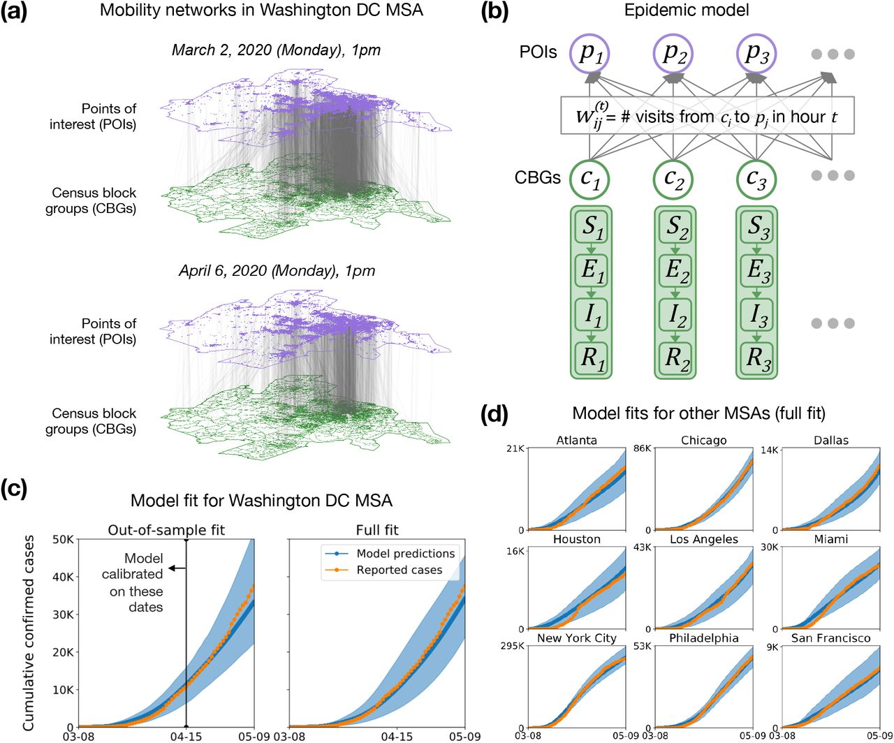
Model description and fit. (a) The mobility network captures hourly visits from each census block group (CBG) to each point of interest (POI). The vertical lines indicate that most visits are between nearby POIs and CBGs. Visits dropped dramatically from March (top) to April (bottom), as indicated by the lower density of grey lines. (b) We overlaid an SEIR disease model on the mobility network, with each CBG having its own set of SEIR compartments. New infections occur at both POIs and CBGs. The model has just three free parameters, which remain fixed over time, scaling transmission rates at POIs; transmission rates at CBGs; and the initial fraction of infected individuals. To determine the transmission rate at a given time at each POI we use the mobility network, which captures population movements as well as visit duration and the POI physical area, to estimate the density of visitors at each POI. (c) Left: To test out-of-sample prediction, we calibrated the model on data before April 15, 2020 (vertical black line). Even though its parameters remain fixed over time, the model accurately predicts the case trajectory after April 15 by using mobility data. Shaded regions denote 2.5th and 97.5th percentiles across sampled parameters and stochastic realizations. Right: Model fit further improved when we calibrated the model on the full range of data. (d) We fit separate models to 10 of the largest US metropolitan statistical areas (MSAs), modeling a total population of 105 million people; here, we show full model fits, as in (c)-Right. While we use Washington DC as a running example throughout the paper, we include results for all other MSAs in the SI.
Model
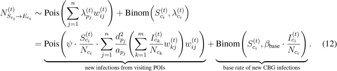
We overlay a SEIR disease model on each mobility network,15, 22 where each CBG maintains its own susceptible (S), exposed (E), infectious (I), and removed (R) states (Figure 1b). New infections occur at both POIs and CBGs, with the mobility network governing how subpopulations from different CBGs interact as they visit POIs. We use the inferred density of infectious individuals at each POI to determine its transmission rate. The model has only three free parameters, which scale (1) transmission rates at POIs, (2) transmission rates at CBGs, and (3) the initial proportion of infected individuals. All three parameters remain constant over time. We calibrate a separate model for each MSA using confirmed case counts from the The New York Times.35
Model validation
We validated our models by showing that they can predict out-of-sample case and death counts, i.e., on a held-out time period not used for model calibration. Specifically, we calibrated models for each MSA on case counts from March 8–April 14, 2020 and evaluated them on case and death counts from April 15–May 9, 2020 (these dates are offset by a week from the mobility data to account for the delay between infection and case confirmation). Our key technical result is that even with a relatively simple SEIR model with three free parameters, the mobility networks allow us to accurately model out-of-sample cases (Figure 1c and Extended Data Figure 1a) and deaths (Extended Data Figure 2a) without needing to directly incorporate information about the case trajectory or social distancing measures. In contrast, a baseline SEIR model that does not use the mobility network has considerably worse out-of-sample fit (Extended Data Figures 1b and 2b). All subsequent results were generated using the models calibrated on the entire range of case counts from March 8–May 9, 2020.
Assessing mobility reduction and reopening policies. (a) Counterfactual simulations (left) of the mobility reduction in March 2020—scaling its magnitude down, or shifting the timeline earlier or later—illustrate that the magnitude of mobility reduction (middle) was at least as important as its timing (right). Shaded regions denote 2.5th and 97.5th percentiles across sampled parameters and stochastic realizations. (b) Most infections at POIs occur at a small fraction of “super-spreader” POIs: 10% of POIs account for more than 80% of the total infections that occurred at POIs in the Washington DC MSA (results for other MSAs in Extended Data Figure 3). (c) Left: We simulated partial reopening by clipping hourly visits if they exceeded a fraction of each POI’s maximum occupancy. We plot cumulative infections at the end of one month of reopening against the fraction of visits lost by partial instead of full reopening; the annotations within the plot show the fraction of maximum occupancy used for clipping. Reopening leads to an additional 26% of the population becoming infected by the end of the month, but clipping at 20% maximum occupancy cuts down new infections by more than 80%, while only losing 40% of overall visits. Right: Compared to partially reopening by uniformly reducing visits, the clipping strategy—which disproportionately targets high-risk POIs with sustained high occupancy—always results in a smaller increase in infections for the same number of visits. The y-axis plots the relative difference between the increase in cumulative infections (from May 1 to May 31) under the clipping strategy as compared to the uniform reduction strategy. (d) We simulated reopening each POI category while keeping reduced mobility levels at all other POIs. Boxes indicate the interquartile range across parameter sets and stochastic realizations. Reopening full-service restaurants has the largest predicted impact on infections, due to the large number of restaurants as well as their high visit densities and long dwell times.
Evaluating mobility reduction and reopening policies
We can estimate the impact of a wide range of mobility reduction and reopening policies by applying our model to a modified mobility network that reflects the expected effects of a hypothetical policy. We start by studying the effect of the magnitude and timing of mobility reduction policies from March 2020. We then assess several fine-grained reopening plans, such as placing a maximum occupancy cap or only reopening certain categories of POIs, by leveraging the detailed information that the mobility network contains on each POI, like its average visit length and visitor density at each hour.
The magnitude of mobility reduction is as important as its timing
US population mobility dropped sharply in March 2020 in response to SARS-CoV-2; for example, overall mobility in the Washington DC MSA fell by 58.5% between the first week of March and the first week of April 2020. We constructed counterfactual mobility networks by scaling the magnitude of mobility reduction down and by shifting the timeline of this mobility reduction earlier and later (Figure 2a), and used our model to simulate the resulting infection trajectories. As expected, shifting the onset of mobility reduction earlier decreased the predicted number of infections incurred, and shifting it later or reducing the magnitude of reduction both increased predicted infections. What was notable was that reducing the magnitude of reduction resulted in far larger increases in predicted infections than shifting the timeline later (Figure 2a). For example, if only a quarter of mobility reduction had occurred in the DC MSA, the predicted number of infections would have increased by 3×, compared to a less than 2× increase had people begun reducing their mobility one full week later. We observe similar trends across other MSAs (Tables S1 and S2).
A minority of POIs account for a majority of infections
Since overall mobility reduction reduces infections, we next investigated if how we reduce mobility—i.e., to which POIs—matters. Using the observed mobility networks to simulate the infection trajectory from March 1–May 2, 2020, we found that a majority of predicted infections occurred at a small fraction of “super-spreader” POIs; e.g., in the DC MSA, 10% of POIs account for more than 80% of the predicted infections at POIs (Figure 2b; Extended Data Figure 3 shows similar results across MSAs). Note that infections at POIs represent a majority, but not all, of the total infections, since we also model infections within CBGs; across MSAs, the median proportion of total infections that occur at POIs is 73%. These “superspreader” POIs are smaller and more densely occupied, and their occupants stay longer, suggesting that it is especially important to reduce mobility at these high-risk POIs. In the DC MSA, the median number of hourly visitors per square foot was 4.6× higher for the riskiest 10% of POIs than for the remaining POIs; the median dwell time was 2.3× higher.

Mobility patterns give rise to socioeconomic and racial disparities in infections. (a) Across all MSAs, our model predicts that people in lower-income census block groups (CBGs) are more likely to be infected, even though they start with equal probabilities of being infected. Disparities are especially prominent in Philadelphia, which we discuss in SI Section S2. Boxes indicate the interquartile range across parameter sets and stochastic realizations. (b) Racial disparities are similar: people in non-white CBGs are typically more likely to be infected, although results are more variable. (c-e) illustrate how mobility patterns give rise to socioeconomic disparities; similar mechanisms underlie racial disparities (Extended Data Figure 6, Table S4). (c) The overall disparity is driven by a few POI categories like full-service restaurants. Shaded regions denote 2.5th and 97.5th percentiles across sampled parameters and stochastic realizations. (d) One reason for the disparities is that higher-income CBGs were able to reduce their overall mobility levels below those of lower-income CBGs. (e) Within each category, the POIs that people from lower-income CBGs visit also tend to have higher transmission rates because they are smaller and more crowded. Thus, even if a lower-income and a higher-income person went out equally often and went to the same types of places, the lower-income person would still have a greater risk of infection. The size of each dot indicates the total number of visits to that category. (f) We predict the effect of reopening (at different levels of clipping maximum occupancy) on different demographic groups. Reopening leads to more infections in lower-income CBGs (purple) than the overall population (blue), underscoring the need to account for disadvantaged subpopulations when assessing reopening plans.
Reducing mobility by clipping maximum occupancy
We simulated the effects of two reopening strategies, implemented beginning on May 1, on the increase in infections by the end of May. First, we evaluated a “clipping” reopening strategy, in which hourly visits to each POI return to those in the first week of March (prior to widespread adoption of stay-at-home measures), but are capped if they exceed a fraction of the POI’s maximum occupancy,36 which we estimated as the maximum hourly number of visitors ever recorded at that POI. A full return to early March mobility levels without clipping produces a spike in predicted infections: in the DC MSA, we project that an additional 26% of the population will be infected within a month (Figure 2c). However, clipping substantially reduces risk without sharply reducing overall mobility: clipping at 20% maximum occupancy in the DC MSA cuts down new infections by more than 80% but only loses 40% of overall visits, and we observe similar trends across other MSAs (Extended Data Figure 4). This highlights the non-linearity of infections as a function of visits: one can achieve a disproportionately large reduction in infections with a small reduction in visits.
We also compared the clipping strategy to a baseline that uniformly reduces visits to each POI from their levels in early March. Clipping always results in fewer infections for the same total number of visits: e.g., clipping at 20% maximum occupancy reduces new infections by more than 25% compared to the uniform baseline for the same total number of visits in the Washington DC MSA (Figure 2c). This is because clipping takes advantage of the heterogeneous risks across POIs, disproportionately reducing visits at high-risk POIs with sustained high occupancy, but allowing lower-risk POIs to return fully to prior mobility levels.
Relative risk of reopening different categories of POIs
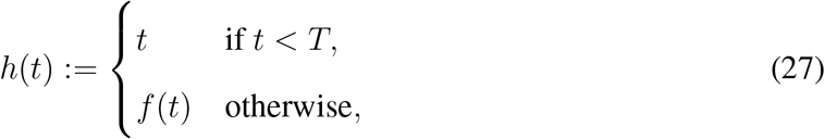
We assessed the relative risk of reopening different categories of POIs by reopening each category in turn on May 1 (and returning its mobility patterns to early March levels) while keeping mobility patterns at all other POIs at their reduced, stay-at-home levels (Figure 2d). We find a large variation in reopening risks: on average across the 10 evaluated MSAs (Extended Data Figure 5), full-service restaurants, cafes, gyms, limited-service restaurants, and religious establishments produce the largest increases in infections when reopened. Reopening full-service restaurants is particularly risky: in the Washington DC MSA, we predict an additional 296k infections by the end of May, more than double the next riskiest POI category. These risks are the total risks summed over all POIs in the category, but the relative risks after normalizing by the number of POIs are broadly similar, with restaurants, gyms, cafes, and religious establishments predicted to be the most dangerous on average per individual POI. These categories are more dangerous because their POIs tend to have higher visit densities and/or visitors stay there longer (Figures S4–S13).
Infection disparities between socioeconomic and racial groups
We characterize the differential spread of SARS-CoV-2 along demographic lines by using US Census data to annotate each CBG with its racial composition and median income, then tracking how infection disparities arise across groups. We use this approach to study the mobility mechanisms behind disparities and to quantify how different reopening strategies impact disadvantaged groups.
Mobility patterns contribute to disparities in infection rates
Despite only having access to mobility data and no other demographic information, our models correctly predicted higher risks of infection among disadvantaged racial and socioeconomic groups.8–14 Across all MSAs, individuals from CBGs in the bottom decile for income were substantially likelier to have been infected by the end of the simulation, even though all individuals began with equal likelihoods of infection in our simulation (Figure 3a). This overall disparity was driven primarily by a few POI categories (e.g., full-service restaurants), which infected far larger proportions of lower-income CBGs than higher-income CBGs (Figure 3c; similar trends hold across all MSAs in Figure S1). We similarly found that CBGs with fewer white residents had higher relative risks of infection, although results were more variable (Figure 3b). Our models also recapitulated known associations between population density and infection risk37 (median Spearman correlation between CBG density and cumulative incidence proportion, 0.42 across MSAs), despite not being given any information on population density. In SI Section S2, we confirm that the magnitude of the disparities our model predicts are generally consistent with real-world disparities and explore the large predicted disparities in Philadelphia, which stem from substantial differences in density that correlate with income and race. In the analysis below, we focus on the mechanisms producing higher relative risks of infection among lower-income CBGs, and we show in Extended Data Figure 6 and Table S4 that similar results hold for racial disparities as well.
Lower-income CBGs saw smaller reductions in mobility
Across all MSAs, we found that lower-income CBGs were not able to reduce their mobility as sharply in the first few weeks of March 2020, and had higher mobility than higher-income CBGs for most of March through May (Figure 3d, Extended Data Figure 6). For example, over the month of April, lower-income CBGs in the Washington DC MSA had 17% more visits per capita than higher-income CBGs. Differences in mobility patterns within categories partially explained the within-category infection disparities: e.g., lower-income CBGs made substantially more visits per capita to full-service restaurants than did higher-income CBGs, and consequently experienced more infections at that category (Extended Data Figure 7).
POIs visited by lower-income CBGs tend to be more dangerous
Differences in the number of visits per capita between lower- and higher-income CBGs do not fully explain the infection disparities: for example, in the DC MSA, grocery stores were visited more often by higher-income CBGs but still caused more predicted infections among lower-income CBGs. We found that even within a POI category, the transmission rate at POIs frequented by people from lower-income CBGs tended to be higher than the corresponding rate for higher-income CBGs (Figure 3e; Table S3), because these POIs tended to be smaller and more crowded. It follows that, even if a lower-income and higher-income person had the same mobility patterns and went to the same types of places, the lower-income person would still have a greater risk of infection.
As a case study, we examine grocery stores in further detail. Across all MSAs but Dallas, visitors from lower-income CBGs encountered more dangerous grocery stores than those from higher-income CBGs (median transmission rate ratio of 2.11, Table S3). Why was one visit to the grocery store twice as dangerous for a lower-income individual? Taking medians across MSAs, we found that the average grocery store visited by lower-income individuals had 45% more hourly visitors per square foot, and their visitors stayed 27% longer on average. These findings highlight how fine-grained differences in mobility patterns—how often people go out, which categories of places they go to, which POIs they choose within those categories—can ultimately contribute to dramatic disparities in infection outcomes.
Reopening plans must account for disparate impact
Because disadvantaged groups suffer a larger burden of infection, it is critical to not just consider the overall impact of reopening plans but also their disparate impact on disadvantaged groups specifically. For example, our model predicted that full reopening in the Washington DC MSA would result in an additional 35% of the population of CBGs in the bottom income decile being infected within a month, compared to 26% of the overall population (Figure 3f; results for all MSAs in Extended Data Figure 4). Similarly, Extended Data Figure 8 illustrates that reopening individual POI categories tends to have a larger impact on the bottom income decile. More conservative reopening plans produce smaller absolute disparities in infections—e.g., we predict that clipping visits at 20% occupancy would result in infections among an additional 4% of the overall population and 9% of CBGs in the bottom income decile (Figure 3f)—though the relative disparity remains.
Discussion
We model the spread of SARS-CoV-2 using a dynamic mobility network that encodes the hourly movements of millions of people between 60k neighborhoods (census block groups, or CBGs) and 565k points of interest (POIs). Because our data contains detailed information on each POI, like visit length and visitor density, we can estimate the impacts of fine-grained reopening plans— predicting that a small minority of “superspreader” POIs account for a large majority of infections, that reopening some POI categories (like full-service restaurants) poses especially large risks, and that strategies that restrict the maximum occupancy at each POI are more effective than uniformly reducing mobility. Because we model infections in each CBG, we can infer the approximate demographics of the infected population, and thereby assess the disparate socioeconomic and racial impacts of SARS-CoV-2. Our model correctly predicts that disadvantaged groups are more likely to become infected, and also illuminates two mechanisms that drive these disparities: (1) disadvantaged groups have not been able to reduce their mobility as dramatically (consistent with previously-reported data, and likely in part because lower-income individuals are more likely to have to leave their homes to work10) and (2) when they do go out, they visit POIs which, even within the same category, are smaller, more crowded, and therefore more dangerous.
The cell phone mobility dataset we use has limitations: it does not cover all populations (e.g., prisoners, young children), does not contain all POIs (e.g., nursing homes), and cannot capture sub-CBG heterogeneity in demographics. These limitations notwithstanding, cell phone mobility data in general and SafeGraph data in particular have been instrumental and widely used in modeling SARS-CoV-2 spread.15–17, 28–32, 38 Our model itself is parsimonious, and does not include such relevant features as asymptomatic transmission, variation in household size, travel between MSAs, differentials in susceptibility (due to pre-existing conditions or access to care), various transmission-reducing behaviors (e.g., hand-washing, mask-wearing), as well as POI-specific risk factors (e.g., ventilation). Although our model recovers case trajectories and known infection disparities even without incorporating these processes, we caution that this predictive accuracy does not mean that our predictions should be interpreted in a narrow causal sense, and that it is important to recognize that certain types of POIs or subpopulations may disproportionately select for certain types of omitted processes. However, the predictive accuracy of our model suggests that it broadly captures the relationship between mobility and transmission, and we thus expect our broad conclusions—e.g., that lower-income CBGs have higher infection rates in part because they have not been able to reduce mobility by as much, and because they tend to visit smaller, denser POIs—to hold robustly.
Our results can guide policymakers seeking to assess competing approaches to reopening and tamping down post-reopening resurgence. Despite growing concern about racial and socioeconomic disparities in infections and deaths, it has been difficult for policymakers to act on those concerns; they are currently operating without much evidence on the disparate impacts of reopening policies, prompting calls for research which both identifies the causes of observed disparities and suggests policy approaches to mitigate them.11, 14, 39, 40 Our fine-grained mobility modeling addresses both these needs. Our results suggest that infection disparities are not the unavoidable consequence of factors that are difficult to address in the short term, like disparities in preexisting conditions; on the contrary, short-term policy decisions substantially affect infection disparities by altering the overall amount of mobility allowed, the types of POIs reopened, and the extent to which POI occupancies are clipped. Considering the disparate impact of reopening plans may lead policymakers to, e.g., (1) favor more conservative reopening plans, (2) increase testing in disadvantaged neighborhoods predicted to be high risk (especially given known disparities in access to tests8), and (3) prioritize distributing masks and other personal protective equipment to disadvantaged populations that cannot reduce their mobility as much and must frequent riskier POIs.
As society reopens and we face the possibility of a resurgence in cases, it is critical to build models which allow for fine-grained assessments of the effects of reopening policies. We hope that our approach, by capturing heterogeneity across POIs, demographic groups, and cities, helps address this need.
Data Availability
Census data, case and death counts from The New York Times, and Google mobility data are publicly available. Cell phone mobility data is freely available to researchers, non-profits, and governments through the SafeGraph COVID-19 Data Consortium (https://www.safegraph.com/covid-19-data-consortium).
https://www.safegraph.com/covid-19-data-consortium
https://github.com/nytimes/covid-19-data
Methods
The methods section is structured as follows. We describe the datasets we use in Methods M1 and the mobility network that we derive from these datasets in Methods M2. In Methods M3, we discuss the SEIR model we overlay on the mobility network, and in Methods M4, we describe how we calibrate this model and quantify uncertainty in its predictions. In Methods M5, we provide details on the experimental procedures used for our analysis of physical distancing, reopening, and demographic disparities. Finally, in Methods M6, we elaborate on how we estimate the mobility network from the raw mobility data.
M1 Datasets
SafeGraph
We use geolocation data provided by SafeGraph, a data company that aggregates anonymized location data from numerous applications. SafeGraph data captures the movement of people between census block groups (CBGs), which are geographical units that typically contain a population of between 600 and 3,000 people, and points of interest (POIs) like restaurants, grocery stores, or religious establishments. Specifically, we use the following SafeGraph datasets:
Places Patterns43 and Weekly Patterns (v1)44, which contain, for each POI, hourly counts of the number of visitors, estimates of median visit duration in minutes (the “dwell time”), and aggregated weekly and monthly estimates of visitors’ home CBGs. For privacy reasons, SafeGraph excludes a home CBG if too few devices were recorded at the POI from that CBG. For each POI, SafeGraph also provides their North American Industry Classification System (NAICS) category, and an estimate of their physical area in square feet. We analyze Places Patterns data from January 1, 2019 to February 29, 2020 and Weekly Patterns data from March 1, 2020 to May 2, 2020.
Social Distancing Metrics,45 which contains hourly estimates of the proportion of people staying home in each CBG. We analyze Social Distancing Metrics data from March 1, 2020 to May 2, 2020.
We focus on 10 of the largest metropolitan statistical areas (MSAs) in the US (Extended Data Table 1). We chose these MSAs by taking a random subset of the SafeGraph Patterns data and picking the 10 MSAs with the most POIs in the data. Our methods in this paper can be straightforwardly applied, in principle, to the other MSAs in the original SafeGraph data. For each MSA, we include all POIs that meet all of the following requirements: (1) the POI is located in the MSA; (2) SafeGraph has visit data for this POI for every hour that we model, from 12am on March 1, 2020 to 11pm on May 2, 2020; (3) SafeGraph has recorded the home CBGs of this POI’s visitors for at least one month from January 2019 to February 2020. We then include all CBGs that have at least 1 recorded visit to at least 10 of these POIs; this means that CBGs from outside the MSA may be included if they visit this MSA frequently enough.
As described in Methods M3.1, our model necessarily makes parametric assumptions about the relationship between POI characteristics (area, hourly visitors, and dwell time) and transmission rate at the POI; these assumptions may fail to hold for POIs which are outliers, particularly if SafeGraph data has errors. We mitigate this concern by truncating extreme values for POI characteristics to prevent data errors from unduly influencing our conclusions. Specifically, we truncate each POI’s area to the 1st and 99th percentile of areas in the POI’s category. Similarly, for every hour, we truncate each POI’s visit count to its category’s 99th percentile of visit counts in that hour, and for every time period, we truncate each POI’s median dwell time to its category’s 99th percentile of median dwell times in that period. Summary statistics of the post-processed data are in Extended Data Table 1. Overall, we analyze over 59,000 CBGs from the 10 MSAs, and over 250M visits from these CBGs to over 565,000 POIs.
SafeGraph data has been used to study consumer preferences46 and political polarization.47 More recently, it has been used as one of the primary sources of mobility data in the US for tracking the effects of the SARS-CoV-2 pandemic.28, 30,48–50 In SI Section S1, we show that aggregate trends in SafeGraph mobility data broadly match up to aggregate trends in Google mobility data in the US,51 before and after the imposition of stay-at-home measures. Previous analyses of SafeGraph data have shown that it is geographically representative: for example, it does not systematically over-represent individuals from higher-income areas.52, 53
US Census
Our data on the demographics of census block groups (CBGs) comes from the US Census Bureau’s American Community Survey (ACS).54 We use the 5-year ACS (2013-2017) to extract the median household income, proportion of white residents, and proportion of black residents of each CBG. For the total population of each CBG, we use the most recent one-year estimates (2018); one-year estimates are noisier but we wish to minimize systematic downward bias in our total population counts (due to population growth) by making them as recent as possible.
New York Times
We calibrate our models using the SARS-CoV-2 dataset published by the The New York Times.35 Their dataset consists of cumulative counts of cases and deaths in the United States over time, at the state and county level. For each MSA that we model, we sum over the county-level counts to produce overall counts for the entire MSA.
M2 Mobility network
We consider a complete undirected bipartite graph 𝒢 = (𝓋, ε) with time-varying edges. The vertices 𝓋 are partitioned into two disjoint sets 𝒞 = {c1, …, cm}, representing m census block groups (CBGs), and 𝒫 = {p1, …, pn}, representing n points of interest (POIs). The weight  on an edge (ci, pj) at time t represents our estimate of the number of individuals from CBG ci visiting POI pj at the t-th hour of simulation. We record the number of edges (with non-zero weights) in each MSA and over all hours from March 1, 2020 to May 2, 2020 in Extended Data Table 1. Across all 10 MSAs, we study 5.4 billion edges between 59,519 CBGs and 565,286 POIs.
From US Census data, each CBG ci is labeled with its population  , income distribution, and racial and age demographics. From SafeGraph data, each POI pj is similarly labeled with its category (e.g., restaurant, grocery store, or religious organization), its physical size in square feet
  , and the median dwell time
  of visitors to pj.
The central technical challenge in constructing this network is estimating the network weights  from SafeGraph data, since this visit matrix is not directly available from the data. Because the estimation procedure is involved, we defer describing it in detail until Methods M6; in Methods M3–M5, we will assume that we already have the network weights.
M3 Model dynamics
To model the spread of SARS-CoV-2, we overlay a metapopulation disease transmission model on the mobility network defined in Methods M2. The transmission model structure follows prior work on epidemiological models of SARS-CoV-215, 22 but incorporates a fine-grained mobility network into the calculations of the transmission rate (Methods M3.1). We construct separate mobility networks and models for each metropolitan statistical area (MSA).
We use a SEIR model with susceptible (S), exposed (E), infectious (I), and removed (R) compartments. Susceptible individuals have never been infected, but can acquire the virus through contact with infectious individuals, which may happen at POIs or in their home CBG. They then enter the exposed state, during which they have been infected but are not infectious yet. Individuals transition from exposed to infectious at a rate inversely proportional to the mean latency period. Finally, they transition into the removed state at a rate inversely proportional to the mean infectious period. The removed state represents individuals who cannot infect others, because they have recovered, self-isolated, or died.
Each CBG ci maintains its own SEIR instantiation, with 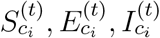 , and
, and  representing how many individuals in CBG ci are in each disease state at hour t, and
 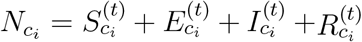 . At each hour t, we sample the transitions between states as follows:


 where
where  is the rate of infection at POI pj at time t;
  , the ij-th entry of the visit matrix from the mobility network (Methods M2), is the number of visitors from CBG ci to POI pj at time t;
  is the base rate of infection that is independent of visiting POIs; δE is the mean latency period; and δI is the mean infectious period.
We then update each state to reflect these transitions. Let 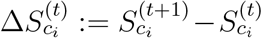 , and likewise for
 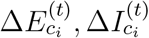 , and
, and  . Then,


M3.1 The number of new exposures 
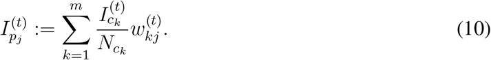
We separate the number of new exposures  in CBG ci at time t into two parts: cases from visiting POIs, which are sampled from Pois
  , and other cases not captured by visiting POIs, which are sampled from Binom
  .
.
New exposures from visiting POIs
We assume that any susceptible visitor to POI pj at time t has the same independent probability  of being infected and transitioning from the susceptible (S) to the exposed (E) state. Since there are
  visitors from CBG ci to POI pj at time t, and we assume that a
  fraction of them are susceptible, the number of new exposures among these visitors is distributed as Binom
  . The number of new exposures among all outgoing visitors from CBG ci is therefore distributed as the sum of the above expression over all POIs, Pois
We model the infection rate at POI pj at time t,  , as the product of its transmission rate
  and proportion of infectious individuals
  , where
  is the total number of visitors to pj at time t,
We model the transmission rate at POI pj at time t as
 where
where  is the physical area of pj, and ψ is a transmission constant (shared across all POIs) that we fit to data. The inverse scaling of transmission rate with area
  is a standard simplifying assumption.41 The dwell time fraction
 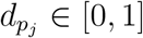 is what fraction of an hour an average visitor to pj at any hour will spend there (Methods M6.2); it has a quadratic effect on the POI transmission rate
  because it reduces both (1) the time that a susceptible visitor spends at pj and (2) the density of visitors at pj.
With this expression for the transmission rate  , we can calculate the infection rate at POI pj at time t as
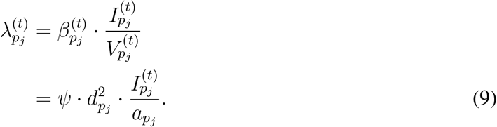
For sufficiently large values of ψ and a sufficiently large proportion of infected individuals, the expression above can sometimes exceed 1. To address this, we simply clip the infection rate to 1. However, this occurs very rarely for the parameter settings and simulation duration that we use.
Finally, to compute the number of infectious individuals at pj at time t,  , we assume that the proportion of infectious individuals among the
  visitors to pj from a CBG ck mirrors the overall density of infections
  in that CBG, although we note that the scaling factor ψ can account for differences in the ratio of infectious individuals who visit POIs. This gives
Base rate of new exposures not captured by visiting POIs
In addition to the new exposures from infections at POIs, we model a CBG-specific base rate of new exposures that is independent of POI visit activity. This captures other sources of infections, e.g., household infections or infections at POIs that are absent from the SafeGraph data. We assume that at each hour, every susceptible individual in CBG ci has a  probability of becoming infected and transitioning to the exposed state, where
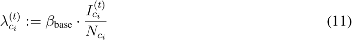 is proportional to the infection density at CBG ci, and βbase is a constant that we fit to data.
Overall number of new exposures
Putting all of the above together yields the expression for the distribution of new exposures in CBG ci at time t,
M3.2 The number of new infectious and removed cases
We model exposed individuals as becoming infectious at a rate inversely proportional to the mean latency period δE. At each time step t, we assume that each exposed individual has a constant, time-independent probability of becoming infectious, with

Similarly, we model infectious individuals as transitioning to the removed state at a rate inversely proportional to the mean infectious period δI, with

We estimate both δE and δI from prior literature; see Methods M4.
M3.3 Model initialization
In our experiments, t = 0 is the first hour of March 1, 2020. We approximate the infectious I and removed R compartments at t = 0 as initially empty, with all infected individuals in the exposed E compartment. We further assume the same expected initial prevalence p0 in every CBG ci. At t = 0, every individual in the MSA has the same independent probability p0 of being exposed E instead of susceptible S. We thus initialize the model state by setting


M4 Model calibration and validation
Most of our model parameters can either be estimated from SafeGraph and US Census data, or taken from prior work (see Extended Data Table 2 for a summary). This leaves 3 model parameters that do not have direct analogues in the literature, and that we therefore need to calibrate with data:
The transmission constant in POIs, ψ (Equation (9))
The base transmission rate, βbase (Equation (11))
The initial proportion of exposed individuals at time t = 0, p0 (Equation (16)).
In this section, we describe how we fit these parameters to published numbers of confirmed cases, as reported by The New York Times. We fit models for each MSA separately. In Methods M4.4, we show that the resulting models can accurately predict the number of confirmed cases in out-of-sample data that was not used for model fitting.
M4.1 Selecting parameter ranges
Transmission rate factors ψ and βbase
We select parameter ranges for the transmission rate factors ψ and βbase by checking if the model outputs match plausible ranges of the basic reproduction number R0 pre-lockdown, since R0 has been the study of substantial prior work on SARS-CoV-2.55Under our model, we can decompose R0 = Rbase + RPOI, where RPOI describes transmission due to POIs and Rbase describes the remaining transmission (as in Equation (12)). We first establish plausible ranges for Rbase and RPOI before translating these into plausible ranges for βbase and ψ.
We assume that Rbase ranges from approximately 0.1–1. Rbase models transmission that is not correlated with POI activity, which includes within-household transmission. We chose the lower limit of 0.1 because beyond that point, base transmission would only contribute minimally to overall R, whereas previous work suggests that within-household transmission is a substantial contributor to overall transmission.56, 57 However, household transmission alone is not estimated to be sufficient to tip overall R0 above 1; for example, a single infected individual has been estimated to cause an average of 0.32 (0.22, 0.42) secondary within-household infections.56 We therefore chose an upper limit of 1, corresponding to the assumption that R0 < 1 when there is no POI activity whatsoever (i.e., RPOI = 0).
The plausible range for RPOI is then determined by combining RPOI = R0 − Rbase with an overall range, estimated from prior work, for pre-lockdown R0 of 2–3.55 Thus, RPOI pre-lockdown plausibly ranges from roughly 1–3.
To determine the values of Rbase and RPOI that a given pair of βbase and ψ imply, we seeded a fraction of index cases and then ran the model on looped mobility data from the first week of March to capture pre-lockdown conditions. We initialized the model by setting p0, the initial proportion of exposed individuals at time t = 0, to p0 = 10−4, and then sampling in accordance with Equation (16). Let N0 be the number of initial exposed individuals sampled. We computed the number of individuals that these N0 index cases went on to infect through base transmission, Nbase, and POI transmission, NPOI, which gives


We averaged these quantities over 20 stochastic realizations per MSA. Figure S2 shows that, as expected, Rbase is linear in βbase and RPOI is linear in ψ. Rbase lies in the plausible range when βbase ranges from approximately 0.001–0.012, and RPOI lies in the plausible range (for at least one MSA) when ψ ranges from approximately 1,000–10,000, so these are the parameter ranges we consider when fitting the model. As described in Methods M4.2, we verified that case count data for all MSAs can be fit using parameter settings for βbase and ψ within these ranges.
Initial prevalence of exposures, p0
The extent to which SARS-CoV-2 infections had spread in the U.S. by the start of our simulation (March 1, 2020) is currently unclear.58 To account for this uncertainty, we allow p0 to vary across a large range between 10−5 and 10−2. As described in Methods M4.2, we verified that case count data for all MSAs can be fit using parameter settings for p0 within this range.
M4.2 Fitting to the number of confirmed cases
Using the parameter ranges above, we grid searched over ψ, βbase, and p0 to find the models that best fit the number of confirmed cases reported by The New York Times (NYT).35 For each of the 10 MSAs studied, we tested 1,260 different combinations of ψ, βbase, and p0 in the parameter ranges specified above, with parameters linearly spaced for ψ and βbase and logarithmically spread for p0.
In Methods M3, we directly model the number of infections but not the number of confirmed cases. To estimate the number of confirmed cases, we assume that an rc = 0.1 proportion of infections will be confirmed, and moreover that they will confirmed exactly δc = 168 hours (7 days) after becoming infectious. We assume that these parameters are time-invariant. As a sensitivity analysis, we alternatively stochastically sampled the number of confirmed cases and the confirmation delay from distributions with mean rc and δc, but found that this did not change predictions noticeably. We estimated these parameters, rc and δc, from prior work (Extended Data Table 2).
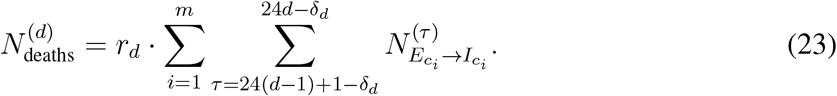
From these assumptions, we can calculate the predicted number of newly confirmed cases across all CBGs in the MSA on day d,
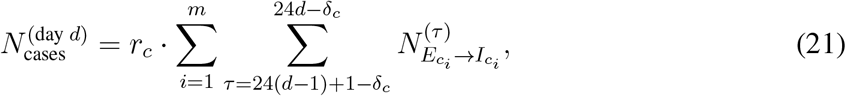 where for convenience we define
 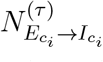 , the number of newly infectious people at hour τ, to be 0 when τ < 1. From NYT data, we have the reported number of new cases
  for each day d, summed over each county in the MSA. We compare the reported number of cases and the number of cases that our model predicts by computing the root-mean-squared-error (RMSE)59 over the D = ⌊T/24⌋ days of our simulations,
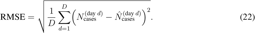
For each combination of model parameters and for each MSA, we quantify model fit with the NYT data by running 20 stochastic realizations and averaging their RMSE.
Our simulation spans March 1 to May 2, 2020, and we use mobility data from that period. However, because we assume that cases will be confirmed δc = 7 days after individuals become infectious (Extended Data Table 2), we predict the number of cases with a 7 day offset, from March 8 to May 9, 2020.
M4.3 Parameter selection and uncertainty quantification
Throughout this paper, we report aggregate predictions from different parameter sets of ψ, βbase, and p0 and multiple stochastic realizations. For each MSA, we:
Find the best-fit parameter set, i.e., with the lowest average RMSE over stochastic realizations.
Select all parameter sets that achieve an RMSE (averaged over stochastic realizations) within 20% of the RMSE of the best-fit parameter set.
Pool together all predictions across those parameter sets and all of their stochastic realizations, and report their mean and 2.5th/97.5th percentiles.
On average, each MSA has 10 parameter sets that achieve an RMSE within 20% of the best-fitting parameter set (Table S7). For each parameter set, we have results for 20 stochastic realizations. All uncertainty intervals in our results show the 2.5th/97.5th percentiles across these pooled results.
This procedure quantifies uncertainty from two sources. First, the multiple realizations capture stochastic variability between model runs with the same parameters. Second, simulating with all parameter sets that are within 20% of the RMSE of the best fit captures uncertainty in the model parameters ψ, βbase, and p0. The latter is equivalent to assuming that the posterior probability over the true parameters is uniformly spread among all parameter sets within the 20% threshold.
M4.4 Model validation on out-of-sample data
We validate our models by showing that they predict the number of confirmed cases and deaths on out-of-sample data when we have access to corresponding mobility data. We then confirm that the mobility data used as input in the model improves the fit to case and death data by comparing to a model that does not use mobility data.
Out-of-sample prediction of the number of cases (Extended Data Figure 1)
For each MSA, we split the available NYT dataset into a training set (spanning March 8, 2020 to April 14, 2020) and a test set (spanning April 15, 2020 to May 9, 2020). We fit the model parameters ψ, βbase, and p0, as described in Methods M4.2, but only using the training set. We then evaluate the predictive accuracy of the resulting model on the test set. When running our models on the test set, we still use mobility data from the test period. Thus, this is an evaluation of whether the models can accurately predict the number of cases, given mobility data, in a time period that was not used for model calibration. Extended Data Figure 1a shows that the models fit the out-of-sample case data fairly well, demonstrating that they can extrapolate beyond the training set to future time periods.
Note that we only use this train/test split to evaluate out-of-sample model accuracy. All other results are generated using parameter sets that best fit the entire dataset, as described in Methods M4.2.
Out-of-sample prediction of the number of deaths (Extended Data Figure 2)
In addition to the number of confirmed cases, the NYT data also contains the daily reported number of deaths due to COVID-19 by county. We use this death data as an additional source of validation. To estimate the number of deaths Ndeaths, we use a similar process as for the number of cases Ncases, except that we replace rc with rd = 0.66%, the infection fatality rate for COVID-19, and δc with δd = 432 hours (18 days), the number of days between becoming infectious and passing away (Extended Data Table 2). This gives
Because we assume that deaths occur δd = 18 days after individuals become infectious, we compare with NYT death data starting on March 19, 2020.
Extended Data Figure 2a demonstrates that the calibrated models also fit death counts surprisingly well, even though their parameters are selected to minimize RMSE in predicting cases, not deaths. In some MSAs, the model fits the death data less well; this is unsurprising, because our case and death count predictions assume constant case detection rates and fatality rates across MSAs.
Comparison to baseline that does not use mobility data
To determine whether mobility data aids in modeling case and death counts, we compare to a baseline SLIR model that does not use mobility data and simply assumes that all individuals within an MSA mix uniformly. In this baseline, an individual’s risk of being infected and transitioning to the exposed state at time t is
 where I(t) is the total number of infectious individuals at time t, and N is the total population size of the MSA. As above, we performed a grid search over βbase and p0, and calibrated the models on the training set. Extended Data Figure 1b shows that this model fits case counts less well than the model that uses mobility data: while it fits the training time period fairly well, it has poor generalization performance. Results are similar for deaths (Extended Data Figure 2b). The baseline model has a higher RMSE in predicting daily case counts during both the training and testing time periods in all 10 MSAs. As expected, using mobility data allows us to more accurately predict the number of cases.
M5 Analysis details
In this section, we include additional details about the experiments underlying the figures in the paper. We omit explanations for figures that are completely described in the main text.
Comparing the magnitude vs. timing of mobility reduction (Figure 2a)
To simulate what would have happened if we changed the magnitude or timing of mobility reduction, we modify the real mobility networks from March 1–May 2, 2020, and then run our models on the hypothetical data. In Figure 2a, we report the cumulative incidence proportion at the end of the simulation (May 2, 2020), i.e., the total fraction of people in the exposed, infectious, and removed states at that time.
To simulate a smaller magnitude of mobility reduction, we interpolate between the mobility network from the first week of simulation (March 1–7, 2020), which we use to represent typical mobility levels (prior to mobility reduction measures), and the actual observed mobility network for each week. Let W (t) represent the observed visit matrix at the t-th hour of simulation, and let f (t) = t mod 168 map t to its corresponding hour in the first week of simulation, since there are 168 hours in a week. To represent the scenario where people had committed to α ∈ [0, 1] times the actual observed reduction in mobility, we construct a visit matrix  that is an α-convex combination of W (t) and Wf(t),

If α is 1, then 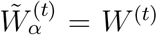 , and we use the actual observed mobility network for the simulation. On the other hand, if α = 0, then
 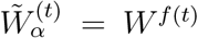 , and we assume that people did not reduce their mobility levels at all by looping the visit matrix for the first week of March throughout the simulation. Any other α ∈ [0, 1] interpolates between these two extremes.
To simulate changing the timing of mobility reduction, we shift the mobility network by d ∈ [−7, 7] days. Let T represent the last hour in our simulation (May 2, 2020, 11PM), let f (t) = t mod 168 map t to its corresponding hour in the first week of simulation as above, and similarly let g(t) map t to its corresponding hour in the last week of simulation (April 27–May 2, 2020). We construct the time-shifted visit matrix 
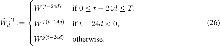
If d is positive, this corresponds to starting mobility reduction d days later; if we imagine time on a horizontal line, this shifts the time series to the right by 24d hours. However, doing so leaves the first 24d hours without visit data, so we fill it in by reusing visit data from the first week of simulation. Likewise, if d is negative, this corresponds to starting mobility reduction d days earlier, and we fill in the last 24d hours with visit data from the last week of simulation.
A minority of POIs account for a majority of infections (Figure 2b and Extended Data Figure 3)
To evaluate the distribution of infections over POIs, we run our models on the observed mobility data from March 1–May 2, 2020 and record the number of infections that occur at each POI. Specifically, for each hour t, we compute the number of expected infections that occur at each POI pj by taking the number of susceptible people who visit pj in that hour multiplied by the POI infection rate  (Equation (9)). Then, we count the total expected number of infections per POI by summing over hours. In Figure 2b, we sort the POIs by their expected number of infections and report the proportion of all infections caused by the top x% of POIs.
Reducing mobility by clipping maximum occupancy (Figure 2c, Extended Data Figure 4)
We implemented two partial reopening strategies: one that uniformly reduced visits at POIs to a fraction of full activity, and the other that “clipped” each POI’s hourly visits to a fraction of the POI’s maximum occupancy. For each reopening strategy, we started the simulation at March 1, 2020 and ran it until May 31, 2020, using the observed mobility network from March 1–April 30, 2020, and then using a hypothetical post-reopening mobility network from May 1–31, 2020, corresponding to the projected impact of that reopening strategy. Because we only have observed mobility data from March 1–May 2, 2020, we impute the missing mobility data up to May 31, 2020 by looping mobility data from the first week of March, as in the above analysis on the effect of past reductions in mobility. Let T represent the last hour for which we have observed mobility data (May 2, 2020, 11PM). To simplify notation, we define
 where, as above, f (t) = t mod 168. This function leaves t unchanged if there is observed mobility data at time t, and otherwise maps t to the corresponding hour in the first week of our simulation.
To simulate a reopening strategy that uniformly reduced visits to an γ-fraction of their original level, where γ ∈ [0, 1], we constructed the visit matrix
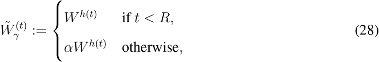 where R represents the first hour of reopening (May 1, 2020, 12AM). In other words, we use the actual observed mobility network up until hour R, and then subsequently simulate an γ-fraction of full mobility levels.
To simulate the clipping strategy, we first estimated the maximum occupancy  of each POI pj as the maximum number of visits that it ever had in one hour, across all of March 1 to May 2, 2020. As in previous sections, let
  represent the i, j-th entry in the observed visit matrix W (t), i.e., the number of people from CBG ci who visited pj in hour t, and let
  represent the total number of visitors to pj in that hour, i.e.,
  . We simulated clipping at a β-fraction of maximum occupancy, where β ∈ [0, 1], by constructing the visit matrix
  whose i, j-th entry is
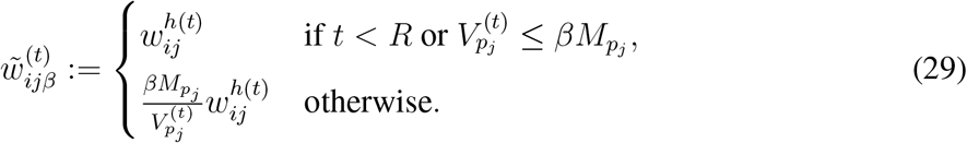
This corresponds to the following procedure: for each POI pj and time t, we first check if t < R (reopening has not started) or if  (the total number of visits to pj at time t is below the allowed maximum
  ). If so, we leave
  unchanged. Otherwise, we compute the scaling factor
  that would reduce the total visits to pj at time t down to the allowed maximum
  , and then scale down all visits from each CBG ci to pj proportionately.
For both reopening strategies, we calculate the increase in cumulative incidence at the end of the reopening period (May 31, 2020), compared to the start of the reopening period (May 1, 2020).
Relative risk of reopening different categories of POIs (Figure 2d, Extended Data Figures 5 and 8, Figures S4-S13)
We study separately reopening the 20 POI categories with the most visits in SafeGraph data. We exclude four categories due to data quality concerns from prior work30: “Child Day Care Services” and “Elementary and Secondary Schools” (because children under 13 are not well-tracked by SafeGraph); “Drinking Places (Alcoholic Beverages)” (because SafeGraph seems to undercount these locations) and “Nature Parks and Other Similar Institutions” (because boundaries and therefore areas are not well-defined by SafeGraph). We also exclude “General Medical and Surgical Hospitals” and “Other Airport Operations” (because hospitals and air travel both involve many additional risk factors our model is not designed to capture).
This reopening analysis is similar to the above analysis on clipping vs. uniform reopening. As above, we set the reopening time R to May 1, 2020, 12AM. To simulate reopening a POI category, we take the set of POIs in that category, 𝒱, and set their activity levels after reopening to that of the first week of March. For POIs not in the category 𝒱, we keep their activity levels after reopening the same, i.e., we simply repeat the activity levels of the last week of our data (April 27–May 2, 2020): This gives us the visit matrix  with entries
As in the above reopening analysis, f (t) maps t to the corresponding hour in the first week of March, and g(t) maps t to the corresponding hour in the last week of our data. For each category, we calculate the difference between (1) the cumulative fraction of people who have been infected by the end of the reopening period (May 31, 2020) and (2) the cumulative fraction of people infected by May 31 had we not reopened the POI category (i.e., if we simply repeated the activity levels of the last week of our data). This seeks to model the increase in cumulative incidence by end of May from reopening the POI category. In Extended Data Figure 5 and Figures S4-S13, the bottom right panel shows the increase for the category as a whole, and the bottom left panel shows the increase per POI (i.e., the total increase divided by the number of POIs in the category).
Per-capita mobility (Figure 3d, Extended Data Figures 6 and 7)
Each group of CBGs (e.g., the bottom income decile) comprises a set 𝒰 of CBGs that fit the corresponding criteria. In Extended Data 6, we show the daily per-capita mobilities of different pairs of groups (broken down by income and by race). To measure the per-capita mobility of a group on day d, we take the total number of visits made from those CBGs to any POI,  , and divide it by the total population of the CBGs in the group,
  . In Extended Data Figure 7, we show the total number of visits made by each group to each POI category, accumulated over the entire data period (March 1–May 2, 2020) and then divided by the total population of the group.
Average transmission rate of a POI category (Figure 3e)
We compute the average transmission rate experienced by a group of CBGs 𝒰 at a POI category 𝒱 as
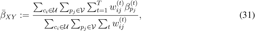 where
where  is the POI transmission rate (Equation (8)). This represents the expected transmission rate encountered during a visit by someone from a CBG in group 𝒰 to a POI in category 𝒱.
M6 Estimating the mobility network from SafeGraph data
Finally, we describe how we estimate the visit matrix W (t) (Methods M6.1) and dwell time  (Methods M6.2) from SafeGraph data.
Notation
We use a hat to denote quantities that we read directly from SafeGraph data, and r instead of t to denote time periods longer than an hour.
M6.1 Estimating the visit matrix W(t)
Overview
We estimate the visit matrix  , which captures the number of visitors from CBG ci to POI pj at each hour t from March 1, 2020 to May 2, 2020, through the iterative proportional fitting procedure (IPFP).34 The idea is as follows:
From SafeGraph data, we can derive a time-independent estimate
of the visit matrix that captures the aggregate distribution of visits from CBGs to POIs from January 2019 to February 2020.However, visit patterns differ substantially from hour to hour (e.g., day versus night) and day to day (e.g., preversus post-lockdown). To capture these variations, we use current SafeGraph data to estimate the CBG marginals U (t), i.e., the total number of visitors leaving each CBG at each time t, as well as the POI marginals V (t), i.e., the total number of visitors present at each POI pj at time t.
We then use IPFP to estimate an hourly visit matrix W (t) that is consistent with the hourly marginals U (t) and V (t) but otherwise “as similar as possible” to the distribution of visits in the aggregate visit matrix
. Here, similarity is defined in terms of Kullback-Leibler divergence; we provide a precise definition below.


Quantities from SafeGraph data
To estimate the visit matrix, we read the following quantities from SafeGraph data:
The estimated visit matrix
aggregated for the month r. This is taken from the Patterns dataset, and is aggregated at a monthly level. To account for non-uniform sampling from different CBGs, we weight the number of SafeGraph visitors from each CBG by the ratio of the CBG population and the number of SafeGraph devices with homes in that CBG.60- : The number of visitors recorded in POI pj Patterns v1 dataset. at hour t. This is taken from the Weekly
- : The estimated fraction of people in CBG ci that did not leave their home in day ⌊ t/24⌋. This is derived by dividing completely home device count by device count, which are daily (instead of hourly) metrics in the Social Distancing Metrics dataset.


Estimating the aggregate visit matrix

The estimated monthly visit matrices  are typically noisy and sparse: SafeGraph only matches a subset of visitors to POIs to their home CBGs, either for privacy reasons (if there are too few visitors from the given CBG) or because they are unable to link the visitor to a home CBG.61 To mitigate this issue, we aggregate these visit matrices, which are available at the monthly level, over the R = 14 months from January 2019 to February 2020:
Each entry  of
of  represents the estimated average number of visitors from CBG ci to POI pj per month from January 2019 to February 2020. After March 2020, SafeGraph reports this matrix on a weekly level in the Weekly Patterns v1 dataset. However, due to inconsistencies in the way SafeGraph processes the weekly vs. monthly matrices, we only use the monthly matrices up until February 2020.
Estimating the POI marginals V(t)
We estimate the POI marginals V (t) ∈ ℝn, whose j-th element  represents our estimate of the number of visitors at POI pj (from any CBG) at time t. The number of visitors recorded at POI pj at hour t in the SafeGraph data,
  , is an underestimate because the SafeGraph data only covers on a fraction of the overall population. To correct for this, we follow Benzell et al.30 and compute our final estimate of the visitors at POI pj in time t as

This correction factor is approximately 7, using population data from the most recent 1-year ACS (2018).
Estimating the CBG marginals U(t)
Next, we estimate the CBG marginals U (t) ∈ ℝ m. Here, the i-th element  represents our estimate of the number of visitors leaving CBG ci (to visit any POI) at time t. We will also use
  ; recall that
  is the total population of ci, which is independent of t.
We first use the POI marginals V (t) to calculate the total number of people who are out visiting any POI from any CBG at time t,
Since the total number of people leaving any CBG to visit a POI must equal the total number of people at all the POIs, we have that 
Next, we estimate the number of people from each CBG ci who are not at home at time t as  In general, the total number of people who are not at home in their CBGs,
  , will not be equal to
  , the number of people who are out visiting any POI. This discrepancy occurs for several reasons: for example, some people might have left their homes to travel to places that SafeGraph does not track, SafeGraph might not have been able to determine the home CBG of a POI visitor, etc.
To correct for this discrepancy, we assume that the relative proportions of POI visitors coming from each CBG follows the relative proportions of people who are not at home in each CBG. We thus estimate  by apportioning the
  total POI visitors at time t according to the proportion of people who are not at home in each CBG ci at time t:
 where
where  is the total population of CBG i, as derived from US Census data. This construction ensures that the POI and CBG marginals match, i.e.,
  .
.
Iterative proportional fitting procedure (IPFP)
IPFP is a classic statistical method34 for adjusting joint distributions to match pre-specified marginal distributions, and it is also known in the literature as biproportional fitting, the RAS algorithm, or raking.62 In the social sciences, it has been widely used to infer the characteristics of local subpopulations (e.g., within each CBG) from aggregate data.63–65
We estimate the visit matrix W (t) by running IPFP on the aggregate visit matrix  , the CBG marginals U (t), and the POI marginals V (t) constructed above. Our goal is to construct a non-negative matrix W (t) ∈ ℝ m×n whose rows sum up to the CBG marginals U (t),
 and whose columns sum up to the POI marginals
  ,
,
 but whose distribution is otherwise “as similar as possible”, in the sense of Kullback-Leibler divergence, to the distribution over visits induced by the aggregate visit matrix
  .
.
Algorithm 1: Iterative proportional fitting procedure to estimate visit matrix W (t)

IPFP is an iterative algorithm that alternates between scaling each row to match the row (CBG) marginals U (t) and scaling each column to match the column (POI) marginals V (t). We provide pseudocode in Algorithm 1. For each value of t used in our simulation, we run IPFP separately for τmax = 100 iterations. Note that IPFP is invariant to scaling the absolute magnitude of the entries in  , since the total number of visits it returns is fixed by the sum of the marginals; instead, its output depends only on the distribution over visits in
  .
.
The notion of similarity invoked above has a maximum likelihood interpretation: if IPFP converges, then it returns a visit matrix W (t) whose induced distribution minimizes the KullbackLeibler divergence to the distribution induced by  .66 We further discuss the convergence of IPFP in our setting in SI Section S3.
M6.2 Dwell times
Here, we describe how we estimate the dwell time  , which we use to estimate the hourly mean occupancy at each POI pj. For simplicity, we treat
  as independent of t, i.e., we average across all times t in our data for each POI pj.
Quantities from SafeGraph data
To compute the average time  spent at each POI pj, we average the values in the median dwell field in the Patterns datasets from 2020.
  is measured to minute-level resolution and expressed in units of hours, e.g.,
  means a median visit time of 1.5 hours = 90 minutes.
If a visit straddles multiple hour boundaries at a POI, SafeGraph treats it as multiple visits in each of those hours for the purposes of computing the visit counts that we use in Methods M6.1. As a hypothetical example, consider a POI p1 which has 1 new visitor come at the start of every hour and stay for exactly 1 hour, and another POI p2 which also has 1 new visitor come at the start of every hour, except that visitors to p2 stay for exactly 2 hours. SafeGraph data will reflect this difference in visit times, with  and
and  . However, SafeGraph will also record that p2 has twice as many visitors at every hour than p1—in the notation of Methods M6.1, we would have that
  for all t—even though the total number of unique visitors to p1 and p2 are the same. This overcounting is the central technical issue that we address in this section.
Note that visits are still counted even if a visitor does not stay for the entire hour. For example, a visitor that arrives at 9:30am and leaves at 10:10am will be counted as two visits, once in the 9-10am hour and another time in the 10-11am hour.
Estimating the dwell time fraction

Our goal is to estimate a correction factor for each POI pj that corrects for the average visit duration of visitors to pj. As the example above shows, setting the correction factor to be directly proportional to the average visit time  would overcount visitors who stay across multiple hour boundaries. Instead, we define the dwell time fraction
  as the average fraction of an hour that a visitor to POI pj at any hour will spend there. In other words, conditioned on a visitor being at pj at some time within an hour t,
  is the expected fraction of the hour t that the visitor physically spends at pj.
To estimate  , we make two assumptions: first, that every visitor to pj stays for exactly
  hours, and second, that the arrival times of visitors are uniformly distributed over all possible arrival times. Concretely, if a visitor to pj stays for
  hours and is recorded as present at hour t, then we assume that they are equally likely to have arrived at any time from
  . From these assumptions, we can calculate
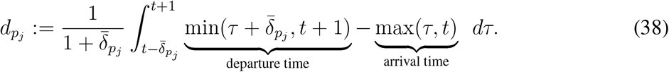
We truncate the departure time at t + 1 because any time spent after t + 1 does not count towards the hour t. Similarly, we truncate the arrival time at t. This expression for  simplifies into

See SI Section S4 for the derivation.
Data Availability
Census data, case and death counts from The New York Times, and Google mobility data are publicly available. Cell phone mobility data is freely available to researchers, non-profits, and governments through the SafeGraph COVID-19 Data Consortium.
Code Availability
Code is in preparation and will be made publicly available at http://snap.stanford.edu/covid-mobility/.
Author Contributions
S.C., E.P., and P.W.K. performed computational analysis. All authors jointly analyzed the results and wrote the paper.
Author Information
The authors declare no conflict of interest. Correspondence should be addressed to jure{at}cs.stanford.edu.
Extended data

Predicted (blue) and true (orange) cumulative case counts for (a) our model, which uses the mobility network, and (b) a baseline SEIR model that does not use mobility data. Incorporating the mobility network improves out-of-sample model fit. Both models are calibrated on observed case counts before April 15, 2020 (vertical black line). Shaded regions denote 2.5th and 97.5th percentiles across sampled parameters and stochastic realizations. See Methods M4.4 for details.

Predicted (blue) and true (brown) cumulative death counts for (a) our model, which uses the mobility network, and (b) a baseline SEIR model that does not use mobility data. Incorporating the mobility network improves out-of-sample model fit. Both models are calibrated on observed case counts before April 15, 2020 (vertical black line). Shaded regions denote 2.5th and 97.5th percentiles across sampled parameters and stochastic realizations. See Methods M4.4 for details.

A small fraction of POIs account for a large fraction of the predicted infections at POIs. We ran our models on the observed mobility data from March 1–May 2, 2020 and recorded the number of infections that occurred at each POI. Shaded regions denote 2.5th and 97.5th percentiles across sampled parameters and stochastic realizations. See Methods M5 for details.

The predicted increase in infections with the “clipping” partial reopening strategy. We simulate reopening starting on May 1, 2020 and run the simulation until the end of the month. Each dot represents a degree of clipping, e.g., clipping at 50% maximum occupancy, at 20% maximum occupancy, etc. The y-coordinate of each dot represents the predicted number of new infections incurred after reopening (per 100k population) and its x-coordinate represents the fraction of visits lost from partial reopening compared to full reopening. In 6 MSAs, the lower-income CBGs incur substantially more infections from reopening. Only in New York City (NYC) is this trend reversed; this is because such a high fraction of lower-income CBGs in NYC had been infected before reopening (62%) that after reopening, there was only a minority of the lower-income population that is still susceptible. In comparison, none of the other MSAs saw such a high incidence proportion among lower-income CBGs before reopening; for example, the second highest was 31% for Philadelphia, and the rest ranged from 2–13%. Shaded regions denote 2.5th and 97.5th percentiles across sampled parameters and stochastic realizations. See Methods M5 for reopening details.

POI attributes in all 10 MSAs combined. The top two plots pool POIs from all MSAs, and show the distribution of dwell time and the average number of hourly visitors divided by the area of the POI in square feet. Each point represents one POI; boxes depict the interquartile range across POIs. The bottom two plots pool across models from all MSAs, and show predictions for the increase in infections (per 100k population) from reopening a POI category: per POI (left bottom plot) and for the category as a whole (right bottom plot). Each point represents one model realization; boxes depict the interquartile range across sampled parameters and stochastic realizations. See Methods M5 for reopening details.
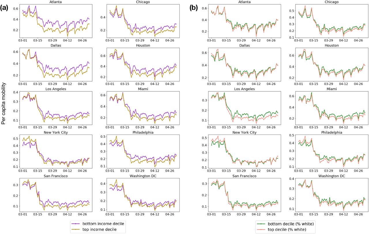
Daily per-capita mobility over time, (a) comparing lower-income to higher-income CBGs and (b) comparing less white to more white CBGs. See Methods M5 for details.

Visits per capita from the bottom-(purple) and top-(gold) income deciles to each POI category, accumulated from March 2–May 1, 2020. See Methods M5 for details.

Predicted additional infections (per 100k population) from reopening each POI category, for CBGs in the top-(gold) and bottom-(purple) income deciles. Reopening impacts are generally worse for lower-income CBGs. See Methods M5 for reopening details.
Dataset summary statistics from March 1–May 2, 2020.
If the parameter has a fixed value, we specify it under Value; otherwise, we write “Variable” to indicate that it varies across CBG / POI / MSA.
Supplementary methods
S1 Comparison of Google and SafeGraph mobility data
To assess the reliability of the SafeGraph datasets, we measured the correlation between mobility trends according to SafeGraph versus Google.51 Google provides a high-level picture of mobility changes around the world for several categories of places, such as grocery stores or restaurants. We analyzed four of the six categories defined by Google: Retail & recreation (e.g., restaurants, shopping centers, movie theaters), Grocery & pharmacy (e.g., grocery stores, farmers markets, pharmacies), Parks (e.g., local parks, national parks, public beaches), and Residential (i.e. places of residence). We omitted Transit stations because they are not well-covered by SafeGraph POIs, and Workplaces because we do not model whether people are at work. To account for the first three categories, we used POI visits in the SafeGraph Patterns datasets, identifying POIs in each category based on their 6-digit NAICS codes (Table S5). For the Residential category, we used SafeGraph Social Distancing Metrics, which provides daily counts of the number of people in each CBG who stayed at home for the entire day.
For each US region and category, Google tracks how the number of visits to the category has changed over the last few months, compared to typical levels of activity before SARS-CoV-2. To set this baseline, they compute the median number of visits to the category for each day of the week, over a 5-week span from January 3–February 6, 2020. For a given day of interest, they then compute the relative change in number of visits seen on this day compared to the baseline for the corresponding day of week. We replicated this procedure on SafeGraph data, and compared the results to Google’s trends for Washington DC and 14 states that appear in the MSAs that we model. For each region and category, we measured the Pearson correlation between the relative change in number of visits according to Google versus Safegraph, from March 1–May 2, 2020. Across the 15 regions, we found that the median Pearson correlation was 0.96 for Retail & recreation, 0.79 for Grocery & pharmacy, 0.44 for Parks, and 0.88 for Residential. As an illustrative example, we visualize the results for New York in Figure S3, and provide a full table of results for every state in Table S6. The Pearson correlations are high for all categories aside from Parks. Since POIs in Parks account for a small fraction of the overall visits in the SafeGraph dataset, we believe that this discrepancy should not significantly impact our models. Specifically, we evaluated the percentage of total SafeGraph POI visits to each category during the baseline period, and we found that Retail & recreation accounts for 34.7% of visits, Grocery & pharmacy covers 5.4%, and Parks only covers 2.5%. Overall, these results indicate that SafeGraph mobility trends recapitulate those in Google data, providing a validation of the reliability of SafeGraph data.
S2 Plausibility of predicted racial/socioeconomic disparities
To assess the plausibility of the predicted disparities in infection rates in Figure 3, we compared the model’s predicted racial disparities to observed racial disparities in mortality rates. (Data on socioeconomic disparities in mortality was not systematically available on a national level.) The racial disparities in Figure 3 are generally of the same magnitude as reported racial disparities in mortality rates—for example, the overall reported black mortality rate is 2.4× higher than the white mortality rate,71 which is approximately the same as the median racial disparity across MSAs of 2.4× that our model predicts (Figure 3b). However, we note that this is an imperfect comparison because many factors besides mobility contribute to racial disparities in death rates.
In addition, we observed that our model predicted unusually large socioeconomic and racial disparities in infection rates in the Philadelphia MSA. To understand why the model predicted such large disparities, we inspected the mobility factors discussed in the main text; namely, how much each group was able to reduce their mobility, and whether disadvantaged groups encountered higher transmission rates at POIs.
First, we find in Philadelphia that higher-income CBGs were able to reduce their mobility substantially more than lower-income CBGs (Extended Data Figure 6 left). The CBGs with the greatest percentage of white residents were also able to reduce their mobility more than the CBGs with the lowest percentage of white residents (Extended Data Figure 6 right). These gaps are noticeable, but not obviously larger than those in other MSAs. The key to Philadelphia’s outlier status seems to lie in the comparison of transmission rates. Within the same category of POI— e.g., full-service restaurants—individuals from lower-income CBGs tend to visit POIs with higher transmission rates than individuals from high-income CBGs (Table S3). This is particularly true for Philadelphia; in every one of the 20 categories, individuals from lower-income CBGs in Philadelphia encounter higher transmission rates than individuals from high-income CBGs, which does not happen for any other MSA. (Results for race are similar: when we compare Philadelphia CBGs in the top and bottom deciles for percentage of white residents, the CBGs in the bottom decile encounter higher transmission rates in 19 out of 20 of the categories, as shown in Table S4.) The transmission rates encountered by individuals from lower-income CBGs in Philadelphia are often dramatically higher than those encountered by higher-income CBGs; for example, up to 11.8× higher for grocery stores. Digging deeper, this is because the average grocery store visited by lower-income CBGs has 4× the number of hourly visitors per square foot, and visitors tend to stay twice as long. Furthermore, Philadelphia’s large discrepancy in density between lower-income and higher-income POIs in SafeGraph data is consistent with Census data, which shows that the correlation between population density and median household income is larger in Philadelphia than in any of the other MSAs that we examine (Spearman correlation 0.55 in Philadelphia, as compared to a median of 0.31 across MSAs).
Since there are many other factors of disparity that we do not model, we do not place too much weight on our model’s prediction that Philadelphia’s disparities will be larger than those of other cities. However, we consider this a valuable finding in terms of Philadelphia’s mobility patterns, suggesting that mobility may play an especially strong role in driving socioeconomic and racial infection disparities in this MSA, and we encourage policymakers to be aware of how differences in mobility patterns may exacerbate the disproportionate impact of SARS-CoV-2 on disadvantaged groups.
S3 Convergence of iterative proportional fitting
For completeness, we briefly review the convergence properties of the iterative proportional fitting procedure (IPFP) used to infer our mobility networks. Consider the L1-error function
 which sums up the errors in the row (CBG) and column (POI) marginals of the visit matrix W (t,τ) from the τ -th iteration of IPFP. Each iteration of IPFP monotonically reduces this L1-error E(t,τ), i.e., E(t,τ) ≥ E(t,τ+1) for all τ ≥ 0.72 In other words, the row and column sums of W (t,τ) (which is initialized as
  ) progressively get closer to (or technically, no further from) the target marginals as the iteration number τ increases. Moreover, IPFP maintains the cross-product ratios of the aggregate matrix
  , i.e.,
 for all matrix entries indexed by i, j, k, ℓ, for all t, and for all iterations τ.
IPFP converges to a unique solution, in the sense that W (t) = limτ→∞ W (t,τ), if there exists a matrix W (t) that fits the row and column marginals while maintaining the sparsity pattern (i.e., location of zeroes) of  .72 If IPFP converges, then the L1-error also converges to 0 as τ → ∞,72 and W (t) is the maximum likelihood solution in the following sense. For a visit matrix W = {wij}, let PW represent a multinomial distribution over the mn entries of W with probability proportional to wij, and define
  and 𝒱(t) ⊆ ℝm×n as the set of non-negative matrices whose row and column marginals match U (t) and V (t) respectively. Then, if IPFP converges,
 where KL (p‖q) is the Kullback-Leibler divergence
  . In other words, IPFP returns a visit matrix W (t) whose induced distribution
  is the I-projection of the aggregate visit distribution
  on the set of distributions with compatible row and column marginals.66 In fact, IPFP can be viewed as an alternating sequence of I-projections onto the row marginals and I-projections onto the column marginals.66, 73
However, in our setting, IPFP typically does not return a unique solution and instead oscillates between two accumulation points, one that fits the row marginals and another that fits the column marginals.73 This is because  is highly sparse (there is no recorded interaction between most CBGs and POIs), so the marginals are sometimes impossible to reconcile. For example, suppose there is some CBG ci and POI pj such that
  is the only non-zero entry in the i-th row and j-th column of
  , i.e., visitors from ci only travel to pj and conversely visitors from pj are all from c. Then, if
  , there does not exist any solution W (t) such that
  . Note that in this scenario, IPFP still monotonically decreases the L1-error.72
In our implementation (Algorithm 1), we take τmax = 100, so IPFP ends by fitting the column (POI) marginals. This ensures that our visit matrix W (t) is fully compatible with the POI marginals V (t), i.e.,
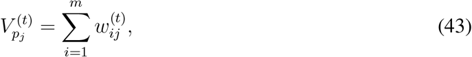 while still minimizing the L1-error E(t,τ) with respect to the CBG marginals U (t). Empirically, we find that τmax = 100 iterations of IPFP are sufficient to converge to this oscillatory regime.
S4 Derivation of the dwell time fraction

Recall from Methods M6.2 that we have
This expression for  simplifies into
To see this, first consider the case where  . To keep notation simple, let t = 0 mark the start of the hour being considered. Then,
Visitors who arrive at
will spend 0 time during the hour being considered. This time increases linearly from 0 to as the arrival time increases from to 0.Visitors who arrive during
will spend the full time in the hour being considered.This time decreases linearly from
to 0 as the arrival time increases from to 1.


In total, we thus have

Similarly, consider the case where  . Then,
Visitors who arrive at
will spend 0 time during the hour being considered. This time increases linearly from 0 to 1 as the arrival time increases from to .Visitors who arrive during
will spend the full hour.This time decreases linearly from 1 to 0 as the arrival time increases from 0 to 1.


In total, we likewise have

Supplementary tables
We report the expected ratio of the number of infections predicted under the counterfactual to the number of infections predicted using observed mobility data; a ratio lower than 1 means that fewer infections occurred under the counterfactual. The numbers in parentheses indicate the 2.5th and 97.5th percentiles across sampled parameters and stochastic realizations. See Methods M5 for details.
Each column represents a counterfactual scenario where the magnitude of mobility reduction is only a some percentage of the observed mobility reduction, i.e., 0% corresponds to no mobility reduction, and 100% corresponds to the real, observed level of mobility reduction. We report the expected ratio of the number of infections predicted under the counterfactual to the number of infections predicted using observed mobility data; a ratio lower than 1 means that fewer infections occurred under the counterfactual. The numbers in parentheses indicate the 2.5th and 97.5th percentiles across sampled parameters and stochastic realizations. See Methods M5 for details.
We report the ratio of the average transmission rate encountered by visitors from CBGs in the bottom income decile to that for the top income decile. A ratio greater than 1 means that visitors from CBGs in the bottom income decile experienced higher (more dangerous) transmission rates. See Methods M5 for details.
We report the ratio of the average transmission rate encountered by visitors from CBGs with the lowest (bottom decile) proportion of white residents versus that for the top decile. A ratio greater than 1 means that visitors from CBGs in the bottom decile experienced higher (more dangerous) transmission rates. See Methods M5 for details.
Google descriptions taken fromhttps://www.google.com/covid19/mobility/data_documentation.html.
We report correlations over the period of March 1–May 2, 2020 for the 15 states that we model. See SI Section S1 for details.
# sets counts the number of parameter sets that are within 20% of the RMSE of the best-fit parameter set, as described in Section M4. For each of βbase, ψ, and p0, we show the best-fit parameter set and, in parentheses, the corresponding minimum and maximum within the 20% threshold.
Supplementary figures
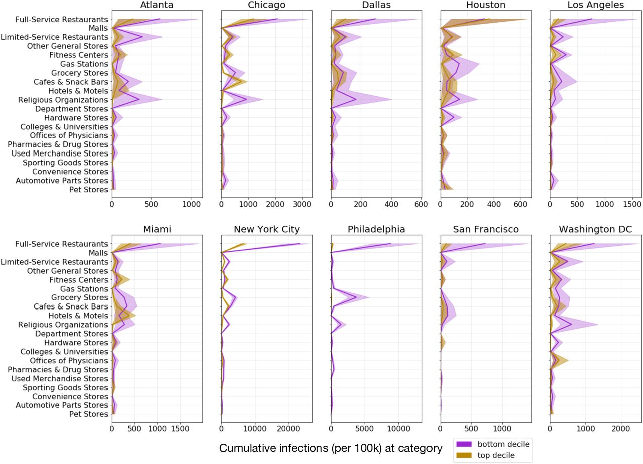
For each POI category, we plot the predicted cumulative number of infections (per 100k population) that occurred at that category for CBGs in the bottom-(purple) and top-(gold) income deciles. Shaded regions denote 2.5th and 97.5th percentiles across sampled parameters and stochastic realizations.
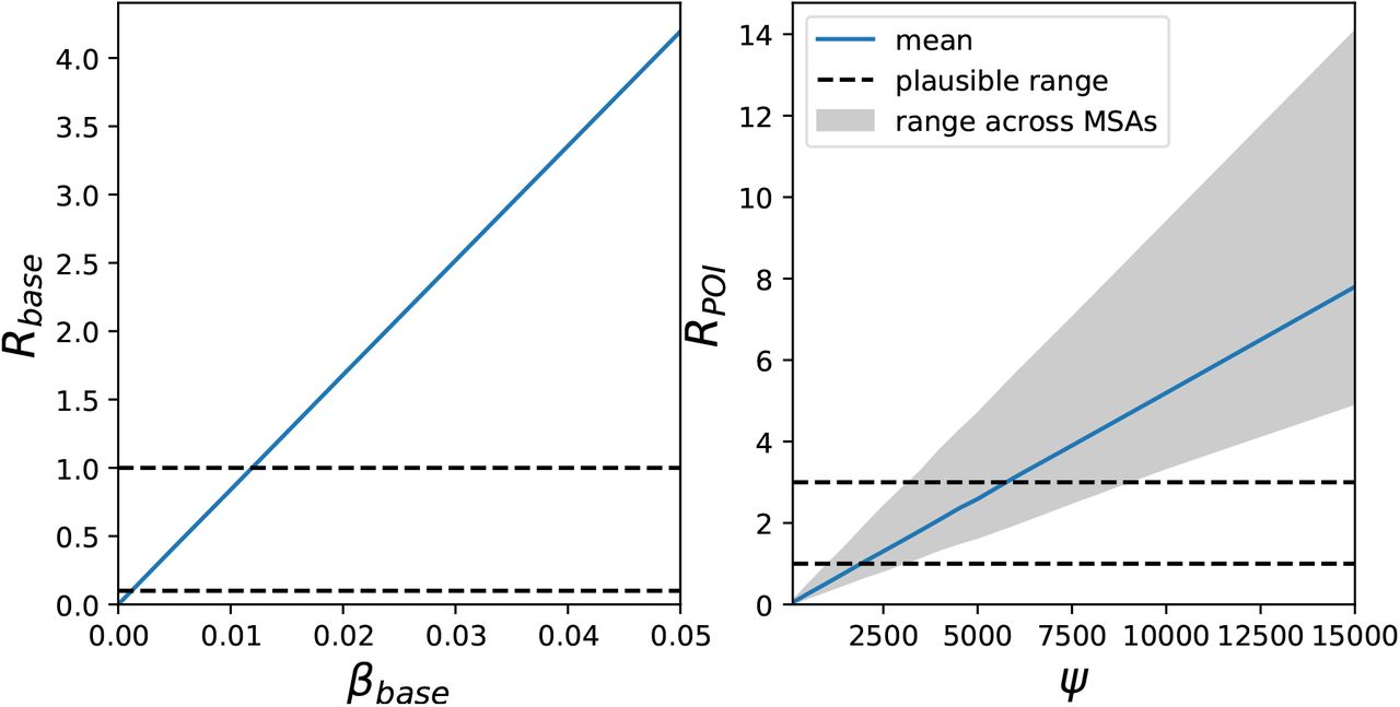
Rbase and RPOI implied by model parameter settings. Dotted black lines denote plausible ranges from prior work, the blue line shows the mean across MSAs, and the grey shaded area indicates the range across MSAs. Rbase does not vary across MSAs because it does not depend on MSA-specific social activity. See Methods M4.1 for details.

Google versus SafeGraph mobility trends for New York state. The y-axis represents mobility levels compared to baseline activity in January and February 2020. For the categories from left to right, the Pearson correlations between the datasets are 0.96, 0.76, 0.57, and 0.91. See SI Section S1 for details.

POI attributes in Atlanta. The top two plots show the distribution of dwell time and the average number of hourly visitors divided by the area of the POI in square feet. Each point represents one POI; boxes depict the interquartile range across POIs. The bottom two plots show predictions for the increase in infections (per 100,000 people) from reopening a POI category: per POI (left bottom) and for the category as a whole (right bottom). Each point represents one model realization; boxes depict the interquartile range across sampled parameters and stochastic realizations.

POI attributes in Chicago. See Figure S4 for details.
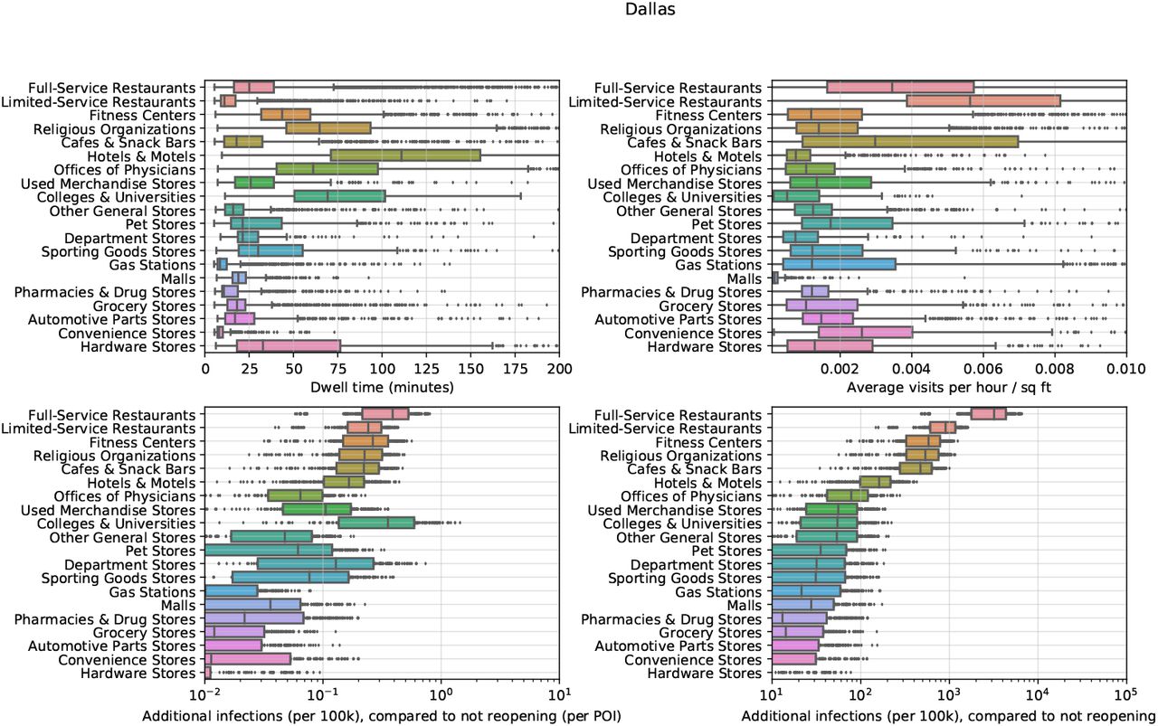
POI attributes in Dallas. See Figure S4 for details.

POI attributes in Houston. See Figure S4 for details.

POI attributes in Los Angeles. See Figure S4 for details.

POI attributes in Miami. See Figure S4 for details.

POI attributes in New York. See Figure S4 for details.

POI attributes in Philadelphia. See Figure S4 for details.

POI attributes in San Francisco. See Figure S4 for details.

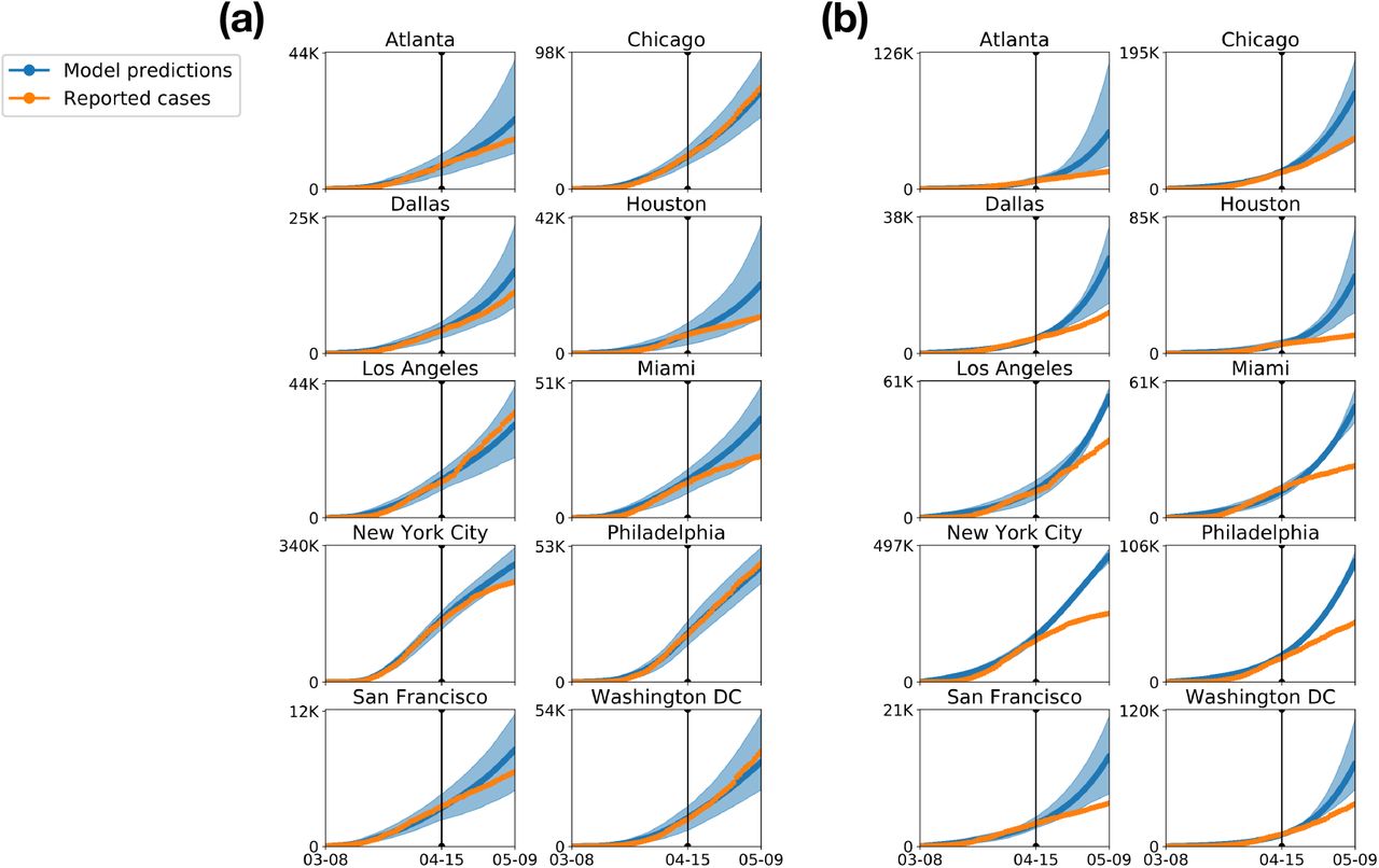
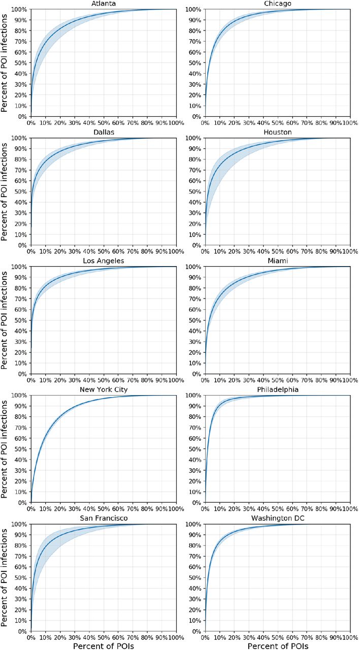
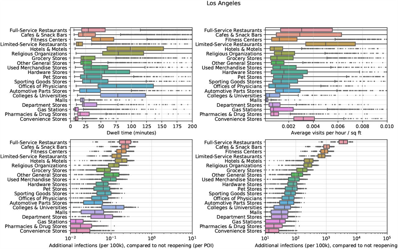
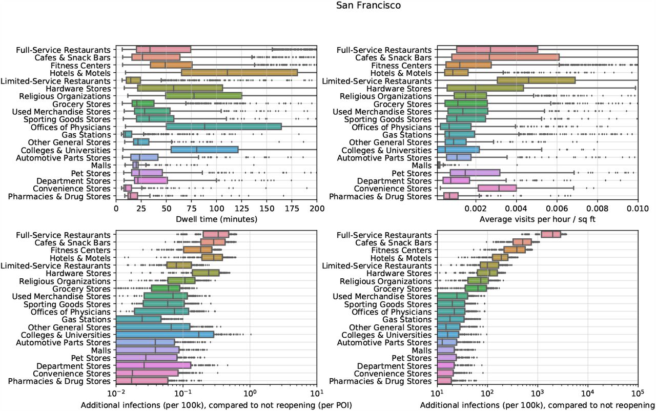
POI attributes in Washington DC. See Figure S4 for details.
Acknowledgements
The authors thank Yong-Yeol Ahn, Nic Fishman, Tatsunori Hashimoto, Roni Rosenfeld, Jacob Steinhardt, and Ryan Tibshirani for helpful comments. We also thank Nick Singh, Ryan Fox Squire, Jessica Williams-Holt, Jonathan Wolf, and others at SafeGraph for cell phone mobility data and helpful feedback. This research was supported by US National Science Foundation under OAC-1835598 (CINES), OAC-1934578 (HDR), CCF-1918940 (Expeditions), Chan Zuckerberg Biohub, Stanford Data Science Initiative, and the Stanford University Dean’s Research Fund. S.C. was supported by an NSF Fellowship. E.P. was supported by a Hertz Fellowship. P.W.K. was supported by the Facebook Fellowship Program. J.L. is a Chan Zuckerberg Biohub investigator.
References


