
Abstract
While the COVID-19 pandemic presents a global challenge, the U.S. response places substantial responsibility for both decision-making and communication on local health authorities. To better support counties and municipalities, we integrated baseline data on relevant community vulnerabilities with dynamic data on local infection rates and interventions into a Pandemic Vulnerability Index (PVI). The PVI presents a visual synthesis of county-level vulnerability indicators that can be compared in a regional, state, or nationwide context. We describe use of the PVI, supporting epidemiological modeling and machine-learning forecasts, and deployment of an interactive, web Dashboard. The Dashboard facilitates decision-making and communication among government officials, scientists, community leaders, and the public to enable more effective and coordinated action to combat the pandemic.
One Sentence Summary The COVID-19 Pandemic Vulnerability Index Dashboard monitors multiple data streams to communicate county-level trends and vulnerabilities and support local decision-making to combat the pandemic.
Defeating the COVID-19 pandemic requires well-informed, data-driven decisions at all levels of government, from federal and state agencies to county health departments. Numerous datasets are being collected in response to the pandemic, enabling the development of predictive models and interactive monitoring applications[1, 2]. However, this multitude of data streams—from disease incidence to personal mobility and comorbidities—is overwhelming to navigate, difficult to integrate, and challenging to communicate. Synthesizing these disparate data is crucial for decision-makers, particularly at the state and local levels, to prioritize resources efficiently, identify and address key vulnerabilities, and evaluate and implement effective interventions. To address this situation, we developed a COVID-19 Pandemic Vulnerability Index (PVI) Dashboard (https://covid19pvi.niehs.nih.gov/) for interactive monitoring that features a county-level Scorecard to visualize key vulnerability drivers, historical trend data, and quantitative predictions to support decision making at a local level (Figure 1).

The Dashboard allows U.S.-wide navigation to area(s) of interest. The filter is set to display the top 250-ranked (i.e., most vulnerable) PVI profiles for the selected date (displayed in the upper left panels for each data layer). The Scorecard displayed shows the contribution of each indicator (slice) for Clarendon, SC, which is in a cluster of high-PVI counties across the rural Southeast U.S. The scorecard summarizes the overall PVI score and rank compared to all 3,142 U.S. counties. In the graphical profile, longer slices indicate higher vulnerability driven by a particular indicator, with corresponding indicator-wise scores (0 =minimum; 1 = maximum) provided in the lower portion of the Scorecard. The scrollable score distributions at left compare the selected county PVI to the distributions of overall and slice-wise scores across the U.S. The panels below the map are populated with county-specific information on observed trends in cases and deaths, observed numbers for the selected date, historical timelines (for cumulative cases, cumulative deaths, PVI, and PVI rank), daily case and death counts for the most recent 14-day period, and a 7-day forecast of predicted cases and deaths. The information displayed for both observed COVID-19 data and PVI layers is scrollable back through March 2020. Documentation of additional features and usage, including advanced options (accessible via the collapsed menu at the upper left), is provided in a Quick Start Guide (linked at the upper right corner).
We assembled U.S. county- and state-level datasets into 12 key indicators across four major domains: current infection rates (infection prevalence, rate of increase), baseline population concentration (daytime density/traffic, residential density), current interventions (social distancing, testing rates), and health and environmental vulnerabilities (susceptible populations, air pollution, age distribution, comorbidities, health disparities, and hospital beds). These 12 indicators (some of which combine multiple datasets) are integrated at the county level into an overall PVI score, employing methods previously used for geospatial prioritization and profiling[3, 4]. The individual data streams comprising these indicators measure either well-established, general vulnerability factors for public health disasters or emerging factors relevant to the COVID-19 pandemic[5]. Details of PVI score formulation and rationale are described in the Supplement, along with links to all source data. The software used to generate PVI scores and profiles from these data is freely available at https://toxpi.org. To empower additional modeling efforts, the complete time series of all daily PVI scores and data are available at https://github.com/COVID19PVI/data.
In developing the PVI, we performed rigorous statistical modeling of the underlying data to augment confidence in responsive actions, enable quantitative analysis and monitoring, and provide short-term predictions of cases and deaths. Our modeling efforts directly address the discussion in [6], by contextualizing factors such as racial differences with corrections for socioeconomic factors, health resource allocation, and co-morbidities, plus highlighting place-based risks and resource deficits that might explain spatial distributions. Specifically, three types of modeling efforts were performed and are regularly updated. First, epidemiological modeling on cumulative case- and death-related outcomes provides insights into the epidemiology of the pandemic. Second, dynamic time-dependent modeling provides similar outcome estimates as national-level models, but with county-level resolution. Finally, a Bayesian machine learning approach provides data-driven, short-term forecasts. The results of these modeling efforts are summarized below, with detailed methods and full results included in the Supplement.
With respect to factors affecting COVID-19 related mortality, we find that the proportion of Black residents and the PM2.5 index of small-particulate air pollution are the most significant predictors among those included, reinforcing conclusions from previous reports[7]. An increase of one percentage point of Black residents is associated with a 3.3% increase in the COVID-19 death rate. The effect of a 1 g/m3 increase in PM2.5 is associated with an approximately 16% increase in the COVID-19 death rate, a value at the high end of a previously reported confidence interval from a report in late April 2020[7] when deaths had reached 38% of the current total.
We find that these effects persist even when including numerous additional predictors and correcting for factors such as socioeconomic status, housing density, and comorbidities. Moreover, the effects persist for a range of response values, including cumulative (i) cases, (ii) deaths, (iii) deaths as a proportion of the population, and (iv) deaths as a proportion of reported cases (Supplemental Tables 2-5). These results strongly suggest the important role of structural variation by location, which results in drastic health disparities.
A dynamic version of the generalized linear model was also built for cases and deaths as a proportion of the population to further investigate the effects of social distancing and other predictors changing daily. Final significance testing was based on bootstrapping to account for potential time-dependent correlation structures. The results (Supplemental Tables 6-7) continue to support the importance of social vulnerability indicators and quantify the impact of social distancing in the context of the model.
To accurately predict future cases and mortality, it is necessary to account for the fluid nature of the data. Accordingly, we developed a Bayesian spatiotemporal random-effects model that jointly describes the log-observed and log-death counts to build local forecasts. Log-observed cases for a given day are predicted using known covariates (e.g., population density, social distancing metrics), a spatiotemporal random-effect smoothing component, and the time-weighted average number of cases for these counts. This smoothed time-weighted average is related to a Euler approximation of a differential equation; it provides modeling flexibility while approximating potential mechanistic models of disease spread. The smoothed case estimates are used in a similar spatiotemporal model predicting future log-death counts based on a geometric mean estimate of the estimated number of observed cases for the previous seven days as well as the other data streams. The resulting county-level predictions and corresponding confidence intervals are shown (Fig. 1).
These modeling efforts support decision making in multiple ways. The epidemiological modeling will allow for testing the impact of changes in dynamic interventions, such as changes in social distancing. The forecasting efforts support short-term resource allocation decisions, such as hospital staffing or supply allocations. These forecasts also help communicate the trends that are part of the CDC’s reopening criteria[8], such as whether subtle data trends translate into flattened curves. The PVI score itself constitutes an integrated indicator of vulnerability that strongly associates with mortality outcomes in the near-to-medium term. Indeed, the significant rank-correlation between daily PVI and death-related outcomes improved along a 1-, 7-, 14-, 21-, or 28-day observation period (Supplemental Figure 1). The overall PVI score highlights highly-ranked counties that should consider taking local actions or receive targeted help to mitigate undesirable outcome trends.
The interactive visualization within the PVI Dashboard is intended to communicate factors underlying vulnerability and empower community action. Figure 2 illustrates PVI for two example counties. The visualization and quantification of county-level vulnerability indicators are displayed by a radar chart, where each of the 12 indicators comprises a “slice” of the overall PVI profile. On loading, the Dashboard displays the top 250 PVI profiles (by rank) for the current day. The data, PVI scores, and predictions are updated daily, and users can scroll through historical PVI and county outcome data. Individual profiles are an interactive map layer with numerous display options/filters that include sorting by overall score, filtering by combinations of slice scores, clustering by profile similarity (i.e. vulnerability “shape”), and searching for counties by name or state (Additional functionality is detailed in the Supplement). User selection of any county overlays the summary Scorecard and populates surrounding panels with county-specific information (Figure 1). The scrollable panels at left include plots of vulnerability drivers relative to the nation-wide distribution across all U.S. counties, with the location of the selected county delineated. The panels across the bottom of the Dashboard report cumulative county numbers of cases and deaths; timelines of cumulative cases, deaths, PVI score, and PVI rank; daily changes in cases and deaths for the most recent 14-day period (commonly used in reopening guidelines[6]; and predicted cases and deaths for a 7-day forecast horizon.
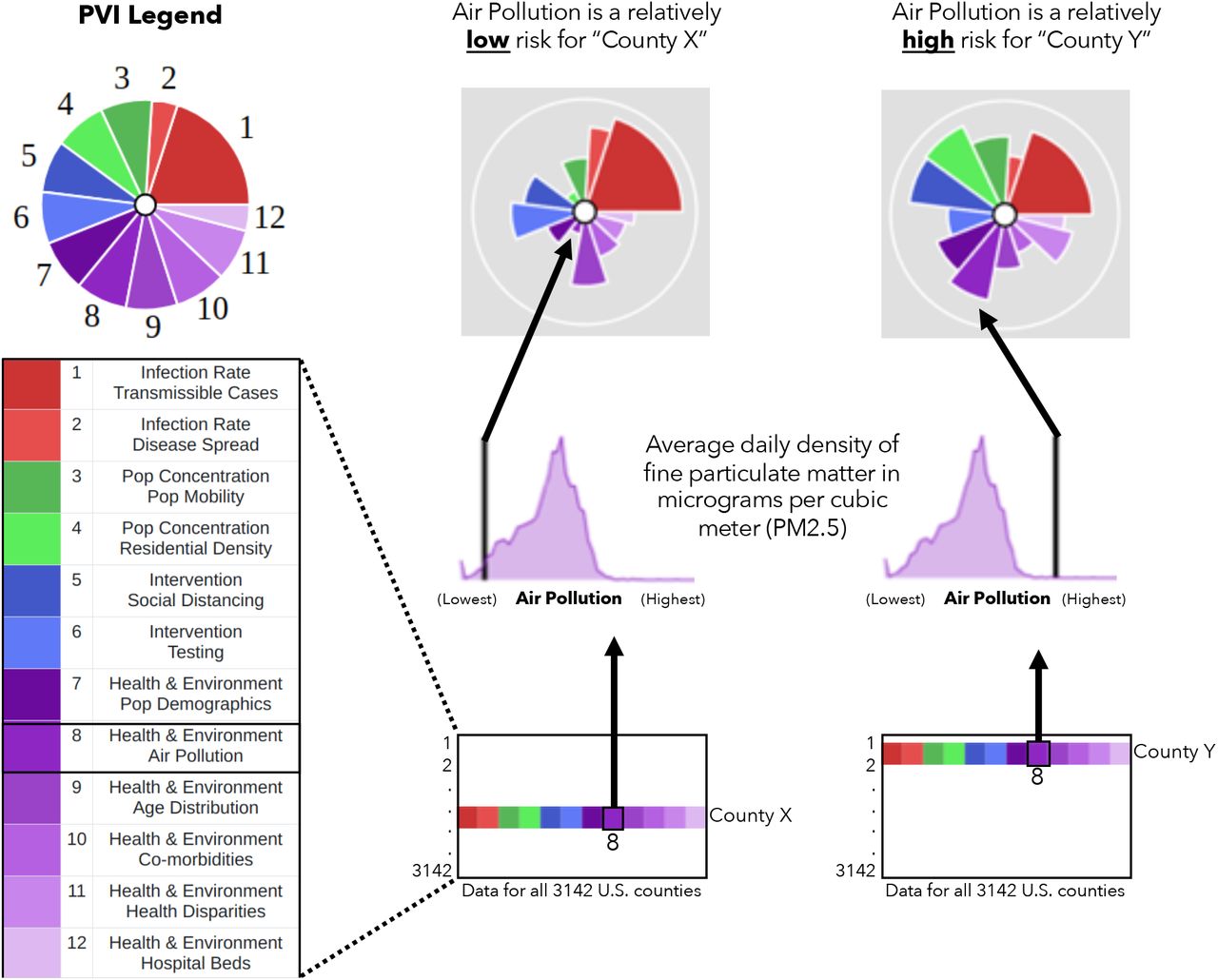
Information from all 3,142 U.S. counties is translated into PVI slices. The illustration shows how Air Pollution data (average density of PM2.5 per county) are compared for two example counties. The county (County Y) with the higher relative measurement has a longer Air Pollution slice than the county (County X) with a lower measurement. This procedure is repeated for all slices, resulting in an integrated, overall PVI profile.
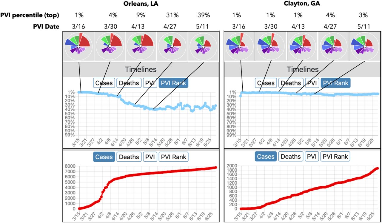
Taking all features together, the Dashboard supports the interactive evaluation and visualization of current data for localities while also providing context with respect to all U.S. counties. Full time-series of case, death, and PVI trends allow for the interrogation of the track records of counties of interest as well as the comparison of trajectories for peer counties based on differing intervention success. For example, using Orleans County (home to New Orleans, LA) as an exemplar, the multi-criteria filtering capabilities in the Dashboard were used to find a “peer county” for comparison. By bounding PVI to a similar range on vulnerability drivers (“slices”) for Pop Mobility, Residential Density, and Pop Demographics, a subset of candidate counties were identified. Clayton County, GA was chosen from this clustering to illustrate the effects of dramatic differences in public action/intervention. Figure 3 shows detailed results for the two counties, which have similar baseline vulnerabilities but took divergent intervention measures at the outset of the pandemic. Specifically, pronounced differences in intervention measures (Social Distancing and Testing) is clearly associated with differing dynamics in infection rates in these counties, as visualized through the considerable differences in magnitude of the blue intervention-related) and red (infection-related) slices over time (note that all data streams are scaled so that a larger slice indicates increased vulnerability, e.g. larger blue slices represent less adherence to social distancing and lower testing rates). As visualized in Figure 3, the PVI rank for Orleans County improves (i.e. follows a downward rank/percentile path), effectively blunting an accelerating cases curve through early intervention. There is no such positive change for Clayton County. Thus, the PVI Dashboard enables customized empirical comparisons and evaluations across peer or comparative counties.

The PVI profiles for an eight-week period (from March 15th, 2020) are shown above the timelines for each county. Comparing Orleans Parish (County) to Clayton County, they have similar ranks for Population Concentration (green slices) and Health and Environment (purple slices). For Intervention Practices (blue slices), differences can be seen; Orleans County’s adherence to social distancing measures and increased COVID-19 testing (reverse-scored and indicated by smaller blue slices) is visualized compared to Clayton. The changes in overall PVI rank across the timeline of the pandemic are shown. While the trajectory of new cases was blunted in Orleans County, it continued increasing in Clayton.
Numerous expert groups have coalesced around a general roadmap to address the current COVID-19 pandemic that comprises (i) reducing the spread through social distancing, (ii) gradually easing restrictions while monitoring for resurgence and healthcare overcapacity, and (iii) eventually moving to pharmaceutical interventions. However, the responsibility for navigating the COVID-19 response falls largely on state and local officials, who require data at the community level to make equitable decisions on allocating resources, caring for vulnerable sub-populations, and enhancing/relaxing social distancing measures. The goal of the COVID-19 PVI Dashboard is to empower informed actions to combat the pandemic from the local to the national level, at multiple time scales, and accomplishes this goal by combining underlying COVID-19-specific structural vulnerabilities with dynamic infection and intervention data at the county level.
Furthermore, interventions must be embraced by the general public to be effective, and interactive visualization is a proven approach to communication between diverse audiences. The PVI Dashboard provides interactive visual profiles of vulnerability atop an underlying statistical framework for comparing, clustering, and evaluating the PVI’s sensitivity to component data.
The county-level Scorecards illustrate both overall vulnerability and the components driving them. Finally, epidemiological and predictive modeling provides dynamic local case- and death-related forecasts. Overall, the COVID-19 PVI Dashboard can help facilitate decision-making and communication among government officials, scientists, community leaders, and the public to enable more effective and coordinated action to combat the pandemic.
Data Availability
All data is publicly available at https://github.com/COVID19PVI/data
Funding
This work was supported by P42 ES027704, P30 ES029067, and P30 ES025128 and by intramural funds from the National Institute of Environmental Health Sciences.
Author contributions
Concept and design: SM, FW, WC, IR, AMR, DR. Acquisition, analysis, or interpretation of data: All authors. Drafting of the manuscript: All authors. Critical revision of the manuscript for important intellectual content: All authors. Statistical analysis: JH, MW, KS, YZ, AMR, DR. Obtained funding: WC, IR, DR, AMR.
Competing interests
Authors declare no competing interests.
Data and materials availability
All data is available through links in the main text or the supplementary materials.
Supplementary Materials
Materials and Methods
Data Streams - Pandemic Vulnerability Index (PVI)
To the best of our knowledge, we have assembled the most extensive set of community-level data streams related to COVID-19 across four major domains: Infection Rate, Population Concentration, Intervention Measures, and Healthcare Vulnerability. The specific components (i.e., datasets) comprising the current Pandemic Vulnerability Index (PVI) model are provided in a dedicated Details page linked from the Dashboard. Table 1 describes each component, the rationale for its inclusion, and a link to the public data source. All source data are publicly available, and the daily assembled data are available at https://github.com/COVID19PVI/data, which is linked under Source Data in the main menu.
These data streams comprise both static and dynamic data, including static measures of population concentration and healthcare vulnerabilities. Many of the data streams are from the CDC’s Social Vulnerability Index (SVI), which was developed by the Agency for Toxic Substances and Disease Registry (ATSDR’s) Geospatial Research, Analysis and Services Program (GRASP). GRASP creates and maintains databases that help emergency response planners and public health officials identify and map the communities most likely to need support before, during, and after a disaster or hazard event such as the current pandemic. The SVI has been successfully used in a variety of emergency response scenarios, including mapping fire outbreaks, determining vulnerability metrics[1], and in hazard mitigation planning studies[2]. The CDC’s SVI uses U.S. Census data to rank each census tract’s social vulnerability based on 15 factors, including poverty, vehicle access, and housing crowding. Additional data streams from the 2020 County Health Rankings that summarize the prevalence of important co-morbidities and risk factors at the county level are also included[3]. Regarding interventions, it has been established that increased testing rates and the implementation of social distancing are effective interventions to slow the spread of COVID-19 and fatalities due to the disease[4]. Testing rates are from the COVID tracking project[5], and daily ordinal grades of social distancing adherence are calculated by Unacast[6] based on relative cell-phone mobility compared to the same period for the previous year. By anchoring movement to pre-COVID-19 activity, this measure is applicable in both rural and urban settings. Dynamic measures of disease spread and the number of transmissible cases are estimated from John Hopkins University data[7].
PVI Calculation
The PVI profiles translate numerical results into visual representations in the form of radar charts. For each county, a PVI, a dimensionless index score, is calculated as a weighted combination of all data sources and represents a formalized, rational integration of information from various domains. It is calculated using the Toxicological Prioritization Index (ToxPi) framework for data integration[8]. This integration framework has been proven to be effective for communicating risk prioritization and profiling information among scientists, regulators, stakeholders, and the general public and has been featured in publications by the U.S. National Academy of Sciences[9] and the World Health Organization’s International Agency for Research on Cancer[10]. The entire set of PVI calculations can be reproduced and analyzed outside of the Dashboard using the source data posted at https://github.com/COVID19PVI/data and in the free software application available at https://toxpi.org[11].
The PVI is visually represented as component slices of a radar chart, with each slice representing one piece (or related pieces) of information. For each profile, the radial length of a slice represents its rank relative to all other entities (i.e., counties), with a longer radius indicating higher concern or risk. The relative width (e.g., fraction of a full, 360° circle) of a slice indicates the contribution of that slice’s score to the overall model. Taken as a whole, these visual profiles provide a risk assessment of the strength, relative contribution, and robustness of the multiple data sources used in the model.
PVI Weighting and Overall Vulnerability
The summarization and communication goals of the PVI and the corresponding scorecards are human-centric and designed to convey and distill high-dimensional complex data. As such, a combination of quantitative modeling and prior knowledge on risk drivers were used to inform apportionment of data into slices.
In order to gauge the association of daily PVI versus observed death outcomes, we assessed the rank-correlation between overall PVI and the key vulnerability-related outcome metrics of Cumulative Deaths (Figure 1A), Population Adjusted Cumulative Deaths (Figure 1B), and the Deaths from Cases Percentage (Figure 1C). The Spearman Rho values for PVI (from March 15 through the June 28) versus outcomes 1, 7, 14, 21, and 28 days ahead of a given day are displayed. All daily rank-correlation estimates were highly significant (all p-values < 5.1E-14). The mean Rho values typically increase with a longer time horizon (blue text on Supplementary Figures 1A,1B,1C).
Dashboard Technical Details
The Dashboard map was built using the ArcGIS JavaScript API (v4.13) and custom PHP and JavaScript files[12]. The API is used to overlay county borders, COVID-19 count data, and PVI model images on a Basemap or custom WebMap. County boundary data is obtained from a feature service while all other data is stored in an SQL database. PVI model images are base64-encoded scalable vector graphics (SVGs) rendered as inline images. The custom scripts controlling the Dashboard’s functionality optimize the efficiency of HTTP requests and other computational overhead to promote real-time interactivity. The Dashboard is hosted by the National Institute of Environmental Health (NIEHS) Office of Scientific Computing, which provides high-availability HTTPS load balanced with NGINX and a secure environment for web applications. Automated data updates are pushed to the public servers daily, and the daily update process is paralleled on a private server to permit independent data integrity assessment.
Dashboard Features
Complete, continually-updated documentation is available from Dashboard links to Quick Start Guide that describes the PVI and the Dashboard tools at an introductory level (https://www.niehs.nih.gov/research/programs/coronavirus/covid19pvi/index.cfm) and a separate Details page for more in-depth information (https://www.niehs.nih.gov/research/programs/coronavirus/covid19pvi/details/). An overview of features is provided here, referring to a screenshot of the Dashboard and the expanded menu (Supplemental Figure 2).
The Dashboard displays a map of the continental U.S. by default. Users can navigate the map by dragging and dropping and by zooming in and out with the PLUS/MINUS icons or keyboard shortcuts. Clicking on a county brings up the contemporary daily scorecard along with other details. The scorecard shows the PVI graphic, the overall score, and the rank and scores for each data stream. The PVIs for the top-250 ranked counties are shown by default, and this can be changed within the quick filter panel (Panel C). Supplemental Figure 2 shows all PVI profiles for counties in the state of Alabama.
The main menu bar provides numerous options for visualizing the map. The base map can be changed from the default gray to options that include satellite imagery and topology (Change Map menu option). Additionally, users can choose a WebMap by inserting a WebMap Portal Item ID[12]. Details of the WebMap Extent options can be found through ESRI[12].
Additionally, cumulative case and death counts are plotted as a map layer default. This display option can be removed or changed through the COVID-19 Legend menu option. The size and opacity of the PVIs displayed on the map can be changed through the PVI Model Legend options. By default, the Dashboard displays the case and death counts from the Johns Hopkins Dashboard and the PVI model from the current day, and there are interactive options to display different days. Panel A (labeled in Supplemental Figure 2) allows a user to change the date for the cumulative case and death data with a scroll menu. Panel B provides similar options for the historical PVI.
Panels on the left-side and bottom of the Dashboard provide additional display options and county-level details. Panel C has several functions, all of which are accessible by scrolling down within the panel. Scrolling down the Legend panel displays the PVI Legend and the overall distribution in the form of a histogram of the overall PVI and each of the slice components across all U.S. counties. A black line indicates the location of a selected county in this distribution. For all distributions, lower values (to the left) indicate lower relative vulnerability whereas higher values (to the right) reflect higher vulnerability. Additional local information, including the county name and several metrics related to the CDC’s reopening guidance, is displayed at the bottom of the Dashboard (Panel D). In addition, the number of new cases and deaths for the previous three days, as well the number of days over the last 14 days during which these numbers declined, are displayed. Both are crucial criteria in the CDC’s reopening guidance[13].
Panel E displays an overall cumulative summary of the total cases, deaths, deaths/case (case fatalities), population, and per capita case and death summaries. Panel F displays the historical timeline of case counts, death counts, the PVI score, and the PVI rank. Panel G shows the daily changes in case and death counts for the previous 14 days. Panel H forecasts and confidence intervals for both cases and deaths for the following week are displayed in the bottom-right panel. Details of the predictive modeling are described below.
As shown in Supplemental Figure 2, there are several additional display options available through the main drop-down menu. In addition to the already discussed Change Map and Covid-19 Legend options, the PVI Model Filter option allows for interactive filtering for display options. With this option, the user can change the number of PVIs displayed. By default, the top-ranked counties are displayed (those with the highest vulnerability according to the overall PVI). Users can change this filtering to display the most vulnerable counties based on individual data streams, with options for multi-level filters. Additionally, options for restricting the ranges of one or more slices allow counties with similar profiles to be identified.
The PVI Model Clusters option provides additional opportunities for data-driven contextualization. Two options for clustering PVI profiles are labeled KMeans (agglomerative with k=10) and HClust (divisive, displaying the top-10 splits) after the algorithm used[14]. Both options identify counties with a similar PVI profile “shape”. The distance matrix is calculated from the integrated profile that considers all slice scores and weights. For KMeans, the clustering is implemented as a Java port of the kmeans R function using the Hartigan-Wong algorithm[14]. For HClust, the clustering is implemented as a Java port of the hclust R function using the “complete” method[14]. By filtering the Dashboard to display only specific clusters, users can identify clusters with multivariate profile similarity. This can detect clusters that are geographically adjacent as well as geographically distinct to reflect the diversity of risk profiles on a national scale. Geographically disparate areas with similar drivers of concern highlight the need for integrated profiles to encourage the creation of effective targeted community policies.
Filtering and clustering options can be used iteratively to compare the histories and trajectories of similar counties, as demonstrated in the exemplar in the Report (Figure 3). These clustering and filtering tools can be used to explore the empirical, historical consequences of interventions for localities with similar baseline vulnerabilities.
The Toggle Filter Info, Toggle Dashboard, and Toggle NavBar (Navigation Bar) options allow users to customize the visualization by turning on and off the respective components on the Dashboard.
Epidemiological Modeling
While there is an ever-increasing number of models related to COVID-19, the vast array of data assembled here enables further modeling efforts. To provide context and ensure that the data streams provide conclusions and priority rankings broadly consistent with those of other groups providing epidemiological modeling, we performed cross-sectional analysis of cumulative (i) cases, (ii) deaths, (iii) deaths as a proportion of population, and (iv) deaths as a proportion of reported cases, using data current as of 6/18/2020. We emphasize that the PVI is not intended as an epidemiological modeling tool per se, e.g., it does not explicitly distinguish between aspects of vulnerability for cases vs. deaths. Our modeling here was intended to anchor the components of the PVI and to provide important context. Additionally, this modeling was not intended to provide forecasts, which are the primary focus of projection models, as discussed in the subsequent section (Functional Power Adjusted Relative Rate Modeling).
As initial analyses displayed evidence of count overdispersion, generalized linear modeling was performed using a negative binomial model with observed cumulative counts as the response, performed in R version 3.5 and the gam() procedure[14]. For analyses (i), (ii), and (iv) log(population size) values were used as predictors with estimated coefficients, and for (iii) using the ‘offset’ command to model deaths as a rate. Similarly, (iv) used log(cumulative cases) as an offset to model death rate among cases, an analysis which may produce biased results due to varying reporting rates by region. We note that a constant underreporting bias across counties would be absorbed into the intercept and otherwise produce valid coefficient estimates for the predictors, and this analysis may provide important clues to death risk, as by using cases in the denominator it removes a large portion of stochastic variation. Moreover, for all analyses we used the proportion tested in the state as a predictor to account for additional sources of bias.
To anchor our efforts to previous work, we included as additional fixed predictors those included in[15], which had focused primarily on the effects of a PM2.5 air pollution index, using an analysis analogous to our model (iii). Prior to analysis, we removed predictors with pairwise correlation greater than 0.85 with any other predictor, or where a predictor would be collinear with a series of predictors, such as overall minority proportion when individual minority groups were included. For pairs exceeding the correlation threshold, we favored the predictor with lower missingness rate (if any) or having been reported by other researchers. Dynamic predictors (i.e., those that changed substantially over the modeled period) were incorporated by using simple county averages over the March-June period covered by the PVI. With over 3100 counties (FIPS) available, most with >0 cases and deaths, the analysis could easily support the 27-28 final predictors used. To facilitate comparison with previous sources, we used predictors as given in original sources, in some instances, predictors are represented as proportions, and in other instances as percentages.
Supplementary Tables 2-7 display the regression coefficients produced with the generalized linear modeling. For cases, the most significant predictor was population size (p=3.5E-181), which might be expected. The next most significant predictors were proportion of black residents (p=2.3E-43) and mean PM2.5 (p=2.75E-20), both associated with case counts (Supplementary Table 2). The SVI Housing measure (p=2.71E-14) and percent Hispanic (p=5.61E-11) were also associated. The proportion of population tested for SARS-Cov-2 infection was also associated (p=1.09E-10), which we attribute to statewide responses to emerging infected clusters. In this cumulative analysis, social distancing and travel-related predictors were not significant, although by mid-June 2020, many of these indexes had become more uniform than in the early days of the pandemic. For deaths as a proportion of population (Supplementary Table 4), these same predictors were highly significant, except for percent Hispanic. We note that cases and deaths per unit population represent an ultimate societal risk for which vulnerability measures are relevant, and the rank correlation coefficients for the PVI vs the fitted values for cases and death rates are 0.57 and 0.49, respectively (p<10-16 for both).
Our analysis of deaths per cases was instructive, despite the caveats we’ve described in interpretation, due to potential bias due to testing variation. We note that a true case fatality rate potentially involves very different predictors than a case rate model, and deaths per unit population are also closely tied to case rates. Our modeling (Supplementary Table 5) shows that, after multiple test correction, state testing rates are no longer significant (p=0.37), which is consistent with the hypothesis that testing mainly uncovers cases, but does not predict case fatality. Proportion black residents (p=3.14E-05) and PM2.5 (p=0.00086) remained significant, but less so than for the deaths/population model. Deaths/(reported cases) was associated with proportion of owner-occupied residences (p=9.31E-07), and inversely associated with median house value (p=0.000863). Both of these measures tend to be associated with wealth, but the relationship is complicated by the fact that higher housing prices are an impediment to home ownership.
To provide additional context, we also performed negative binomial modeling (R version 3.5 bam() with “REML” fitting)[14] of the daily cases up to 6/11/2020 (Supplementary Table 6), using the fixed county predictors as well as the dynamic predictors (not averaged). Due to the nature of the model, here we included a two-week lag cumulative number of cases as an additional predictor, as well as a smoothing spline time-dependent term to reflect a nationwide component of risk. We refer to this model as “dynamic,” although it is formally a fixed effects model, treating each day outcome as an independent realization with rate determined by the predictors. To account for potential time-dependent latent correlation structures, standard errors for the coefficients were determined by bootstrapping, treating each county across all dates as an observational unit for bootstrap resampling. Bootstrapped p-values were much more strongly significant than for the cumulative case model, which we attribute to the model’s ability to account for additional sources of variation due to the use of lagged case count, the smooth time-dependent term, and the inclusion of daily dynamic predictors. Here again the most significant predictors were proportion black (p<1E-300), the two-week lag predictor (p<1E-300), statewide percent tested (p=3.28E-291), and PM2.5 (p=9.20E-233). The analogous model was also run for deaths/(population size) (Supplementary Table 7), again with all these predictors highly significant.
In summary, the dynamic versions of the generalized linear model reinforce and amplify the conclusions from the previous cumulative models. However, the models are not designed to perform forecasting, which can be viewed as essentially a machine learning exercise, and for which careful cross-validation approaches may be used to assess accuracy.
Functional Power Adjusted Relative Rate Modeling
To predict COVID-19 case and death counts, we model the observed log-counts for new cases and deaths in each U.S. county using a Bayesian functional model. We assume deaths are a proportion of active COVID cases, and we jointly model both cases and deaths so information is shared between these observations. In this model, the expected case count is the rate offset by the observed number of deaths and is spatially modeled across the United States. Currently, the model assumes a normal distribution on the logs of the observed counts.
Let Ctj and Dtj be the observed case and death count for day t, 1 ≤ t ≤T, and county j,1 ≤ j ≤ J. For county j, we also observe a vector xj = (1, x1j,…, xmj)′ of m explanatory variables that are static over time (e.g., population density) and a vector ztj = (z1tj,…, zktj)′ of k explanatory variables that are observed each day (e.g., social distancing metrics). Let Xj be the matrix of observed explanatory variables, both static and dynamic, for the T time points in county j. Conditional on knowledge of the rate λCij and λDij, we assume that Cij and Dij are Poisson variates where
 and
and

To define these rates, log  is the log geometric-mean of the previously observed count, log
  is the log of the new case rate for the last m days (i.e.,
 , μc(sj, t) and μD(sj, t) are spatial process accounting for unobserved heterogeneity in the response at time t and county location sj, and
  and
and 
 . This defines a Poisson-lognormal model over Cij and Dij, which is an over-dispersed count model that allows for efficient sampling Bayesian computation through conditionally Gibbs updates.
The random fields borrow information from nearby counties under the assumption that geographically proximate counties have public health departments with similar testing strategies and testing resources and may be more similar in response, which will account for heterogeneity not captured by the covariates. Time is included as testing strategies and testing resources are expected to change over time as well as by region.
Modeling the Spatial-Temporal Power Term
Let  and
and  , where fC ~ GP(0, σC[.,.]) and fD ~ GP(0, σD[.,.]), which are Gaussian processes (GPs) [16]with a 0 mean and squared exponential covariance kernel functions σC[s, s′] = exp [−tc(s − s′)2] and σC[s, s′] = exp [−τD(s − s′)2], where τC and τD are length-scale parameters controlling the amount of correlation between spatial locations s and s′. For fC and fD, it is standard to assume the covariance kernel has an unknown variance component. In our case, we fix this parameter to 1, because it is not identifiable given gC and gD.
For gc and gD, we use first-order B-splines [17], which are local linear piecewise splines. That is,
 and
and
 where bck(t) and bDk(t) are defined on Kc and KD evenly spaced knots, respectively. Linear splines were chosen to minimize end-knot variability. This formulation is a tensor product formulation[17,18], which allows modeling the three-dimensional surface as the product of a two-dimensional surface and a one-dimensional surface.
Bayesian Specification and Computation
Inference and prediction were conducted using Bayes’ rule. As such, all parameters in the models given in Equations (1) and (2) are given proper priors, and inference is completed using Markov Chain Monte Carlo (MCMC) methods. All coefficients on the explanatory covariates are given Normal(0,10) priors. The precision terms, that is  and
and  , are given Gamma(10,1) priors. For the GPs, the length-scale terms τc and τD are given discrete uniform priors over a range of equally spaced values that cover a variety of covariance functions. Finally, the ζck and ζDk terms, which specify the spline coefficients over the time component in the tensor product, are given Bayesian P-spline priors[19]. This allows flexible smooth modeling of the time component and defines the variance of the tensor product GP, conditional on the time component.
All priors are conditionally conjugate, and inference is conducted using Gibbs sampling. In total, 11,000 MCMC samples are taken, with the first 1,000 disregarded as burn-in. Trace plots were examined for convergence and mixing from separate chains. These indicated convergence in the chain, typically within 100 iterations, and reasonable mixing. Posterior predictive observations (i.e., future cases and deaths) are taken every 20th sample, for a total of 500 posterior predictive observations. For the Dashboard, predictions are made by taking the mean and standard deviation of these observations. Because 1 is added to the original count, 1 is subtracted from the estimate. In the rare case that the estimated data point is negative, a 0 average case count or death count is recorded. Otherwise, non-integer values are used for the forecast.
A major issue of this construction is that the computational time of the GPs dramatically increases with more observations (i.e., algorithms on covariance matrices are intrinsically 0(n3)). Bayesian computation using the exact GP is not feasible for 3,142 distinct geographical locations. As an alternative, we use the method developed by Moran and Wheeler[20], which uses compressed covariance matrices that are nearly exact to the original covariance matrix (i.e., constructed such that the max norm of the two matrices is approximately 1e-14), but has the added benefit of computational complexity of 0(nlog2n). Utilizing these algorithms, computation time is decreased by a factor of 40, from two weeks to 6 to 8 hours. Unlike Moran and Wheeler, we do not use Ambikasaran and Darve’s[21] HODLR compression technique due to its inability to scale to more than one dimension. Instead, we utilize Börm’s[22] H2 matrix compression method that utilizes the H2lib matrix library.
Discussion
Our PVI model communicates an integrated concept of vulnerability that accounts for both dynamic (Infection Rate and Interventions domains) and static (community population and healthcare characteristics) drivers. In Supplemental Figure 1, the PVI is strongly associated with observed cases and deaths for a mid-term (up to one month) horizon. Thus, a highly-ranked PVI may indicate that local actions should be taken to mitigate undesirable outcomes in the future. Moreover, the data streams themselves can be used to build predictions such as ours described below. PVI visualization is a human-centric optimization that communicates how particular communities’ drivers (i.e., slices) differ in terms of overall vulnerability. Presenting information in a relative sense enables the fair comparison of communities of different sizes to support prioritization decisions. Visualization promotes transparency by clarifying the judgments and trade-offs entering into an assessment while maintaining a direct link to the underlying quantitative data.
By integrating vulnerability information (both historical and forward-looking), the Dashboard supports several kinds of key decision-making for managing the ongoing pandemic. Example use cases include the priority distribution of medical resources such as hospital beds, targeted community outreach activities, and the establishment of contact-tracing mechanisms. Eventually, the PVI could be used to support the priority distribution of vaccines to highly vulnerable communities. A key utility of a public-facing, interactive dashboard is that decision-makers can point to it for support, thus promoting transparency and public buy-in for actions taken in the interest of public health. The Timelines panel of the Dashboard illustrates observed county-level changes over time to answer questions such as “Have we flattened the curve?” while the Predictions panel presents statistically robust forecasts that consider all of the data to answer the question, “What’s next?”.
It is clear that pandemic vulnerability and response are dynamic and differ across communities[23]. The overall goal of the COVID-19 PVI Dashboard is to provide contextualized local summaries of differential vulnerability. A growing number of individual risk factors have been highlighted in the rapidly expanding scientific studies on COVID-19.
From the early identification of older individuals’ vulnerability[24] to the dramatic racial disparities that have been more recently highlighted[25], there is mounting evidence that socially marginalized populations are suffering disproportionally. Unfortunately, this is not unique to the ongoing pandemic.
As recently reviewed in the New England Journal of Medicine[26] it is crucial that more data are collected and properly contextualized and analyzed to gain a comprehensive understanding of the distribution of vulnerabilities. Without sufficient explanatory context, figures on disparity can easily perpetuate harmful myths that directly undermine the goal of eliminating health disparities. For instance, myths related to biological explanations for racial health disparities, racist stereotypes about behavioral patterns, and place-based stigma can exacerbate disparities. Chowkwanyun and Reed [26] offered clear directives to help address these concerns. First, the authors called for modeling of racial differences, correcting for socioeconomic factors, health resource allocation, and co-morbidities. Second, they called for modeling that highlights place-based risks and resource deficits that may explain spatial distributions of disparities along racial lines. We directly answer these calls in our modeling efforts and demonstrate that racial disparities due to the weathering effect of systemic inequities are the largest epidemiological factor in COVID-19 vulnerability.
Unfortunately, it is clear from the resurgence of cases occurring as states reopen that containing the COVID-19 pandemic will be an ongoing battle. Monitoring will be needed for the foreseeable future, and it is generally agreed that, due to the size and diversity of the United States, reopening and closing decisions will increasingly need to be made at the local level[27]. The PVI Dashboard can be used by policymakers and decision-makers to support the inevitable prioritization of medical resources and to communicate the reasons for such decisions. While most emerging COVID-19 dashboards provide cumulative reporting measures, our Dashboard also uniquely provides several additional functions. Historic data reporting is supported, and complete timeline data is available at the county level. The PVI visualization and rank-based quantification enumerate and summarize the numerous data streams assembled. Further, the Dashboard provides links to the data assemblage to enable further research as well as data summaries related to the CDC’s reopening guidance. Finally, it delivers forecasting results for short-term resource planning.
As additional data streams become available, there will be ongoing efforts to evaluate how these data should be weighted and incorporated. For example, emergent symptom tracking data could inform estimates of disease spread and unreported cases. Additionally, software development efforts are ongoing to enable the development of PVI models with other data streams, including by government agencies that have access to data that is not publicly available.

Spearman correlation (Rho) estimates of daily PVI (by county) vs. Cumulative Deaths (A), Population Adjusted Cumulative Deaths (B), and the Case Fatality Rate (C) for 1, 7, 14, 21, or 28 days into the future. Mean Rho values for each time horizon are displayed in blue.

A screenshot of the Dashboard, and Menu options. Detailed descriptions of the panels and menu options are discussed in the text and available in the Quick Start Guide at https://www.niehs.nih.gov/research/programs/coronavirus/covid19pvi/index.cfm
Datasets comprising the current PVI model. Note that this table is available with live links on the ‘Details’ page at: https://www.niehs.nih.gov/research/programs/coronavirus/covid19pvi/details/
Coefficient table for negative binomial model with cumulative cases as response. *P<0.05 after Bonferroni correction.
Coefficient table for negative binomial model with cumulative deaths as response. *P<0.05 after Bonferroni correction.
Coefficient table for negative binomial model with cumulative death rate (proportion per unit population) as response, and thus population is not included as a predictor. *P<0.05 after Bonferroni correction.
Coefficient table for negative binomial model with cumulative death rate (proportion among cases) as response. *P<0.05 after Bonferroni correction.
Coefficient table for negative binomial model with daily cases as response, up to 6/11/2020, using both fixed and dynamic predictors, and standard errors evaluated by bootstrapping. *P<0.05 after Bonferroni correction.
Coefficient table for negative binomial model with daily deaths/(population size) as response, up to 6/11/2020, using both fixed and dynamic predictors, and standard errors evaluated by bootstrapping. *P<0.05 after Bonferroni correction.
Acknowledgments
We would like to thank the IT and web services staff at NIEHS for their help and support, as well as JK Cetina and DJ Reif for useful input and advice.


