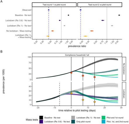
Top panel: the change in prevalence of infectious non-quarantining individuals between 10 and 65 years of age as predicted by the microsimulation model. For comparison the observed test-positivity rate is shown in blue. The facets show changes from the pilot to the first round of mass testing (left) and from the pilot to the second round of mass testing (right). Shown scenarios compare the effect of (top to bottom) no additional interventions that limit the growth rate of Re=1.4, the national lockdown drastically reducing the growth rate to Re=0.6 and no mass testing being conducted, the national lockdown reducing the growth rate to Re=1.0 and no mass testing being conducted, no change in growth rate but mass testing, and the national lockdown reducing the growth rate to Re=1 and mass testing. Bottom panel: Simulated infection incidence of alternative intervention strategies. Simulations are aligned by the date of the first mass test (t=0). The dashed line indicates the timing of the lockdown and the solid lines the timing of the mass testing campaigns. Colors indicate the simulations stratified into whether no mass testing or 1, 2 or 3 testing rounds were performed and the effectiveness of the lockdown measures. Red and yellow dots indicate the prevalence of infectiousness observed among the non-quarantining age-eligible population, corresponding to the scenarios in the top panel.
