
ABSTRACT
During the COVID-19 pandemic authorities have been striving to obtain reliable predictions for the spreading dynamics of disease. We recently developed an in-homogeneous multi-”sub-populations” (multi-compartments: susceptible, exposed, pre-symptomatic, infectious, recovered) model, that accounts for the spatial in-homogeneous spreading of the infection and shown, for a variety of examples, how the epidemic curves are highly sensitive to location of epicenters, non-uniform population density, and local restrictions. In the present work we tested our model against real-life data from South Carolina during the period May 22 to July 22 (2020), that was available in the form of infection heat-maps and conventional epidemic curves. During this period, minimal restrictions have been employed, which allowed us to assume that the local reproduction number is constant in time. We accounted for the non-uniform population density in South Carolina using data from NASA, and predicted the evolution of infection heat-maps during the studied period. Comparing the predicted heat-maps with those observed, we find high qualitative resemblance. Moreover, the Pearson’s correlation coefficient is relatively high and does not get lower than 0.8, thus validating our model against real-world data. We conclude that our model accounts for the major effects controlling spatial in-homogeneous spreading of the disease. Inclusion of additional sub-populations (compartments), in the spirit of several recently developed models for COVID-19, can be easily performed within our mathematical framework.
I. INTRODUCTION
Infectious disease spreading models are largely based on the assumption of perfect and continuous “mixing”, similar to the one used to describe the kinetics of spatially-uniform chemical reactions. In particular, the well-known susceptible-exposed-infectious-recovered (SEIR) model, builds on this homogeneous-mixing assumption. Some extensions of SEIR-like [1–5] and other models [6–14] that account for spatial variability employed mainly diffusion processes for the different sub-populations (where the term “sub-population” refers to people under a certain stage of the disease, otherwise termed “compartment”). Yet, clearly, while such processes can effectively describe wildlife motion in some systems, they fail to describe the (non-random) human behavior [15]. To mimic the heterogeneity of human behavior more realistically [16], recent extensions employed diffusion processes of the sub-populations that are limited to contact networks [17]. However, one of the most important artifacts for the application of diffusion process for human population is its unrealistic tendency to spread all populations to uniformity (be it in real space or on contact networks). Moreover, these models do not involve naturally a spatial dependence of the population density – which could influence the spread – nor a spatial dependence of infection spreading parameters, which are required to model geographically local quarantine. Thus, implementation of such dependence using homogeneous models requires a division of the geographic region into multiple number of patches [17].
We have recently advanced a general mathematical framework for epidemiological models that can treat the spatial spreading of an epidemic [18]. The framework accounts for possible spatial in-homogeneity of all associated “compartments”, which we termed “sub-populations”, such as the infectious and the susceptible sub-populations. To describe the spatial spreading of COVID-19, we have used the general framework in a 5-compartment model: susceptible, exposed, pre-symptomatic, infectious, and recovered (SEPIR). We used the SEPIR model, with parameters typical for COVID-19, to examine several scenarios of COVID-19 spreading, including the effect of localized lockdowns. However, the validation of our model against the COVID-19 spatial spreading in a specific country is still missing.
Vaccination against COVID-19 is now ongoing in many countries, despite complications associated with shortage of supply, anti-vaccination movements, and vaccination program during a strongly bursting epidemics. Most strategies use age group and risk factor prioritization, ignoring the density variation of susceptible vs. recovered (hence naturally immune) sub-populations. However, under an outbreak it does make send to vaccinate first in regions where the outbreak is expected to be stronger, thereby avoiding a catastrophe. Our in-homogeneous SEPIR model can easily be generalized to predict the outcome of vaccination strategies that involve such variation.
In this publication we wish to validate our in-homogeneous SEPIR model against real world data. For this purpose we have chosen the state of South Carolina, which made COVID-19 infection heat-maps publicly available. Information for the density variation across the country is also readily obtained from NASA public resources. As we have shown [18], these data are critical for the prediction of realistic infection heat-maps (based on an initial heat-map) and for testing them against those obtained in real-life situations. The validation of our model will allow to generalize – to the in-homogeneous regime – various advanced multi-compartment homogeneous models, that have been proposed in the past year to treat COVID-19.
II. INHOMOGENEOUS SEPIR MODEL
We briefly review the key features of our in-homogeneous SEPIR model, described in detail in Ref. [18]. To model the spread of COVID-19 and other epidemics, the population is divided into five compartments, termed as “sub-populations”: susceptible, exposed, pre-symptomatic (that are infectious), infectious (that are symptomatic), and recovered. This choice, and similar approaches, have proven as effective generalizations of the classical SEIR models. The basic chain of infection dynamics is as follows. Healthy individuals, and those that are not immune, are initially susceptible. They can become exposed when in contact with pre-symptomatic (that are also infectious) or infectious-symptomatic people. These individuals stay in the exposed stage for a certain period of time  during which they are not infectious to others. After this initial incubation period they become pre-symptomatic and also infectious to healthy people. They stay as pre-symptomatic for another period of time, denoted by
  , after which they become symptomatic, remaining infectious. This sickness stage lasts for a period of
  time. At the end of this period, these individuals become recovered and also immune. According to the literature (concerning here only with the parent, wild-type, SARS-COV-2 virus), the mean time for the appearance of symptoms is 5 days, setting
 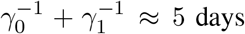 . It is accepted that people become infectious about 3 days before appearance of symptoms, that is,
 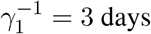 , and hence
 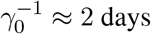 [19]. The time constants
  and
and  , describing the transitions from pre-symptomatic (infectious) to symptomatic (infectious), and from symptomatic-infectious to recovered, respectively, must obey
 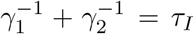 where τI ≈ 16.6 is the average infectious period. It follows that
  .
.
The most unique feature of our model, that is absent in most epidemiological models, is its ability to account naturally for spatial in-homogeneity. The geographical area under consideration is divided into a lattice that can be square or hexagonal, with inter-node spacing δ. At each node the sum of the five sub-populations equals to the nodal population number (varying from node to node), i.e. the total number of people living in the area corresponding to that node. The spatial dependence of the number of people in each sub-population is accounted for by inclusion of infection kinetics between neighboring nodes (“interactions”). On a scale much longer than the inter-node spacing, all densities become continuous. In this limit, inter-nodal interactions give rise to diffusion-like infection terms in the rate equations. After proper rescaling, the model equations can be written as [18]
 The variables h, b, w, f, and r denote the number area density of susceptible (healthy), exposed, presymptomatic, symptomatic, and recovered sub-populations, respectively. They are dimensionless due to scaling by the average population density in the region under study. These variables depend on the spatial location x (scaled by δ). Their sum obeys
 where n(x) is the total (fixed) population density at location x. We emphasize that the above rate equations describe diffusion of the epidemic and not of people; at any point x the sum h(x)+b(x)+w(x)+f (x)+r(x) remains constant in time.
The spatially-dependent parameters k(x) and Dk(x) originate both from infections within each node (influencing k alone), and from infections between neighboring nodes (influencing both k and Dk) [18, 20]. k describes the rate at which susceptible people (h) become exposed (b) when they meet asymptomatic (w) or symptomatic (f) people. It is given by k = R0/τI, where R0 is the well known basic reproductive number. The epidemic diffusion coefficient is estimated to be Dk ≈ k/5 for a square lattice. Our model thus consists of five nonlinear partial differential equations in two spatial dimensions. They can be solved numerically with given initial conditions and a given total population density n(x), as we present next using real-world data from South Carolina.
III. METHODS
In the year 2020 the COVID-19 epidemic has spread in many places around the world [21]. Here we focus on South Carolina, which has been hit hard by the virus and has good quality data available in the public domain. Specifically, the South Carolina Department of Health and Environmental Control (DHEC) provides areal maps of infected people density with daily resolution [22]. The “movie clips” appear in the DHEC website and on youtube and are a source of data. These movie clips were used to extract the density of infected people as a function time. The second source of data is the “Worldometer” website [23], including various total (integrated) numbers, such as the number of active cases, daily new cases, and accumulated cases. The third data source we used is NASA’s Socioeconomic Data and Applications Center (SEDAC) [24], from which we obtained the South Carolina population density n(x).
We restrict ourselves to the time window between May 22, 2020 (initial time t = 0) and July 22, 2020; see Fig. 1 for the observed initial (May 22, 2020) and final (July 21, 2020) COVID-19 infection heat-maps. During this period no major South Carolina government orders were issued [25]. After a long period of restrictions, a series of “opening” executive orders commenced on April 21 and ended with the following four relevant opening orders: (i) on May 8, (ii) on May 11, (iii) on May 22 [26], and (iv) on June 12 [27]. Whereas the orders on May 22 and June 12 can possibly have some influence on the transmission of COVID-19 during the period of study May 22–July 22 (noting that infection data may lag the actual infection events up to 7-10 days), we believe they are of minor consequence. The next SC government executive order is on July 10 and is of restriction type; Due to the data lag, it may affect the published infection data just at the very last few days of the studied period. Therefore, it appears that we can assume that R0 remained almost constant during the studied period and time-dependent adjustments are not required. Conversely, this two months period is a very strong test of our model, as common predictions using homogeneous models usually require parameter adjustments after a few weeks at most.

Infection maps taken from the DHEC movie clip. The top figure corresponds to the initial time of the simulation, while the middle, two months later, is the last time. Bottom figure is the heat-map presenting our actual initial conditions for the simulations (set as t = 0), that was deduced through image processing from the top figure (see text for detials).
Infection data were extracted from the DHEC movies as follows: The mp4 movie was divided into frames, each corresponds to a period of one day. Each frame was read as an image, cropped to the relevant area, and digitized to red-blue-green (RGB) pixel triplets. We cleaned the images of text labels, roads and noise. Each pixel corresponds to a unique location x in our model. We obtained the pixel area 3.9 km2 by counting the number of pixels within the South Carolina borders and dividing by the state area, 82, 930 km2. The RGB values of the pixels were converted to number of infected people in several consecutive steps as follows. First, a pixel’s RGB triplet was converted to a hue-saturation-value (HSV) triplet. For example, the blue color RGB triplet (r, g, b) = (0, 0, 255) is converted to HSV values (h, s, v) = (240, 255, 255).
The hue values in the range [0, 360] were then converted to the range [0, 1] by a division by 360. The result for each pixel, say c, was then inverted: c → 1 − c, so red hues correspond to high values and blue hues to low ones, as in the DHEC clip. In Fig. 1 (bottom) we depict our image-processed heat-map as a visual presentation of the initial conditions used in our simulations.
The images in the DHEC clip were prepared by a composition of a layer containing the infection data inside the South Carolina borders as a low resolution blue-to-red color coded image, on top of a layer containing a higher-resolution map of South Carolina and its surrounding region. Consequently, infection hue values vary discontinuously across the state border. To correct this, we subtracted the baseline hue value c ≈ 0.3 from the image. The resulting values were scaled by a constant factor, ensuring that their total sum (area integral) equals the known number of infected people at time t = 0 from the Worldometer website [23]. Next, for each pixel, the resulting number, say c′, was “split” into f and w according to 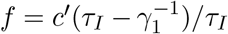 and
and 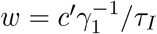 . These values served as the initial conditions for f and w; at t = 0 we set h = n − f − w and b = r = 0. Finally, it is estimated that the actual number of infected people in the community, during the studied period, is about 5-15 times larger than the number of positive RT-PCR tests, as implied by several seroprevalence surveys of antibodies to SARS-CoV-2 around the US [28–30] and in Israel [31]. Accordingly, to estimate the actual number of infected population density, the observed density was multiplied by a factor 8. To make a valid comparison with the reported positive RT-PCR number of infected people, we divided back the results of the simulations by 8.
To obtain the population density n(x) we read the NASA SEDAC image and cropped it to the relevant South Carolina region, see Fig. 2. The image was converted to shades of gray (bright meaning high population density), then scaled and rotated by 2 degrees to fit the images from DHEC. n(x) was calculated in two steps. First, for each pixel at location x, the pixel brightness, varying between 0 and 1, was multiplied by a numerical factor ensuring that sum of all pixel brightnesses inside the South Carolina borders is equal to the known total population in South Carolina, 5, 210, 100, resulting in pixel scaled brightness c″. The density n(x) was then defined as c″ divided by the average of c″ over the area of the state.

Population density of South Carolina from NASA’s SEDAC. Bright spots correspond to highly populated regions. Population outsides of the state’s limit was ignored (large dark areas).
To solve the set of coupled rate equations (1), we divided the two-dimensional space to nodes. Each node corresponded to one pixel in the clip. The gradient and divergence operators were discretized according to standard finite difference formulations. To propagate the equations in time we used an explicit scheme with a sufficiently small time differential.
The claculation of the Pearson’s correlation coefficient (CC) [32], between observed and predicted heatmaps, was performed in several steps. Hue color triplets were calculated from the raw RGB format of the movie clip. If a pixel’s hue value was c, this value was transformed to c′ = 1 − c, so that red hues have higher values. The very faint baseline bluish hue ≈ 0.3, which was due to the superposition of the background map and the DHEC data, was removed in all places where c′ was smaller than 0.7. Finally, the infected matrix Idata(x) was defined as c′ and rescaled such its values would lie between 0 and 1. For the simulation, Isim(x) was defined as the sum f + r + w, scaled to lie in the range between 0 and 1. To follow the color truncation employed in the DHEC movie clip, Isim(x) was further modified such that all values above 0.25 were set to be Isim = 0.25.
The Pearson’s CC is
 where the index i runs over all pixels (x coordinates), 0 ≤ i ≤ N, and N is the total number of pixels in the images. Īdata and Īsim are the averages of Idata and Isim, respectively, and
  and
and  are their standard deviations.
IV. RESULTS
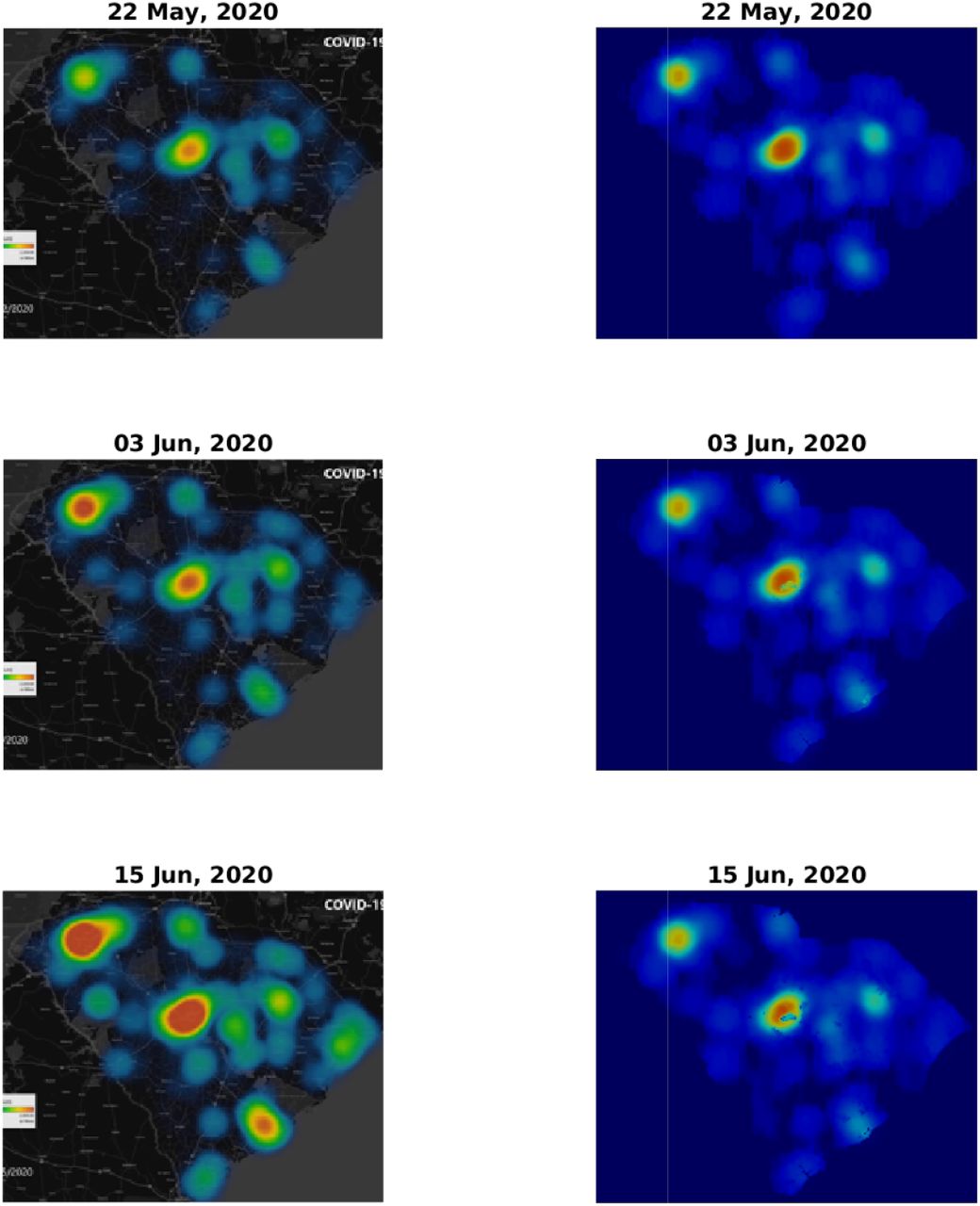
Figs. 3 and 4 depict a comparison between five pairs of observed vs predicted South Carolina heat-maps from the period under study. The top two panels in Fig. 3 are the same as those appearing in Fig. 1 and, as explained in the Methods section, serve to define our initial conditions for the simulations. The visual similarity between the South Carolina heat-maps and our simulations for the subsequent dates, including the very late date of July 21, is evident. In some respect our predictions are better than the observations, since our numerical scheme does not allow, as it should, the spreading of infection to regions where human population is missing or very low. In contrast, the apparent, observed, heat-maps include such internal errors (presumably due to an image processing algorithm that is used to create low resolution images, thereby avoiding conflict with privacy issues).

Comparison of infection dynamics between the data from the DHEC and the theoretical model. Image snapshots from the actual data are displayed on the left column and the model results for I(x) ≡ f (x) + w(x) + r(x) are on the right. The heading for each panel shows the date, starting from May 22, 2020, corresponding to a relative times t = 0 (identical to Fig. 1, top and bottom panels), t = 12, and t = 24 days. See later times in Fig. 4.
Comparison of infection dynamics – continuation of Fig. 3 for relative times t = 36, t = 48, and t = 60 (dates June 27, July 9, and July 21, respectively).
Total number of active cases (‘F’+‘W’) in South Carolina vs time. Blue line is the model simulation and red dashed curve is the number provided by worldometer. The model input is the total number of active cases at time t = 0 (May 22, 2020), 3312. We assumed the basic reproductive rate R0 = 2 to be constant throughout the whole inspected time.
To make this comparison more quantitative, we calculated the Pearson’s CC, see Methods section for details. In Table 1 we report the Pearson’s CC values, ρ(Idata, Isim), for all the six dates corresponding to the heat-maps presented in Figs. 3 and 4. The initial conditions (top pair in Fig. 3) may be regarded as a check on this numerical criterion where theoretically the Pearson’s CC should be very close to unity. Indeed we find ρ(Idata, Isim) = 0.972, where the very samll difference from unity is associated with the numerical error emerging from the image processing algorithm. For the subsequent dates, the CC values are slowly descending – which is quite reasonable as errors should grow in time – yet remain close to unity. For July 21 (2020), that is 60 days after initiation of the simulation, we find ρ(Idata, Isim) ≈ 0.8, which is still quite high, recalling that we ran our simulation for 60 days without any intermediate tweaking of the model parameters.
V. CONCLUSIONS
In this paper we have tested our in-homogeneous SEPIR model against real spatial data from South Carolina and found remarkable agreement of the infection heat-maps that is visible to the eye and confirmed by the large Pearson’s CC between the model predicted and observed heat-maps. This suggests that our approach can be employed for the COVID-19 pandemics in other parts of the world. This will require extended and high resolution data on the geographic spread of the pandemic, in order to accurately set the initial conditions of the five sub-populations associated with our model. In addition, the geographic population density in an essential ingredient of our model.
Our general mathematical framework can be easily implemented in essentially all “multi-compartment” (i.e. several sub-population) models developed so far for the COVID-19 pandemic [9, 13, 33]. It may be also used to predict the effect of vaccination, by adjusting the local fraction of susceptible sub-population h(x)/n(x), thereby helping to improve vaccination strategies. We hope that further use and development of our approach will assist fighting the COVID-19 and other pandemics. Further improvements of our model are currently underway.
Data Availability
1) All simulations data will be provided uppon request. 2) The sources of data used for comparsion with the simulations are properly referenced in the manuscript.
References


