
Abstract
As increasing amounts of data accumulate on the effects of the novel coronavirus Sars-CoV-2 and the risk factors that lead to poor outcomes, it is possible to produce personalised estimates of the risks faced by groups of people with different characteristics. The challenge of how to communicate these then becomes apparent. Based on empirical work (total n=5,520, UK) supported by in-person interviews with public and physicians, we make recommendations on the presentation of such information. These include: using predominantly percentages when communicating the absolute risk, but also providing (for balance) a format which conveys a higher perception of risk (expected frequency out of 10,000); using a visual linear scale cut at an appropriate point to illustrate the maximum risk, explained through an illustrative ‘persona’ who might face that highest level of risk; and providing context to the absolute risk through presenting a range of other ‘personas’ illustrating people who would face risks of a wide range of different levels. These ‘personas’ should have their major risk factors (age, existing health conditions) described. By contrast, giving people absolute likelihoods of other risks they face in an attempt to add context was considered less helpful.
Introduction
When a new threat emerges, such as that presented by the Sars-CoV-2 virus, it is very difficult for individuals to assess the risk it poses to them personally: how likely they are to be affected by it, and how severely. These two aspects are important components of a person’s ‘risk perception’ – a subjective feeling which also incorporates emotional aspects such as worry, affected by feelings of control, knowledge about the risk and other aspects which can cumulatively make a risk be perceived as a ‘dread risk’[1,2]. Risk perceptions are key drivers of behaviour, which can be protective[3–5] but high risk perceptions can lead to worry, anxiety and behaviours whose harms may be greater than their benefits[6–8], and low ones to inadequate protective behaviours – which has both individual and societal consequences.
As countries accumulate more data on mortality and hospitalisation rates from COVID-19, as well as the proportions who suffer long term effects, it is possible to produce increasingly personalised risk calculators (e.g. [9]). The issue, then, is how to communicate this potentially highly emotional information, which may challenge people’s prior perceptions about the risk, triggering identity-protective cognition, to diverse audiences.
Risks from COVID-19 fall into one of the more difficult areas to communicate: the thought of the disease can provoke strong emotion (or ‘dread’[1]) which is known to affect risk perceptions[10– 13]; for many people the magnitude of the risk is low (less than 0.1% chance of dying from the disease even if you catch it) making the numbers difficult to comprehend[14–16]; but with a very wide variation, meaning that it is difficult to represent the range of risks on a single, linear scale. It is well known that even relatively subtle changes in methods of communication can have profound effects on audiences’ perceptions of risks and behaviours (e.g.[17–19]) and hence careful empirical work alongside qualitative work with the intended audience is key to designing effective communication messages.
Before embarking on such work, it is vital to define the aims, audiences and medium of the communication as these determine the outcome measures and constrain the design.
Aim of communication
Communication messages lie on a continuum from a purely persuasive design (e.g. many public health messages) where the desired outcome is behavioural change; to purely informative (e.g. informed consent processes) where the outcome of interest is objective comprehension.
Many trying to communicate the risk from COVID-19 might be aiming for some level of behavioural change (people adopting either more or fewer preventative actions), which might mean, for instance, placing an individual into a risk band (e.g. ‘high risk’) with tailored behavioural advice. Others may be aiming to be as neutral as possible, allowing individual interpretation of the risk, which will naturally vary between individuals.
The first approach communicates less information to the audience and requires less from them, so may be preferred by some, whilst others may find its persuasive intent less trustworthy.
The second approach avoids some practical difficulties. For example, the same additional absolute risk of death would present a very different prospect to, say, a 9-year-old and a 90-year-old because of their different background levels of risk, making automated categorisation of risks difficult.
Audience for communication
The main audience for our purposes was the general public. This presents the greatest communication challenge, and means that any communication produced should then also be suitable for other contexts (e.g. use by a healthcare professional in checking a patient’s risk whilst making treatment decisions, or communicating risk to an individual patient).
Medium of communication
We designed the communications for use online, optimised for mobile phone screens and possible to print out.
Methods
This study consisted of four online large-scale quantitative experiments, supported by four rounds of interviews with members of the public and primary care physicians (see Appendix 1 for details), between 1st June and 31st July 2020.
The study was approved by the Psychological Research Ethics Committee at the University of Cambridge (PRE.2020.070).
All quantitative experiments were carried out online, with participants recruited through the ISO-accredited polling company Respondi. Quotas were set to ensure recruitment of UK participants representative of the national population on age and sex. Participants were paid £2.50 and each survey lasted 20-25 minutes.
Full methods for the survey experiments are described in Appendix 2.
Survey 1 collected purely observational and preference data from the audience (see Appendix 2 for key questions), and the number of participants (500) was based on our previous experience of these types of surveys. There were no planned statistical analyses.
Survey 2 contained two randomised controlled experiments. The power calculation was based on the largest of these (the second).
2.1) Interpretation of numerical risks with and without context
Participants were each presented with a set of 6, randomised hypothetical risk results. They were randomised to one of 8 conditions in a 2(numerical format: frequency vs percentage)x4(context: none; risks to people of different ages; description of the person whose result it was concordant with the numerical risk; description of the person whose result it was but discordant with the numerical risk) factorial design (see Appendix 2 and Results for full details).
2.2) Interpretation of visual scales with and without context
Each participant was shown a single mock-up of a hypothetical risk result alongside a visual scale. They were randomised to see one of three versions of the scale: no context at all; a graphic alongside the scale representing how many of the UK population faced each level of risk; markers on the scale indicating the risk results for ‘average’ people of three given ages. (See Appendix 2 for full details). GPower was used to determine the number of participants required for a one way ANOVA (with 3 groups) at 95% power, alpha 0.05 and small-to-medium effect size (d=0.3). This provided an estimated sample size of 690 which we rounded up to 700.
Survey 3 contained one randomised controlled experiment: interpretation of logarithmic versus linear scale and number formats on scales. Participants were randomly assigned to one of eight treatment conditions: 2(linear vs log)x2(frequency vs percentage)x2(high vs low risk). GPower was used to determine the number of participants required to provide 95% power for small to medium sized effects (d=0.3) for the main planned comparison tests, for an alpha of 0.5 adjusted to correct for multiple hypothesis tests with the Benjamini-Hochberg procedure. This led to a sample size of 1820 participants.
We ran generalized linear models to investigate effects on subjective risk perception, subjective and objective comprehension of the information provided, worry about COVID-19, and behaviour (see Appendix 2 for exact questions asked). We also conducted separate t-tests to explore the differences in these key dependent variables between log and linear presentations (pooling frequency and percentage conditions), and likewise between the frequency and percentage conditions (pooling log and linear presentations) for the high risk group only, correcting for multiple comparisons with the Benjamini-Hochberg procedure. We also explored differences between all groups via ANOVA and post hoc comparisons, adjusted using Tukey HSD. Analyses for survey 3 were preregistered at https://osf.io/xpyk9.
Exploratory analyses also investigated two further measures: Responses to the questions “If the person who got this result caught COVID-19, how likely do you think it is that they would die as a result?” and “How would you describe the risk of this person dying from COVID-19 if they caught it?” were highly correlated, and these were therefore combined into a single measure of ‘cognitive risk perception’ (details in Appendix 2), whereas worry (the response to “If this result applied to you, how worried would you be?”) was treated as a measure of “emotional risk perception”.
Survey 4 contained three randomised controlled experiments. The power calculation was based on the largest of these.
4.1) Interpretation of risk information with and without context, visual scale, and positive versus negative framing
A 5×4 factorial design randomised participants to see one of 5 formats of risk presentation (See Appendix 7) at one of 4 risk levels. GPower was used to determine the number of participants needed in order to have 95% power to detect a small-to-medium effect size (d=0.3) at alpha .05 for the main analyses and the pairwise planned contrasts. As we intended to use the Benjamini-Hochberg procedure to control the familywise error rate, we powered so as to be able to detect an effect of this size even for the most stringently corrected test of the 24 tests planned. A total of 2495 subjects was found to be needed for the survey as a whole, which we rounded up to 2500.
We ran four regression models in which perceived likelihood of death, worry, communication efficacy, and concern about higher-risk behaviours were the dependent variables (see Appendix 2 for exact questions), fitting a main effect of display format. We treated risk level as a continuous variable1. We also conducted pairwise planned contrasts between different pairs of display formats for all four DVs, fitting a main effect of format with risk level treated as above. These analyses were pre-registered at https://osf.io/4yu73 2. Exploratory analyses also investigated cognitive risk perception, defined as in Survey 3.
4.2) Interpretation of different numeric formats
Participants were asked to imagine they had received a personalised estimate of the risk of dying if infected with COVID-19 and were presented with 5 different risk estimates in random order. They were randomised to one of five conditions: four formats of presentation of the risk number (percentages, ‘1 in x’, ‘x in 100’, ‘x in 1000’ in which they were asked to respond with a sliding scale labelled ‘very low risk’ at one end and ‘very high risk’ at the other) and one condition where they received the risk as a percentage but were asked to respond instead on an 11-point Likert scale with the same labelling as the slider.
We compared mean perceived risk scores between the four presentation conditions (excluding the exploratory response condition with the Likert scale response) and risk levels using a 4×5 two-way ANOVA. This analysis was preregistered at https://osf.io/rdtc4.
4.3) Elicitation of different numeric formats
Participants were presented with basic descriptions of five different individuals (the same as in experiment 2.1) in a randomised order and asked to estimate their chances of dying from COVID-19 if infected. Participants were randomised to be asked to provide their estimate in one of 3 formats: as a percentage chance for a single individual, as a number out of 100 whom they would expect to die, or as a number out of 1000 whom they would expect to die.
We compared the mean estimated risk of dying (as a percentage) between conditions and personas using a 3(response format)x5(persona) two-way ANOVA. This analysis was preregistered at https://osf.io/w2vks.
In all analyses, participants who failed an attention check in the survey were excluded. There was no attention check in survey 2. Surveys 3 and 4 contained one attention check question each (“To check that you are paying attention, please select ‘somewhat agree’ below”). In survey 3, 106 participants were excluded based on failing the attention check. In survey 4, 277 participants were excluded.
In addition, demographic information was collected: age, sex registered at birth, COVID-19 risk perception (measured by 6 items from [5]), numeracy (using a sum of their score on the adaptive Berlin numeracy test [20], 3 items from [21] and a single item from [22]), household income, employment status, whether they had had or suspected they had had coronavirus, perceived social status [23], health literacy (using subscale 9, “Understanding health information well enough to know what to do,” of the Health Literacy Questionnaire [24]), ethnicity, and education level.
Participants
Participants were quota sampled so as to be representative of the UK population on age and sex. In Survey 1 they were also quota sampled by ethnicity to be representative of the UK (we prioritised ethnicity representation over representation by sex, hence the slight difference in sex ratio).
Results
Information needs
One of the themes identified within the interviews with primary care physicians was that of infantilisation and empowerment. Some physicians spoke strongly about how they felt the public in the UK were being ‘infantilised’ by clinicians who implied that “every risk can be managed away” and by the government for not being honest about the risks that some socialising can bring. They also recounted how patients ask them what they should do, wanting an authority instead of “the risk of thinking for themselves”. They felt it was important that patients made their own decision about certain risks, as only the patient’s values can inform that. Additionally, one physician felt such risk information could empower patients to “have those conversations with the people who are making the decisions”, for example, employers.
Around half of the healthcare providers interviewed also spontaneously brought up the issue of having experienced contention between advice from the government, which they viewed as political, and the advice they wanted to give, which they viewed as clinical.
Preferences expressed by the public in our online surveys and interviews also showed a desire for trustworthy, personalised risk information (see Appendix 3).
When asked their opinions on whether the aim of personal risk communication about COVID-19 should be as neutral as possible ‘just to ‘inform people’ or whether the aim should be to ‘persuade’ people in order to change their behaviour, 63% of participants (n=2500) chose a mark on the Likert scale above the half-way point towards the tool being ‘persuasive’. When this subset of participants were asked in which direction they wanted it to persuade people, 61% said that ‘it should try to make people be more cautious by showing that even if the risk is low to them, they can spread it to others’. For more details on people’s information preferences, see Appendix 3.
Participants’ perception of the risk of COVID-19 & the influence of numerical format
The perception of a risk and the numerical understanding of its likelihood and severity are two very different things. Risk perception takes into account emotional factors such as worry about the potential outcomes and therefore depends on an individual’s circumstances (eg. what impact ‘being too ill to work for 2 weeks’ will have on an individual; what the relative increase in their risk is). Knowing the audience’s prior perceptions of the risk helps understand the potential impact of communicating about it.
During interviews, even when asked to quantify risks from COVID-19, participants rarely used numbers, and instead naturally described the characteristics of people they would consider ‘high’ or ‘low’ risk (see Appendix 6). We therefore investigated people’s prior beliefs about the risks of COVID-19 both through numerical information and through the use of these ‘personas’.
When given 5 different personas and asked to rate the chances of each person dying if they caught COVID-19 (as a percentage, as a frequency out of 100 or as a frequency out of 1000: Experiment 4.3), it was clear that although people broadly recognised the main risk factors, as interviews had suggested, they estimated fatality rates to be very high. As suggested in previous literature, frequencies appeared to represent ‘higher risks’ to people than percentages (and ‘x out of 1000’ higher than ‘x out of 100’) - in this case shown by participants who were asked to rate the chance of death in percentage points inputting a higher fatality rate than those who were asked to rate the chance as a frequency (see Figure 7).

Estimates of different personas’ risk of dying if infected with COVID-19. Participants provided their estimate as either a percentage, or a frequency out 100 (‘X in 100’) or 1000 (‘X in 1000’); converted to percentage for comparison. For each persona, mean estimates differed significantly from each other by response format (p<0.01).
As per our pre-registered analysis we first conducted a two-way mixed ANOVA comparing participants’ estimates of a hypothetical individuals’ risk of dying across the three response formats (between factor) and five personas (within factor).
This revealed a significant interaction (F(8, 8824)= 39.56, p<0.001 η2G=0.01). One-way ANOVAs revealed a significant effect of response format for all personas (Fs(2, 2260) 69.55-175.30, all p<0.001), but this effect was more pronounced for personas with descriptions that included more risk factors and hence higher estimated risks; the effect of format was greatest for Sam (η2=0.14; see full descriptions in Figure 7 and Appendix 2) and Alex (η2=0.13) compared to Jo, Ali and Mel (η2s 0.12, 0.11 and 0.06 respectively). Post hoc analyses using Tukey’s HSD revealed that risk estimates differed significantly between all response formats, with individuals who entered their estimate as a percentage, on average, estimating a higher risk of death for each persona than those who gave their estimate as a frequency out of 100. In turn, estimates provided as a frequency out of 1000 were on average lower than those given in the percentage or ‘out of 100’ conditions (all p<0.01).
In sum, when asked to estimate a hypothetical individual’s risk of death from COVID-19, people, on average, give the lowest estimates when asked to provide the figure as a frequency out of 1000, higher if out of 100, and the highest estimates if asked to provide the figure as a percentage, and these differences appear greater when the individual in question can be considered generally ‘high risk’.
Participants’ perception of absolute risks & the influence of numerical format
To investigate how participants would perceive a range of realistic absolute risks of dying from COVID-19 (if infected), and to quantify the effects of numerical format, participants were asked to rate five different numerical risks (which were presented to them in a random order) on a sliding scale marked only ‘very low risk’ and ‘very high risk’ at the extremes. The position of the slider was coded as 0-100 by the survey software.
Participants were randomised to see all five numerical risks in one of four formats: percentage; x out of 100, x out of 1000, 1 in x (Experiment 4.2). Means and distributions of participants’ ratings of the risks are shown in Figure 8a and b respectively.

Mean ratings (from ‘very low risk’ (0) to ‘very high risk’ (100)) of five different COVID-19 infection fatality risk figures, presented as either a percentage or as one of three frequency formats. Dotted lines indicate a non-significant difference between means, all other pairwise comparisons were significant at p<0.05.

Distributions of ratings (from ‘very low risk’ (0) to ‘very high risk’ (100)) of five different COVID-19 infection fatality risk figures, presented as either a percentage or as one of three frequency formats.
As per our pre-registered analyses, we conducted a mixed 5(risk level; within) x 4 (risk format; between) ANOVA. We report a significant interaction between conditions, F(12, 7,048)= 15.09, p<0.001, η2G=0.01. One-way ANOVAs comparing perceived risk across formats for each risk level all returned a significant effect of format (Fs(3, 1762) 34.7-122.58, all p<0.001). The effect of format was greatest for ratings of the 5% risk level condition (η2=0.17) followed by 12% (η2=0.14), 1% (η2=0.12), 20% (η2=0.12) then 0.1% (η2=0.06).
Post hoc comparisons using Tukey’s HSD revealed a consistent pattern across all risk levels: risk ratings, on average, were highest for risk levels presented in a ‘1 in X’ format, followed by ‘X in 1000’, ‘X in 100’, then percentages. Mean ratings for nearly all formats in each risk level condition differed significantly from each other (ps<0.05). The exception to this was the differences between the ‘X in 100’ and ‘X in 1000’ formats in the 20% and 1% risk level conditions, which were not statistically significant.
At risks higher than 0.1%, the absolute difference between format condition means appeared relatively consistent. For example, across all four of the higher risk levels the average response in ‘X in 100’ condition was about 10 percentage points higher than percentage condition (Mdiff range: 9.0-11.3). Similarly, the mean responses in the ‘X in 1000’ condition were around 13 percentage points higher than the percentage condition (10.8-16.5), and the ‘1 in X’ condition mean scores were approximately 30 percentage points higher than the percentage condition (28.7-34.0).
This confirmed the elicitation experiment reported above, and revealed that the ‘1 in X’ format is consistently rated as a greater risk than the others we tested for this range of risks. Note that in the 1% condition, those seeing the ‘X in 100’ and those seeing the ‘1 in X’ format were both presented with the risk ‘1 in 100’, and yet rated it, on average, very differently. This is an effect of context - comparison with other risks they were presented with within the experiment (the presentation order was randomised). When only those who saw that 1% value first were analysed (removing contextual effects), there was no difference between the ratings of that value by those who were randomised to the ‘X in 100’ and the ‘1 in X’ groups.
Levene’s test of variance equality indicated variances differed significantly between formats for ratings of the 0.1%, 1%, and 5% risk levels (Fs(3, 1762) 17.69, 23.90, 11.41 respectively all p<0.001), with the percentage formats having lower variances than the formats, but not the 12% (F(3, 1762) 2.17, p=.08) and 20% risk levels (F(3, 1762) .79, p=.50). See Appendix 4 for a table of pairwise comparisons.
Participants’ perception of absolute risks & the influence of context
In order to investigate the effects of contextual information on risk perception, participants were randomised in an experiment (2.1) to receive the numerical risks in frequency or percentage format, and to be in one of four different groups. One group was given just the absolute risk with no context information; one group contextual information about the risk levels for other people of different ages; and two groups personal information about the individual whose risk level was being described, either information that matched the risk level or information that was dissonant with the risk level displayed (based on observation about the natural use of ‘personas’ to ‘quantify’ risk in interviews). The personas used were the same as in Experiment 4.3 reported above, with each participant seeing all five in a random order. In the ‘dissonant’ group the five personas were matched with the ‘opposite’ numerical risk levels, with the ‘highest risk’ persona presented alongside the lowest numerical risk.
A 5(risk levels; within)x2(format; between)x4(group; between) mixed three-way ANOVA revealed a significant three way interaction between all factors, F(12, 2748)=2.56, p<0.01, η2G=0.004, which we decomposed by running separate 5×2 mixed ANOVAs within in each group. All groups showed an expected significant main effect of risk level, which we will not examine further here for brevity, except where interactions with other factors were detected.
In the ‘no additional information’ group there was a significant main effect of numerical format, F(1, 183)=11.41, p<0.001, η2G=0.045. Tukey’s post hoc tests indicated that across all risk levels, frequencies were rated as higher risk than the equivalent percentage (all p<0.05).
In the group presented with age comparison information, we report a significant interaction between risk level and format F(2.51, 440)=3.78, p<0.01, η2G=0.006. Post hoc tests revealed that frequencies were only rated significantly higher than percentages in the 1% risk level (p<0.05).
In the groups presented with an individual’s description there was no significant main effect of format or interaction with risk level (F(1, 161)= 0.44, p=0.51 in the congruent group, F(1, 168)=1.45, p=0.23 in the dissonant group). However, post hoc comparisons within the dissonant group revealed a significant difference between the frequency and percent groups ratings of the 20% risk value (p<0.01).
Overall, as can be seen in Figure 9a&b, the difference in risk perception between those given a risk in a percentage compared to a frequency was diminished in the presence of additional information. It is also clear that the presence of the contextual information made a difference to people’s estimations of the risks (compared with the ‘no additional information’ group), and the effect of giving a description of the risk factors of the individual was so strong that in the ‘dissonant context’ condition, a 0.1% risk (given as the risk for an 85 year old man with two health conditions) was judged higher than a 20% risk (given as the risk for a 30 year old man with no health conditions).

Mean ratings (‘very low risk’ (0) to ‘very high risk’ (100)) of five different risk levels presented as a percentage or frequency (out of 1000), with or without additional information. Asterisks indicate a significant difference between percent and frequency formats, *p<0.05, **p<0.01, ***p<0.001.
Distributions of the ratings of the five different risk levels presented as a percentage or frequency (out of 1000), with or without additional information.
To examine the relationship between demographic factors and risk ratings (e.g., whether males or older people had a lower perception of the risks), we fitted a linear model to the data from the ‘no information group’ regressing risk ratings on risk level, age, sex and level of numeracy.
Accounting for experimental manipulations, we found no significant effect of age (β=-0.04, p=0.15) or sex (β=-0.04, p=0.15) on risk ratings. Numeracy did not moderate the effect of format but did interact with risk level, (β=0.38, p<0.001). Lower numeracy individuals tended to rate the risks presented as higher risk compared to higher numeracy individuals, with this difference decreasing as the risk level increased. (See Appendix 3).
Visualising the risk
Research has long emphasized the advantages of visualising numerical information, providing at-a-glance estimation and context (e.g. [25]). In the case of very small risks, and those where comparative information is likely to be helpful, risk ladders are usually recommended (e.g. [18]). We investigated the empirical effects of several design decisions that need to be made when designing a risk ladder to communicate COVID-19 risks.
In experiment 4.1, we compared the effects of providing a visual scale with the effects of providing the same information in text format (see Figure 10).
Example mock-ups tested in experiment 4.1, showing the same information with and without a visual scale. Participants were randomised within each format to see one of four risk results covering four orders of magnitude.
As per our pre-registration, we carried out planned contrasts (Appendix 7) comparing five pairs of mock-ups to look for effects on perceived likelihood of death, worry, concern about higher-risk behaviours, and communication efficacy, and found no significant differences. Exploratory regressions were also carried out to look for effects on subjective clarity and understanding, objective understanding, and actionability (see Appendix 5), which showed that those shown risks without a visual scale perceived them to be higher (cognitive risk perception).
When participants in survey 4 were shown all 5 visual format options and asked to rank them in order of preference, the formats with visual scales were clearly preferred (see Figure 11).

Participants’ preferences across the five presentation formats tested in experiment 4.1 when shown all five and asked to rank them.
Logarithmic versus linear scale
In the qualitative interviews, 21 out of 29 participants (72%), including health professionals, were confused by a logarithmic scale and/or considered it to be unfairly representing the risks, for example: “I don’t like the scale because it’s supposed to be a scale but it’s not TO scale! Spatially it’s not right!”, “The 12% has been manipulated to look higher!”
In experiment 3, participants were randomised to one of 8 groups in a 2×2×2 between-subjects design. They were shown a risk of either 12% or 0.1%, expressed either as a percentage or a frequency, and indicated on either a log or a linear scale (Figure 12).

a 12% risk shown on a log or linear scale, in percentages or frequencies (participants were randomised to see either a 12% or a 0.1% risk in one of these four formats).
Following our pre-registered analysis, we created an index of perceived risk made up of three items measuring participants’ estimates of the risk (very low to very high), likelihood of death (very unlikely to very likely) and how worried they would be over such a result (not at all to very; all rescaled 0-100; α=0.87).
The results for the 4 arms of the 12% risk are shown in Figure 13. The results for frequency versus percentage are reported in the next section (‘labelling of the scale’)

Mean risk perception (A) and subjective comprehension (B) among participants responding to a high (12%) risk result presented as either a frequency or percentage with either a linear or logarithmic scale. Error bars show 95% confidence intervals. Stars denote significant difference between frequency and percent groups (no significant difference between scale formats).
Previous literature [26] reported that the visual positioning of the risk on the scale is influential, and we expected risks to look higher on a logarithmic scale as a result, and pre-registered analyses of those who saw the higher (12%) risk result.
Among the participants who saw this 12% risk result, however, there was no difference in risk perception between those who saw the result displayed on a logarithmic (M=45.19, SD=21.12) vs linear scale (M=43.12, SD=20.40; t(769.46)=-1.39, p=0.16).
Similarly, scale format had no impact on a subjective comprehension measure consisting of two items asking the extent to which the graphic was clear, and easy to understand (not at all (1) to completely (7); r=0.88). Responses did not differ significantly between participants who saw a logarithmic (M=5.58, SD=1.38) or linear scale (M=5.70, SD=1.35; t(771.13)=1.18, p=0.24).
Trust in the linear format (M=4.22, SD=1.31), however, was significantly higher than trust in the logarithmic format (M=4.01, SD=1.32; t(770.32)=2.16, p=0.031) although the effect size was small (d=0.15).
The same analyses for those who saw the 0.1% risk result were not done due to a mistake in the graphic for this condition.
Labelling of scale: effect of numerical format
In experiment 3, those who saw the numerical information in frequency terms (‘120 out of 1000’), compared to a percentage, perceived the risks to be significantly higher (MFreq=47.31, SD=21.46; MPerc=41.11, SD=19.63; t(761.41)=4.20, p<0.001, d=0.30) and less clear ((MFreq=5.46, SD=1.42 ; MPerc=5.81, SD=1.29; t(760.45)=-3.75, p<0.001, d=-0.26)) (see Figure 12 above). This was in line with the other experiments).
In interviews, 7 out of 14 (50%) participants mentioned finding frequencies hard to understand: “I think it’s a lot clearer with the percentages. I mean 190 out of 1000, I think it’s hard to imagine.” and felt the constant repetition of frequencies on the scale contributed to this (4 out of 14; 29%): “It’s just all zeros everywhere!”. Some participants also commented that, in order to understand their result given as a frequency, they would have to convert it into a percentage (3 out of 14; 21%). Lastly, in line with the quantitative work, some participants suggested that the use of frequencies made the risk seem higher (3 out of 14; 21%).
Colour of scale
In interviews, participants expressed varied opinions about the traffic light system of green, orange and red used to colour some mock-up scales. Those shown these colours felt this colouration was easily understood, but 2 of the 6 (33%) spontaneously added that it could be misinterpreted: “The green colour could make people think that they don’t need to worry that much and not undertake proper behaviours.” It became clear that particular colours could be interpreted as an indication of what ‘should be’ considered high risk and what low risk. The decision over colouring, therefore, depends on how pointedly the communicator wants to guide interpretation.
Top/bottom points of scale
The estimated risks of an individual dying from COVID-19 if they become infected with Sars-CoV-2 very rarely exceed 30% (or, conversely, their chance of surviving it is rarely below 70%).
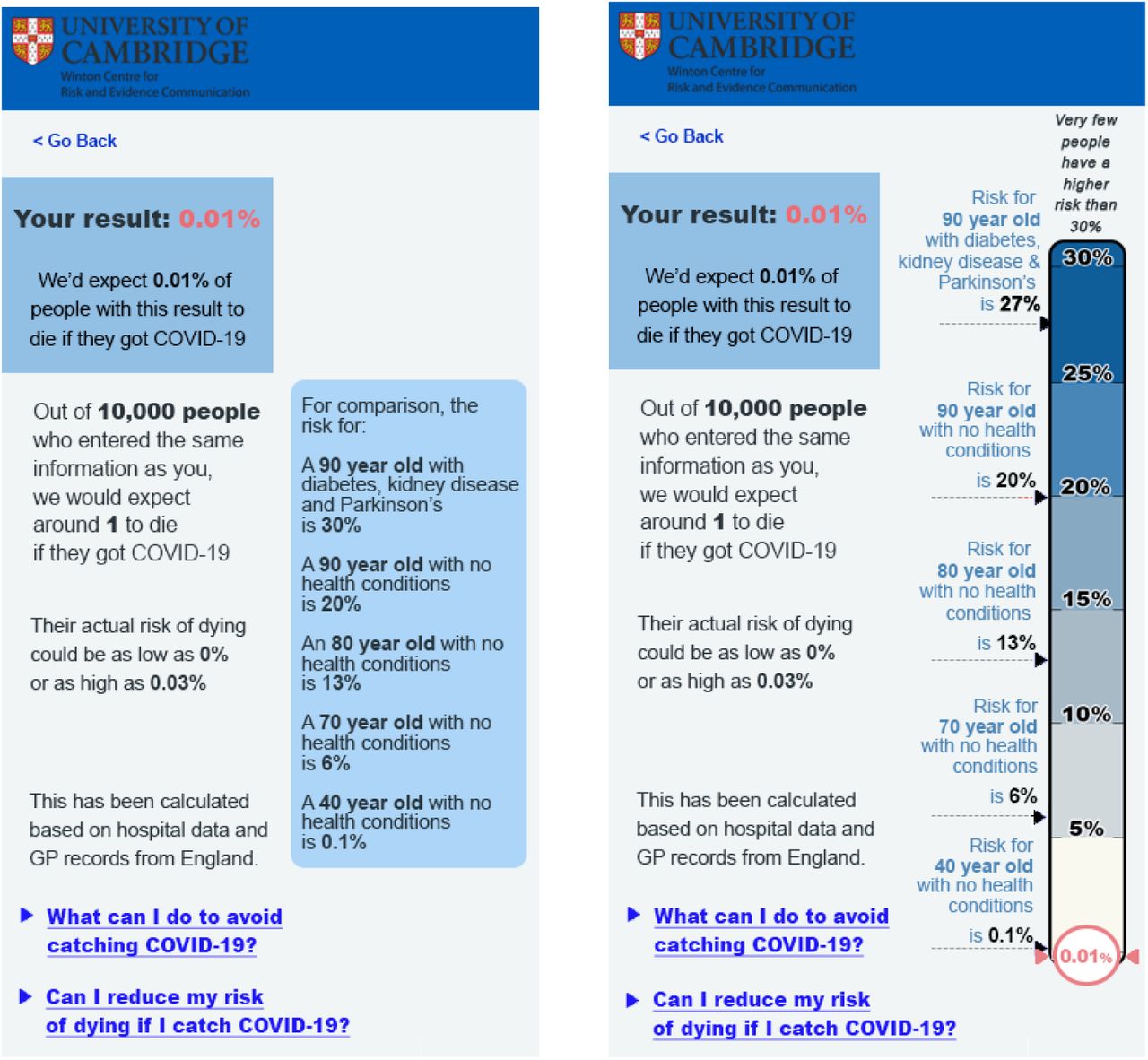
If a linear scale is used it is likely that communicators will want to cut the axis and display half or less than the full 0-100% scale. In interviews, participants felt that this was justified, but wanted it to be made clear in the visualisation, and to know why the particular cut-off point was chosen. Knowing ‘the highest risk possible’ was helpful for them to calibrate their perception of the numerical risks, and 5 out of 7 participants (71%) with whom it was discussed again found it helpful to have that ‘maximum risk’ presented in terms of a persona: the type of person (in terms of risk factors such as age, health conditions etc) who might be at that sort of level of risk.
Providing context for the risk
Choosing contextual information that is ‘informative’ without being ‘persuasive’ is hard, if not impossible. There is a paucity of empirical literature on the effects of different kinds of comparator risks on risk perception (e.g. [27]). Slovic [28] warned that the choice needs to take into account people’s differing feelings about different risks. We therefore started by asking our interviewees about their preferences for different comparators.
Participants were asked about several types of contextual information (the risk for a healthy person of a specified age; the risk of other causes of death; the risk for a person with specified health conditions and age; the risk for the individual getting the results if they did not have any health conditions; the risk for an ‘average’ person of a specified age; what proportion of the population had a higher or lower risk than the individual getting the result). Comparators that involved participants mentally moving away from ‘their risk’ to ‘someone else’s risk’ were generally disliked, especially if those people were very different from the participant themselves. Those options that compared the participant’s risk of dying from COVID-19 to dying from other causes were thought likely to be helpful but only if those risks seemed similar enough to COVID-19 (e.g. seasonal ‘flu, but not accidental injury). Those presentations that tried to communicate a concept that wasn’t an absolute risk (e.g. a person’s position within a population, such as a percentile, or the number of people who had such a risk score) were easily misunderstood as an absolute risk (e.g. ‘75% of people have a higher risk than you’ being read as ‘you have a 75% risk’).
In experiment 2.2, participants were randomised to see one of three mock-ups, each using a (logarithmic) scale illustrating the result. The control group saw no further information. A second group saw a scale with the risks for ‘an average’ 50, 70 and 85-year old shown alongside it. The third group saw the scale with, alongside it, an illustration of the approximate distribution of the different absolute risk percentages in the UK population (see Figure 14).

The three formats tested in experiment 2.2: each shows a 2% risk on a logarithmic scale. One shows no additional contextual information, one shows the comparative risks of ‘average’ people of different ages, and one attempts to illustrate the proportion of the UK population that experiences each level of risk.
Participants were asked to rate the visualisation on clarity and ease of understanding as well as being asked questions to ascertain their cognitive and emotional risk perception, as described in Appendix 2. For their mean responses, see Figure 15.


Participants’ ratings of the three formats shown in Figure 13 (Cognitive risk perception: slider scale 0-100; comprehension and emotional risk perception: 7-point Likert scales; error bars denote 95% Confidence intervals).
Cognitive risk perception was slightly decreased by giving the age comparators. A one-way ANOVA revealed an overall trend between groups (F(2, 691)= 2.81, p=0.061)3. Follow-up post-hoc testing using Tukey HSD correction for multiple comparisons showed a significant difference between the “comparator by age” group and the “no comparator” group (p=0.049, d=0.22). The three visualizations did not lead to a significant difference in emotional risk perception (worry about the result). The population distribution presentation was less well understood than the other two visualizations (F(2, 694)= 10.07, p<0.001, η2=0.028; Tukey HSD post-hoc pairwise comparisons significant for this group versus the other two, both p<0.001).
In experiment 4.1, participants were randomised to view one of five formats of visualisation (Appendix 7). One of these used positive framing (see section below) and one used no visual scale (previously described). The other three compared a visual scale giving no comparator risks, the equivalent risk for the individual dying from seasonal ‘flu, or the risks of COVID-19 for people of a range of ages and health conditions chosen to give good coverage of the scale (see Figure 16). Participants were also randomised to see one of 4 levels of risks within each format, covering 4 orders of magnitude (0.01%, 0.1%, 2%, 20%).

Scales used in experiment 4.1 comparing a visual scale with no comparator risks, with ‘flu risk, and with the risks for people with defined ages and health conditions. These illustrate a 2% risk, but participants were randomised to see one of 4 levels of risk within each format.
Following our pre-registration, we fitted regressions with a main effect of display format, risk level as a covariate, to look for effects on perceived likelihood of death, emotional risk perception, concern about higher-risk behaviours, and communication efficacy, as well as planned contrasts comparing five pairs of mock-ups. After alpha adjustment, we found a main effect of format on perceived likelihood of death, F(4, 2217)=4.7, p<0.001, as well as on concern about higher-risk behaviours, F(4, 2217)=3.9, p=0.004. Post-hoc tests (described in ‘Positive versus negative framing’) were conducted to learn more about what format differences may have led to these effects.
No planned contrasts found significant differences. However, the stringency of our pre-registered correction procedure may have caused us to miss true effects. Uncorrected contrasts suggested that the negatively-framed scale with no comparator risk information scored modestly better on communication efficacy (M=3.27, SD=0.60) than the versions of the scale that added comparisons with individuals of different ages (M=3.17, SD=0.60), p=0.02, or with the flu (M=3.16, SD=0.66), p=0.01. They also suggested potential differences between participants viewing the positively and negatively framed scales, described in the next section.
In addition, we also looked at the relationship between the measures of cognitive and emotional risk perception (rescaled from 1-7 to 0-100), described in Appendix 2. These were well-correlated (r=0.81). A Levene median test indicated unequal variances (F=59.8, p<0.001), with emotional risk perception - worry about the result - (M=39.7, SD=30.6) having a greater variance than cognitive risk perception (M=28.1, SD=26.2).
Cognitive risk perception showed a weak but significant inverse correlation with age (cognitive risk perception: r=-0.09, p<0.001), with older participants perceiving less risk, while emotional risk perception did not. Both showed inverse correlations with numeracy (cognitive risk perception: r=-0.33, p<0.001, emotional risk perception: r=-0.21, p<0.001), with more numerate participants perceiving less risk, as in our earlier experiments.
Sex was a significant predictor of cognitive risk perception, but not of emotional risk perception, when entered into a regression along with format, risk level, age, and numeracy, as was overall perception of risk associated with COVID-19 (assessed using index from [5]). Even without taking covariates into account, males perceived a lower level of overall risk from COVID-19 (M=4.77, SD=1.04) than women (M=5.08, SD=0.93), t(2221)=-7.27, p<0.001. Sex, age, numeracy, and prior COVID-19 risk perception were therefore included in the exploratory regressions reported in Appendix 5.
Positive versus negative framing
In experiment 4.1 we also tested two formats that differed only in the framing of the result: percentage survival versus percentage mortality (see Figure 17).

The two formats comparing negative and positive framing (within experiment 4.1). These both illustrate a 0.1% risk of mortality: participants were randomised to see one of four different risks within each format.
Uncorrected planned contrasts suggested that those viewing the positively-framed scale felt less concern about engaging in higher-risk behaviours (M=4.61, SD=1.54) than those viewing the corresponding negatively-framed scale (M=4.89, SD=1.63), p=0.008. Similarly, post-hoc Tukey tests suggested that perceived likelihood of death was lower for those viewing the positively-framed scale (M=2.55, SD=1.75) than for those viewing text only (M=2.90, SD=1.67), p = .01, and that concern about higher-risk behaviours was likewise lower for those viewing the positively-framed scale (M=4.61, SD=1.54) than those viewing either text only (M=5.02, SD=1.53), p = .001, or the age comparison scale (M=4.89, SD=1.63), p =0.03.
Providing advice and actions to be taken
‘Actionability’ is a key component of good risk communication: the audience need to know what they can do with the information they have just received (e.g. [29,30]).
A measure of actionability was used in experiment 4.1; possible scores on the measure range from 1 to 7. The formats did not appear to differ in actionability; the largest and smallest means were 5.07 and 4.85, respectively (see Figure 18). To put these means in the context of prior literature using this measure, all formats were rated as much more actionable than genetic report templates currently in use in UK clinical care, but less actionable than report templates that were specifically developed to advise patients of appropriate next steps with a user-centred design process [31].

Actionability ratings for the five formats tested in experiment 4.1 (illustrated in Appendix 7)
Trust
In interviews we specifically asked the participants if they would trust an outcome from the tool, and what would make them trust it more. However, sub-themes (which were unprompted) were also identified:
Trust related to the data
Participants questioned whether it was collected in a rigorous way, how accurate the data was, and was it being ‘tampered with’ once collected?
Trust related to the source
Some participants identified the Cambridge University logo displayed on the mock-up; knowing that the source of the tool was a university institution that undertook research made them trust the outcome.
Trust related to the methods behind the results
Suggestions that the risk information was produced through careful research (indicating high quality of underlying evidence) affected the participants’ perceptions. One said: “It’s important that people know it’s not been plucked out the air, like they think it might be, but that it’s actually based on data.”
Trust related to the medium
Referring to increasing incidences of online scams and other malicious online activity, one participant commented: “People are careful these days of anything online.”, going on to suggest that the inclusion of institutional logos was particularly important in gaining people’s trust when communicating online.
Measures of the perceived trustworthiness of the information and the producers of the information were included as exploratory dependent variables in experiments 3 and 4.1. Perceived trustworthiness was measured via an index including perceived accuracy, trustworthiness, and reliability of the numeric information (αExp3=0.95, αExp4.1=0.95). Trust in the producers of the information was measured via a single item.
In the experiment 4.1 we did not find a significant difference in either perceived trustworthiness of the information nor trust in the producers of the information in any of the planned comparisons of the main analysis.
Comparing effects for the various risk levels, however, revealed a significant effect for trust in the information (F(3, 2219)= 4.87, p=0.002, η2=0.007), with trust being significantly lower for the 20% risk level compared to the 0.01% risk level (p=0.003) as well as compared to the 0.1% risk level (p=0.015) (Figure 19a). Trust in the producers of the information showed a similar descriptive trend with trust decreasing with increasing risk levels, however, no significant differences were observed (Figure 19b). There were no interactions between format and risk level for either perceived trust in the information, nor trust in the producers.

Ratings of trust in the information and trust in the producers of the information (averaged across all five formats tested in experiment 4.1) for each of the 4 risk levels indicated.
In experiment 3, as reported previously, we found that the linear format was significantly more trusted than the logarithmic.
Recognising uncertainty
Uncertainty was identified as a theme within interviews, with many participants commenting that the risk score itself was inherently uncertain. This did not seem to affect their feelings of how useful the tool was, nor their trust in guidance it might provide. Some participants indicated that the range around the risk score presented in the mock-ups was superfluous, possibly because they instinctively acknowledged the uncertainty of the result. Some also felt that the data which could be used to calculate the risk score was uncertain. This uncertainty of the data, and whether it was accurate and reliable, did seem to affect trust. These findings were also broadly similar within the primary care physicians, though unlike the public, uncertainty about the risk score itself was attributed to applying population-level data to individuals.
Previous research [32] has shown that communicating quantified uncertainty does not undermine people’s trust in the result. We therefore included cues of quantified (direct) uncertainty (a range around the estimated result) in all our test materials. However, these were not experimentally manipulated (although the size of the estimated range around the result was proportional to the level of the risk portrayed and so varied). Measures of perceived uncertainty of the information were included as exploratory outcome measures in experiments 3 and 4.1.
In experiment 3, whether the risk was presented as a number or a frequency, or in a linear or a logarithmic fashion, did not have an effect on perceived uncertainty.
In experiment 4.1, people perceived information in the negatively-framed condition as more uncertain (M=3.32, SD=1.33) than in the positively-framed condition (M=3.09, SD=1.32, t(888.52)=-2.66, p=0.008; d=0.18) (Figure 20) even though the actual confidence interval expressed on the positively-framed mock-up (99-100%) was wider than that expressed on the negatively-framed one (0.01-0.3%). No other comparisons were significant.

Participants’ ratings of the perceived uncertainty of the information presented in a positively-framed and a negatively-framed mock-up (see Figure 17)
There was a positive relationship between risk level and perceived uncertainty of the result; the higher the risk, the higher the perceived uncertainty (F(3, 2219)= 19.38, p<0.001, η2=0.026).
Differences were significant between all groups, except the two at the edges, i.e. 0.01% versus 0.1% and 2% vs. 20% (p range: <0.001-0.043) (See Figure 21). This reflects the relative sizes of the uncertainty intervals illustrated which increased with the size of the absolute risk portrayed: 0.01% (0%-0.03%); 0.1% (0.01%-0.3%); 2% (1%-3%); 20% (11%-23%).

Participants ratings of the perceived uncertainty of the information presented in the mock-ups tested in experiment 4.1 (averaged across format) for each of the four possible risk levels communicated.
Worry and anxiety
Throughout the general public interviews numerous participants spoke about how the tool may worry them or others. Many primary care physicians also commented on how the tool could have a negative effect on the mental well-being of patients. In contrast, one primary care physician detailed how a tool like this would empower them to talk openly with their patients who were unnecessarily concerned, which for some had resulted in deteriorating mental health.
In our quantitative experiments we asked people how much they would worry about the result if it were theirs (‘emotional risk perception’). We found that different formats had very little effect on this measure (as reported above) - although different risk levels of the results did have a significant effect, as would be expected.
An analysis of responses to questions about concern on numerous covariates (Appendix 5) demonstrated that risk level was predictive of increasing worry in three of them: “If this result applied to me, I would not be worried about catching COVID-19” (β=-0.06, p<0.001); “If this result applied to me, I would likely be anxious and it might affect my mental health” (β=+0.06, p<0.001); “If this result applied to me, I would do everything I could to avoid catching the virus” (β=0.04, p<0.001). We found a slightly counterintuitive result that higher risk levels predicted less agreement with “If this result applied to me, I would likely change my behaviour to be less cautious of catching the virus” (β=-0.02, p<0.01).
Likewise we found that increased risk level was predictive of increased emotional risk perception (β=1.49, p<0.001), as was male sex (β=2.89, p<0.05) and high prior overall perception of the risk associated with COVID-19 (β=6.96, p<0.001). Higher levels of numeracy were predictive of decreased emotional risk perception (β=-3.53, p<0.001).
Additionally, in survey 4, participants reported at the start of the survey how worried they would be about engaging in seven different behaviours on account of the risk of catching or passing on coronavirus (e.g. scale ‘not at all worried’ (1) to ‘very worried’ (7)). See Figure 22

Participants’ ratings of how worried they would be (on a 7-point Likert scale) to carry out each kind of behaviour because of the risk of catching or passing on coronavirus (UK participants, survey 4, July 2020, asked before having seen any risk information about the virus)
After being randomised to view one of the five visual mock-ups, participants were asked to indicate how worried they would be about the same behaviours if they had received the risk result communicated to them by the mock-up (either a 0.01%, 0.1%, 2% or 12% chance of dying if infected).
Adopting a pre-post design, we created an index of responses to the seven items before and after the presentation of the mock-up (pre α=0.91; post α=0.94) and collapsed scores across the different presentation formats to investigate the impact of just the risk level communicated.
A 2(pre-post; within)x4(risk level; between) mixed ANOVA revealed a significant interaction between time point and risk level, F(3, 2493)=63.71, p<0.001, η2G=0.01. Paired t-tests examining the difference between pre and post scores for each risk level (with Benjamini– Hochberg correction) indicated that participants who viewed a 20% risk result reported they would be more worried had they received that result (M= 5.23 SD=1.41), than their actual level of worry reported prior to the experiment (M=4.71, SD= 1.43; t(628)=-12.48, p<0.001, d=-0.50). For participants who viewed a 2% risk result, there was no significant difference in terms of worry scores before and after the experiment (Mpre=4.90, SD=1.41; Mpost=4.93, SD=1.52; t(624)=-0.72, p=0.47). For participants who viewed a 0.1% risk, reported level of worry, given the result, was lower than that reported prior to the experiment (Mpre=4.68, SD=1.53; Mpost=4.86, SD=1.40; t(622)=4.09, p<0.001, d=0.16). A similar effect was seen for participants who viewed a 0.01% result (Mpre=4.78, SD=1.48; Mpost=4.52, SD=1.59; t(619)=5.39, p<0.001, d=0.22). See Figure 23.

Actual worry before (Pre) and hypothetical worry after (Post) receiving risk result. Asterisks indicate a significant difference between pre and post means, ***p<0.001.
To summarise, on average participants said they would be more worried than they currently are if they were told they had a 20% chance of dying if infected with COVID-19. Conversely if they were told they had 0.1% or 0.01% chance of dying, they would be less worried than they currently are.
Exploratory regressions
In exploratory regressions (Appendix 5), higher levels of numeracy predicted higher ratings of communication efficacy (β=0.03, p<0.001), lower ratings of actionability (β=-0.04, p<0.05), higher ratings of subjective clarity (β=0.12, p<0.001) and subjective comprehension (β=0.17, p<0.001), and better comprehension of risk levels (percentages: β=0.57, p<0.001; frequencies: β=0.58, p<0.001). Not surprisingly, then, higher numeracy participants generally found the formats easier to read and understand.
Increased age was very slightly predictive of higher ratings of communication efficacy (β=0.003, p<0.001), actionability (β=0.01, p<0.01), and better comprehension of risks (percentages: β=0.01, p<0.05; frequencies: β=0.01, p<0.01). Older participants, then, also found the formats generally easier to understand.
Additionally, higher risk levels were very slightly but significantly predictive of lower ratings of communication efficacy (β=-0.01, p<0.001) and actionability (β=-0.01, p<0.001), perhaps suggesting that participants who were shown high levels of risk found the tool to be marginally less helpful; they also showed greater objective comprehension on ‘percentage’ questions (β=0.05, p<0.001), perhaps indicating that individuals shown very low probabilities had difficulty expressing these low probabilities as percentages.
Objective comprehension was similar between formats with the exception of the positively framed scale, which predicted poorer comprehension of the level of risk (percentages: β=-0.3, p<0.05; frequencies: β=-0.69, p<0.001).
Discussion
Perception of risk of dying from COVID-19
When asked to give a numerical estimate, the UK population surveyed here (in July 2020) tended to greatly overestimate the absolute risks of dying from COVID-19 if infected (‘low risk’ was deemed to be around 20%, ‘high risk’ above 50% chance of death). This over-estimate of the likelihood could be the result of a combination of factors such as the risk being ‘dread’ (new, little-understood, potentially fatal etc)[1], and extremely well-covered in the media, causing availability bias[33].
Despite the magnitudes being incorrect, when asked to estimate the likelihood of death for a range of people whose risk factors were given, participants’ estimates showed internal consistency - the rank ordering of the risks of the different personas described was in line with experts’ estimations of their risks - as has been seen previously within people’s mental models of risks (summarised in [34]).
Higher numeracy was associated with lower risk perception, particularly as risks became lower, which might indicate a greater familiarity with numerical risks and hence a more ‘realistic’ view of the numbers associated with the risks in this instance.
Perception of risk conveyed by numerical formats
In accordance with previous findings (e.g. [25,35–38]), the same number expressed as a percentage, as ‘x in 100’, ‘x in 1000’, and ‘1 in x’ conveyed increasingly higher risk. This is usually ascribed to ‘ratio-bias’ and ‘denominator neglect’, where the numerator is more salient than the denominator. We were able to quantify the difference in risk perception as an 11, 13 and 30 percentage point increase from the perception of the percentage format respectively. Our experiments covered 4 orders of magnitude (from 0.01% to 20%) but the high perception of the risk when presented as ‘1 in x’ may reduce as the risk gets smaller (and ‘x’ hence gets bigger).
Adding context to numbers
Giving comparative information in the form of the risks of COVID-19 to people of a variety of ages appeared to assist mainly participants with higher numeracy. Giving contextual information in the form of a description of the person at risk (including their main risk factors) had a much more universal and powerful effect on risk ratings. This echoed the findings of the qualitative interviews, where interviewees tended to think of risk in the form of ‘personas’ - having in their heads an impression of the risk factors of a ‘high risk’ and ‘low risk’ person. Providing numerical absolute risks for these kinds of instinctive personas may help calibrate the perception of ‘high’ and ‘low’ risk to the numerical scale.
Using a visual scale
We attempted to combine the concept of ‘persona’ descriptions with the age comparators with a visual scale, to maximise the potential for assisting comprehension of the risks.
Adding the linear visual scale alongside the presentation of absolute risks appeared to reduce participants’ perceptions of the risks in exploratory regression analysis comparing the two matched formats in experiment 4.1 (‘age comparators, text-only’ versus ‘age comparators plus visual scale’). This is in contrast to findings from Lee & Mehta [39], who found no difference in risk perception between written and visual risk communication in a similar scenario and Siegrist et al [36] who found that a visual scale increased perception of risk. However, in both these studies, the logarithmic ‘Paling perspective scale’ was used, and in the latter study the ‘text only’ condition did not convey any comparator risks, unlike the scale tested in our experiment.
We did not see a difference in perception of the risk based on its position on the scale as expected following the work of Sandman et al [26] when testing logarithmic and linear scales, but we did find that the logarithmic scale was slightly less trusted.
Trustworthiness
Interviews suggested that trustworthiness and relevance was enhanced by appropriate branding and making it clear that the results presented were based on research (ideally from a trustworthy source) and on relevant data. Previous experience (e.g. [40]) suggests that people are sensitive to cues of quality of evidence (such as sizes of datasets and relevance of the population on which the evidence is based), as well as assessing the information’s source.
In experiment 4.1, we found that although trustworthiness was not affected by format, it was affected by the level of risk being communicated. Prospect theory [41,42] and negativity bias entities [43,44] predict that losses loom larger than gains, and research by Slovic [45] showed a ‘trust asymmetry’ where people reacted more strongly in their (dis)trust of risk managers to negative information. White and Eiser [46] found that this asymmetry was more pronounced for more concrete and tangible events, as well as greater hazard risk potential. This may help explain the effect of the highly negative information (i.e. the high risk of death) over the more positive information (i.e. the low risk). Additionally, denial or avoidance are ways of coping with stress [47,48], and trusting more negative information less could help to psychologically mitigate a potential self-threatening situation.
Effectiveness of the communication
Weinstein and Sandman [49] suggested a number of criteria that should help define effective risk communication: objective comprehension, agreement with recommendations/advice, dose-response consistency, hazard-response consistency, uniformity in response, audience evaluation (subjective measures), and a regard for types of failure of the communication and how acceptable those might be.
Experiment 4.1 was designed to assess our mock-ups according to those criteria. Exploratory regressions found that framing the risk in terms of the percentage who survive rather than the percentage who die resulted in poorer comprehension (Appendix 5). This may be linked to the large number of ‘9’s in the positively-framed numbers (‘99.99%’ etc), familiarity with negative framing in media reports, or large numbers being harder to mentally manipulate than small ones.
Although the tool was not giving specific advice or recommendations, we examined whether it affected people’s levels of concern about specific behaviours (such as shopping in a crowded supermarket) and found that the portrayed risk level did affect the level of worry that participants expressed about carrying out different behaviours, suggesting a degree of hypothetical behavioural intent as a result of seeing the communication.
Dose-response consistency was good: those who were presented with higher levels of risk perceived the risk to be higher, as measured by both their perceived likelihood of the risk (objective risk perception) and the levels of worry they expressed about the risk (subjective risk perception).
Hazard-response consistency: we asked participants to what extent they were more concerned with catching COVID-19 than seasonal ‘flu. There was no difference in the responses between those who saw the comparative risk of seasonal ‘flu and those who didn’t in experiment 4.1. However, given that the main hazard being communicated was that of COVID-19 and that this was always a greater risk than seasonal ‘flu (regardless of the risk level being communicated for either) this does not mean that the hazard response to the communications tested was not consistent.
We found no differences between the variances in the responses to the five different formats tested in experiment 4.1, implying that they were all roughly equivalent in how homogeneously they were interpreted by participants, and there was also no significant difference between the variances in the responses to the formats tested in experiment 4.1 and participants being given the bald absolute risks as a percentage in experiment 2.1 (testing the 0.1% and 20% risk levels individually). This suggests that the communication via the formats we tested was as uniform in its messaging as communication via a simple percentage.
On subjective audience response, the negatively-framed scale with age comparators was preferred when the formats were overtly ranked, but there was no significant differences between the subjective ratings of clarity and understanding between the different formats.
Other findings
In exploratory regressions (Appendix 5), male sex was also predictive of higher cognitive risk ratings, which may seem surprising given that regressions also show that male sex was predictive of lower worry in responses to questions about engaging in various ‘higher-risk’ behaviours such as going to a large cinema, and given that men perceived a lower level of overall risk from COVID-19 than women, in line with previous literature [50,51]. One possible explanation is that ratings of risk to individuals are relative to prior expectations: if a person perceives COVID-19 to be very risky, then they may rate even a 20% risk of death as “low” because it is lower than their expectations. However, in our data higher prior COVID-19 risk perception was predictive of higher cognitive risk ratings; multicollinearity was not likely to be an issue, as no variables in the model had correlations of greater than 0.43 and all VIFs were less than 1.6. Another explanation could be that males and females differ in both their cognitive assessment of the likelihoods of death (with males being higher) and their worry about that likelihood (with females being higher), but the picture may be more complex, as our regressions suggested that being male predicted higher levels of emotional risk perception (worry), despite predicting lower levels of concern about higher-risk behaviours.
Older age was predictive of lower cognitive risk ratings but not emotional risk rating (worry), which again is slightly counter-intuitive as one might expect the same absolute risk to feel less risky to an older person given the lower relative risk that it would present to them.
Conclusions
This series of rounds of qualitative interviews and quantitative experiments give useful insights into how personalised information about the risks of COVID-19 might be clearly communicated to individuals.
Communicators first need to consider whether their aims fall on the spectrum from purely informing individuals of the risk to outright persuasion to follow a certain behavioural outcome. Many of the design and communication choices that need to be made will be based on how persuasive or not the communicator wants the message to be, and in what direction.
Here we provide some guidelines based on our findings:
How to express the numbers
Percentages appear to be the clearest format, having the smallest variance. They also make the risk seem lowest, with chances expressed as ‘x out of 100’, ‘x out of 1000’ or ‘1 in x’ conveying increasingly higher likelihoods (on the range of orders of magnitude we tested - down to 1 in 1000). In order to provide balance, then, communicators might choose to use both a percentage and a frequency with a large denominator for the main risk score. However, beware using too many numbers on a single scale or presentation format as they can become visually busy and overwhelming, which can have negative effects on comprehension due to cognitive load[52].
The result should not be described as ‘your risk’ as the outputs from algorithms are always a (sub)population-level result relying only on the necessarily limited amount of information inputted. We suggest using ‘Risk result’ or ‘Risk level’ as descriptions.
Framing: the number of people who die or the number who survive?
Positive and negative framing is known to be able to cause a difference in people’s perceptions of risks (e.g. [53]) and we also found that people who had been shown the number likely to survive rather than the number likely to die found the risk less worrying and seemed lower. It was also ranked high on subjective liking when five formats were ranked by participants.
However, these effects do come with a compromise in participants’ comprehension of the risks, which may have been affected by the large numbers (which frequently included long strings of ‘9’s) needed to convey the very low risks in this experiment. We would recommend using negative framing but including a single translation to the positive within the format (eg. ‘We would expect 2 in 1000 people to die… that means that 998 out of 1000 would survive’), once again with the caveat that this may decrease comprehension if there are already many numbers being presented.
Using a visual scale: log vs linear
Despite the difficulties of representing several orders of magnitude on the same scale, participants generally found the linear scale more easily understandable and slightly more trustworthy.
Using a linear scale generally requires cutting it at a suitable maximum point, and participants stressed the importance of explaining why that maximum point had been chosen and using a description of the type of person who would have that very highest level of risk to help them calibrate their perceptions to the numerical scale in front of them.
Using a visual scale: colour
Colouring can affect the impact and interpretation of a scale. In this study we did not investigate these systematically. Issues of accessibility to those with visual impairments as well as the principles of good design should guide the use of colour as well as empirical testing.
Giving context
An absolute risk figure (eg. ‘2% chance of dying if you catch COVID-19’) is, on its own, generally unhelpful to members of the public. The public are very unfamiliar with the absolute risks posed by COVID-19, but their estimation of the absolute risks of those individuals changed when given some contextual information.
A visual scale with a well-chosen and well-explained maximum point helps give context, but participants in these studies also found that the most useful comparators were the absolute risks faced by individuals of defined ages and risk factors covering the full range from very low risk individuals to very high risk individuals - in other words, putting numbers against a series of ‘personas’ that are their natural mental models.
Giving people context in the form of other risks that they might face was deemed slightly less helpful - probably because people don’t have a good mental perception of those risks either or because those risks were seen to be qualitatively different in important dimensions [28]. Similarly, choosing personas that weren’t easily imagined (‘you if you didn’t have these risk factors’, or ‘an average person of this age’) were less helpful.
Limitations
All mock-ups of results shown to participants in this study were hypothetical, and participants were asked to imagine receiving that result in real life. This removes both the prior beliefs that that participant may have had about their own risk (making it impossible to assess the effects of those prior beliefs and potential conflict with the information being communicated), and the emotional component of receiving a result relating to one’s own mortality.
Before implementing any such personalised risk communication it would be important to test the proposed format on participants receiving their real results, with appropriate ethical permissions and support in place.
Our experiments also only covered the communication of risks between 0.01% and 20%. Depending on the absolute risks being communicated (eg. whether it is ‘the risk of dying from COVID-19 if you catch the virus’ or ‘the risk of catching and then dying as a result of the virus’), the absolute risks for many people could be much lower than this (especially at times of low prevalence of the virus). Further research would be necessary to extend this work to lower percentages where different visual and numerical formats may be required.
Data Availability
The questionnaires and data for the surveys is available at: https://osf.io/auf8h/
Data availability
The questionnaires and data for the surveys is available at: https://osf.io/auf8h/.
Funding
This work was funded by the Winton Centre for Risk & Evidence Communication at the University of Cambridge, which is financed by a donation from the David & Claudia Harding Foundation.
Acknowledgements
Interviews with some participants were additionally carried out by Ilan Goodman and María Climént Palmer.
We would like to thank all the participants in this study who generously gave large amounts of time and thoughtful responses, and all those who were involved in the administration of the survey at Respondi.
Footnotes
↵1 As perceived likelihood of death increased with risk level in a linear fashion, we treated risk level as a continuous variable rather than as a categorical variable. Treating risk level as a categorical variable led to the same pattern of results.
↵2 In this paper, “perceived likelihood of death” refers to the measure described in the preregistration as “risk perception”. “communication efficacy” refers to the measure described as “subjective clarity”, and “concern about higher-risk behaviours” refers to the measure described as “behavioural intentions”.
↵3 A confirmatory Kruskal-Wallis rank sum test to account for mild skew showed a significant effect (2= 6.05, p=0.048, df=2).
References


